

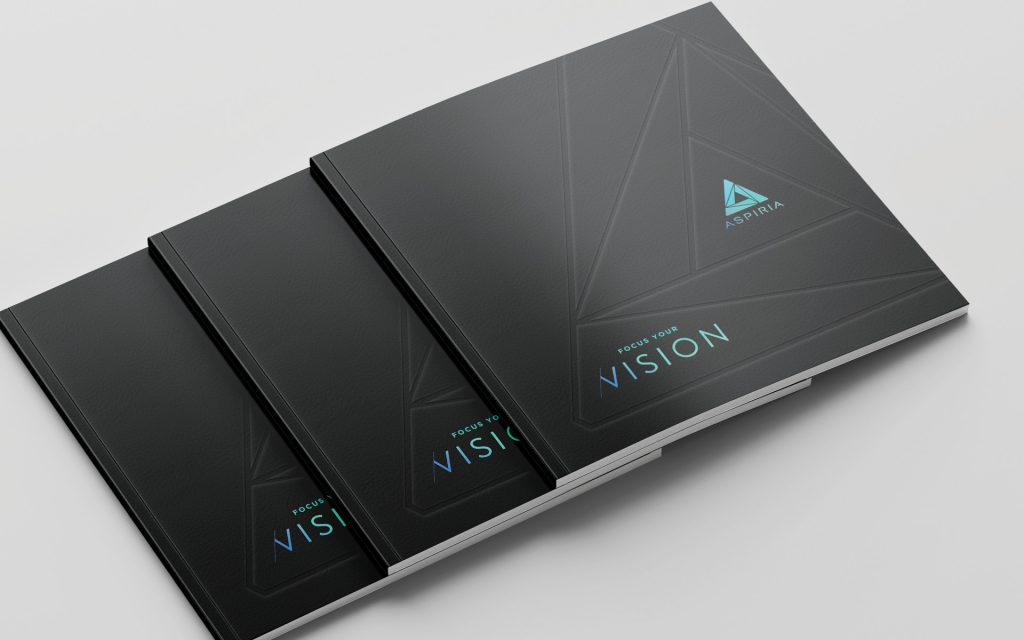
The Ask
Give Lander University’s Flagship Publication a Strategic Overhaul
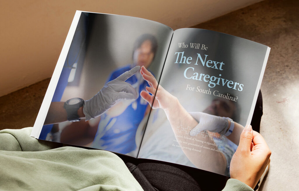
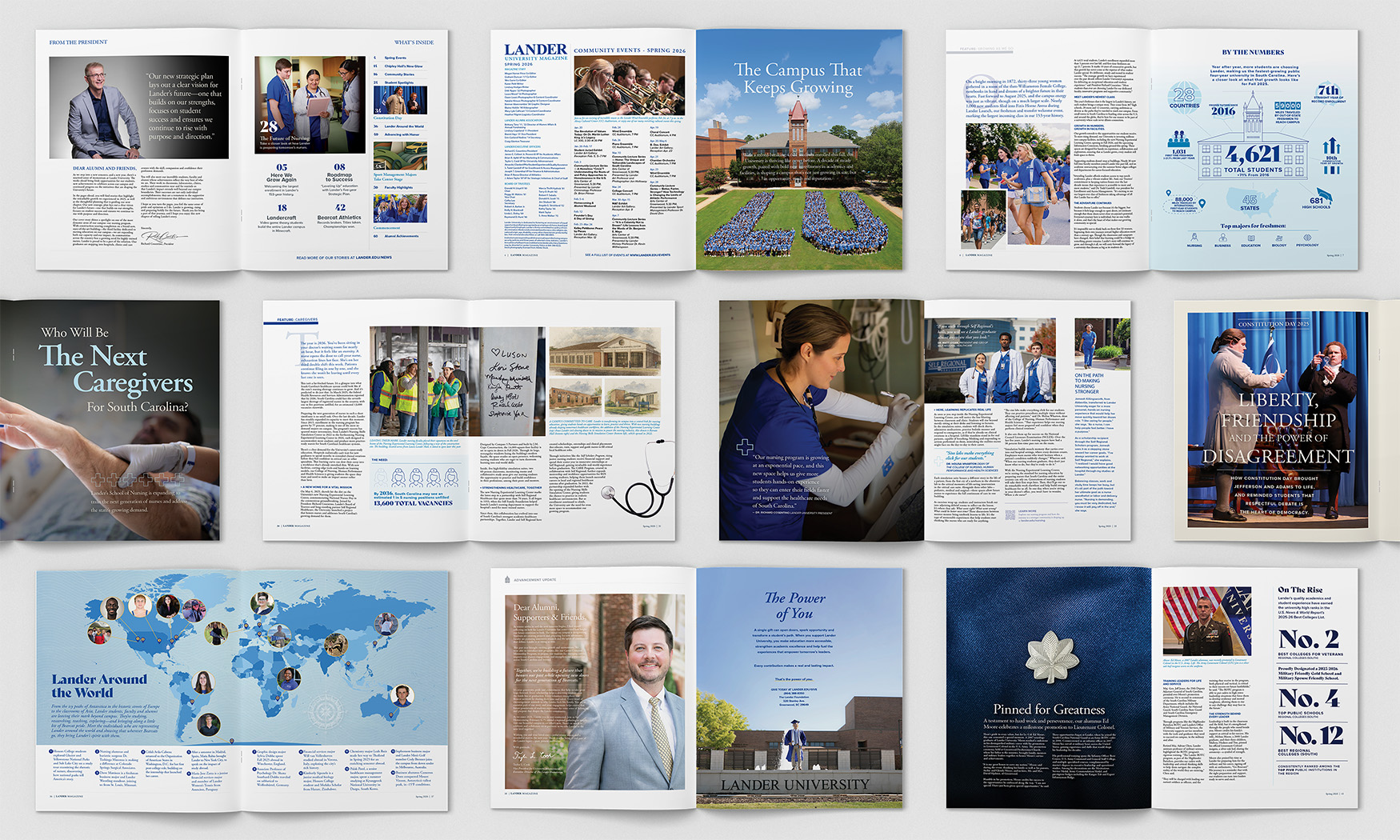
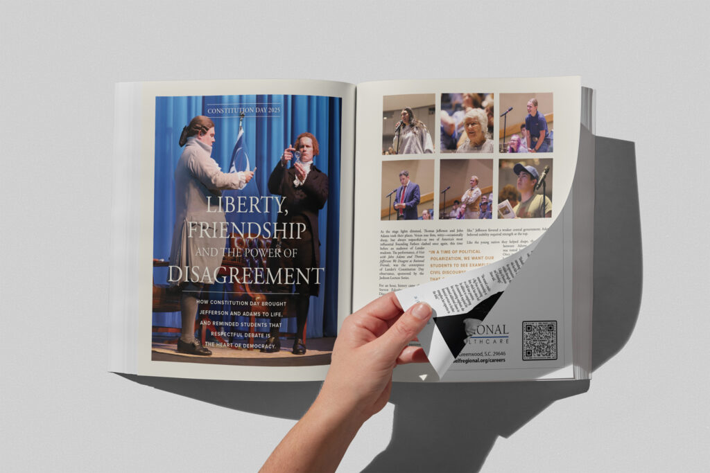
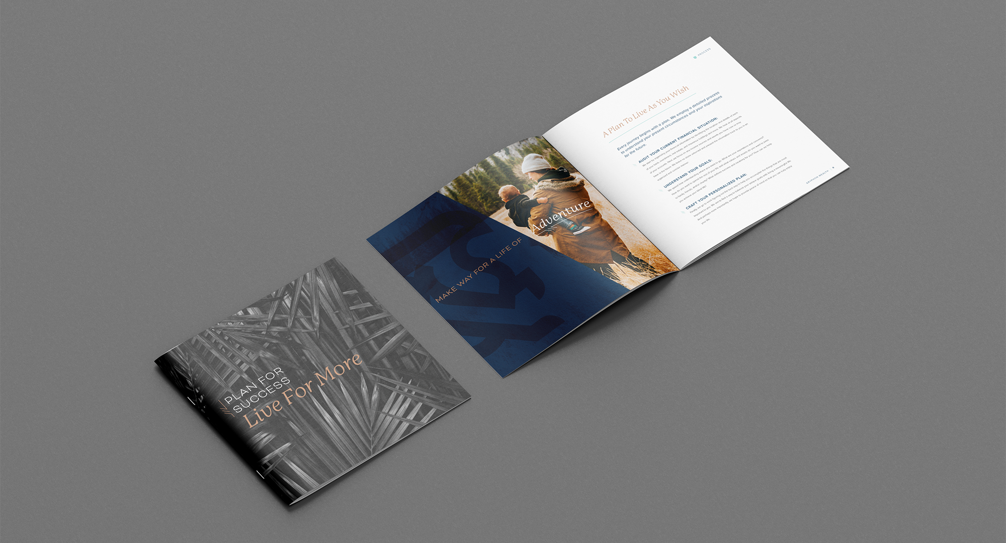
After a multi-year hiatus, Lander relaunched its end-of-year magazine—expanding it from an alumni piece into a flagship publication that supports advancement, leadership messaging, and brand awareness while keeping the personal feel of campus. With an 8–11 week runway and a firm print deadline, the project quickly scaled from an estimated 48–68 pages to a full 72, requiring alignment and decisive execution from day one.
: What We Did
- Research & Discovery
- Pagination, Outlining, & Templating
- Copywriting & Design
Strategic Approach
Research & Discovery
We kicked off with discovery conversations across Marketing & Communications, Advancement, and past contributors to clarify what the publication needed to be. The direction came into focus quickly: an alumni magazine, an annual institutional report, and a brand-building tool, all in one issue.
With that framework set, we reviewed the story list, refined the narrative arc, and built a structure that paired feature storytelling with concise updates and highlights. Writing progressed in three batches to overlap the writing, review and design stages for maximum efficiency against a tight deadline.
Planning the Issue
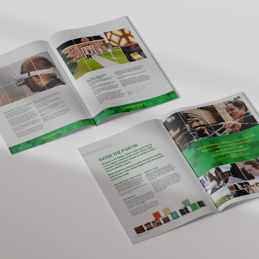
Establishing a Clear Structure Across 70+ Pages
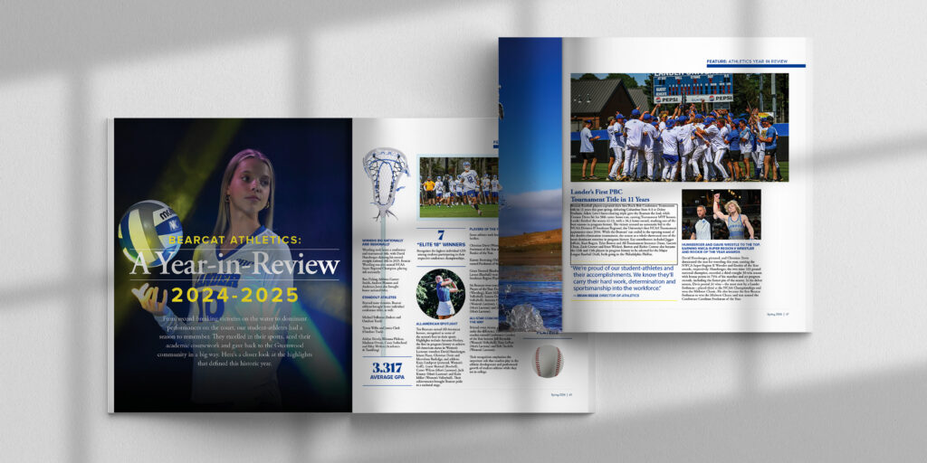
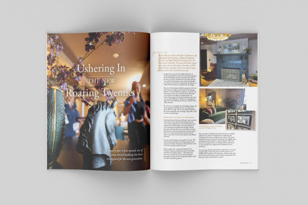
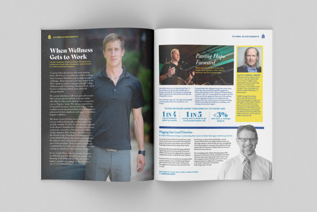
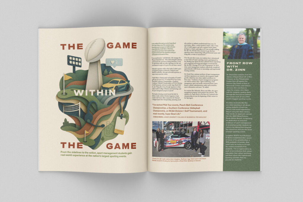
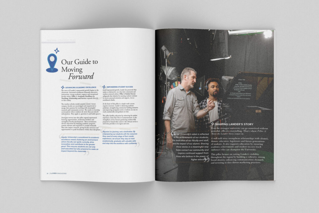
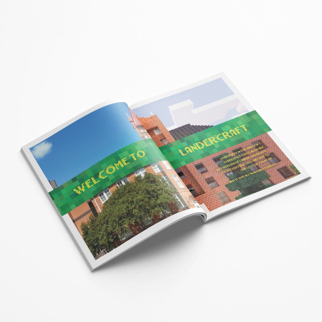
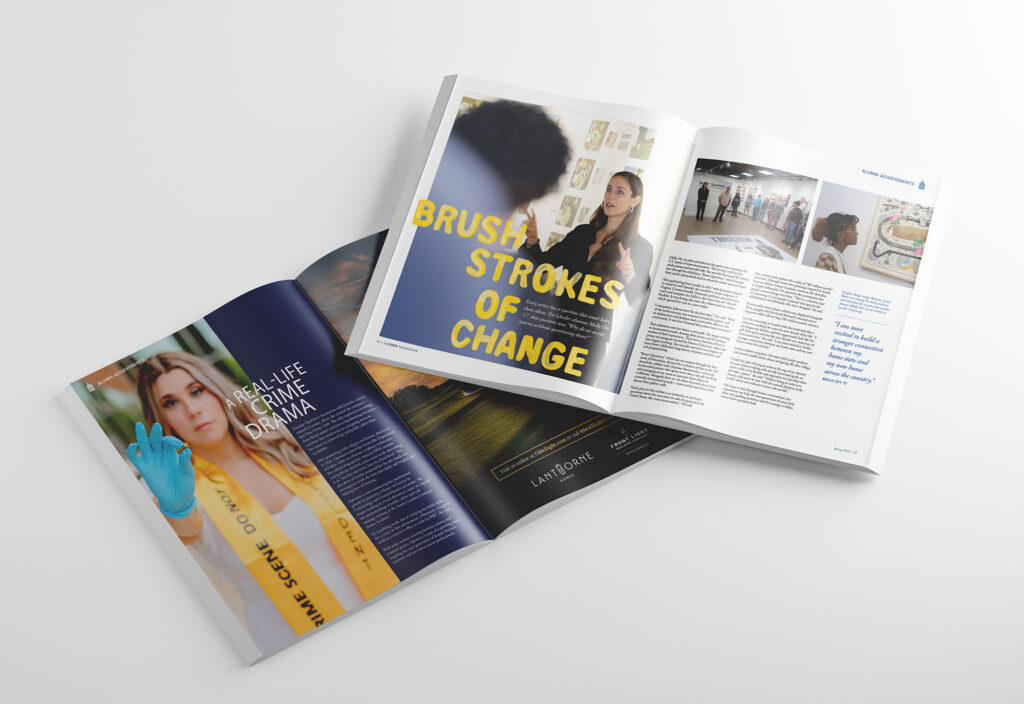
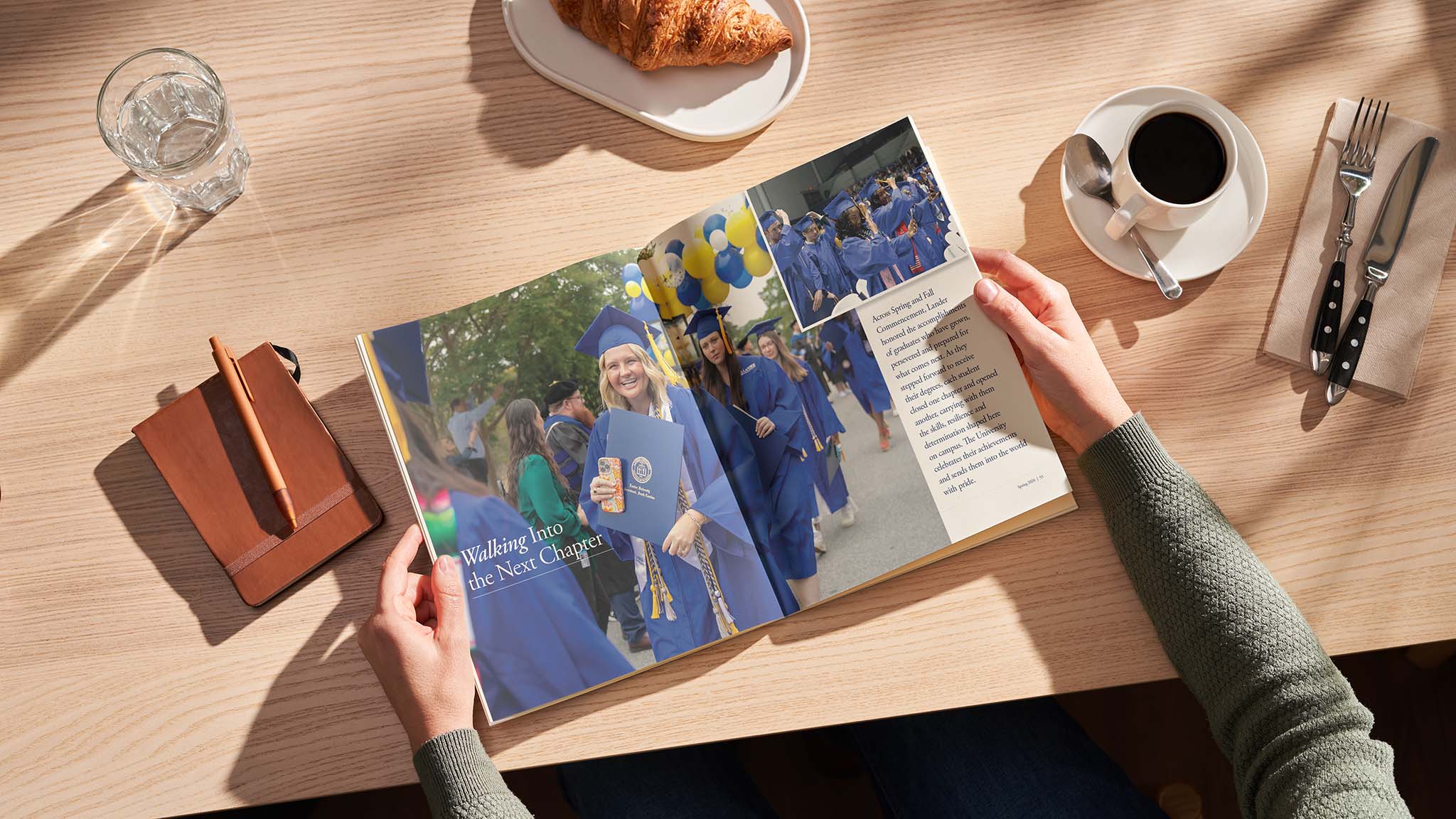
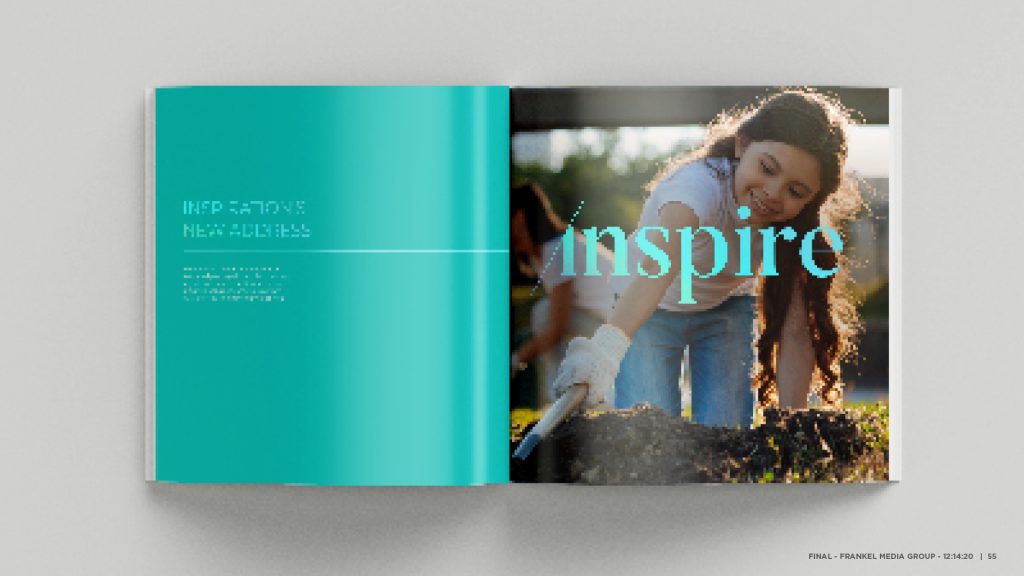
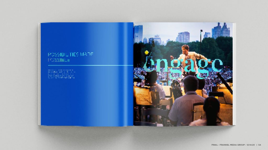
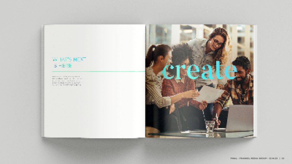
To keep a 70+ page issue cohesive and easy to move through, we built a section-based framework that organized content around Lander’s core communities: the university, students, faculty, athletics, and alumni. That structure gave each story a clear “home” while creating natural transitions across the issue.
Within that framework, we paced the magazine intentionally—anchoring each section with feature storytelling, then giving readers breathing room through shorter pieces, quick updates, and image-forward spreads. The result is a layout that reads with momentum and invites readers to keep going.
Designed for Flexible Consistency
We built the magazine around a consistent editorial system, grid, typography, and navigation, so the issue reads as one cohesive publication across 70+ pages. Within that structure, we gave feature stories and featurettes room to behave like true editorial moments: each one could adopt its own visual language (data, illustration, photography, pacing) in service of the content, without ever feeling disconnected from the pages around it.
Design principles we applied across the issue:
- A strong backbone: consistent grid, brand typography, and recurring components for clarity and cohesion
- Designed-to-fit features: story-specific art direction and layouts that match the subject and tone
- Cohesion across variety: features feel distinct, but never incongruous with the overall system
- Pacing by design: alternating feature anchors with lighter, image-forward interludes
- Templates that scale: repeatable formats for short pieces, profiles, and section openers
Built for Long-Term Success
Lander’s end-of-year magazine connects alumni, students, and faculty through a shared snapshot of campus life. For this issue, we shaped the year’s most important stories—campus growth, academic investment, student achievement, into human, editorial-style narratives.
We worked closely with the Lander team to refine copy, finalize edits, and stay on schedule. The finished magazine delivered a level of design the university had long wanted, and the response reflected it: President Richard Cosentino and teams across campus were thrilled.
Just as important, the issue established a flexible template for future editions: consistent, but not static, and built to evolve year after year.
Results
Setting Up Future Issues for Success
Lander University’s end-of-year magazine historically connects alumni, students, and faculty through a shared snapshot of the year at Lander. For this issue, we worked in tandem with Lander’s most important stories from throughout the year. We took timely news—campus growth, academic investment, student achievement—and translated it into editorial-style narratives that felt human and story-driven.
Throughout the process, we collaborated closely with the Lander team to refine copy, finalize edits, and stay on schedule. The finished magazine was something the university had been looking forward to for years—a design they hadn’t quite been able to achieve in past iterations. The response spoke for itself. University leadership, including President Richard Cosentino, was thrilled. Feedback across departments was equally and overwhelmingly positive.
Just as importantly, this first issue established a flexible template for the future. One that creates consistency without locking the magazine into something static. A strong foundation that can evolve, not restart, with each new issue.
The Situation
Caring Advisors Deep in the Heart of Texas
In College Station Texas, Briaud Financial Advisors have been going above and beyond for their clients since 1986. Over the years, they have developed expertise in serving university professors and administrators, small business owners, and families with special needs.
A Brand to Match Their Mission
The common thread among each client group is a dedication to serving others, which serves as an inspiration for Briaud’s deep commitment to providing exceptional service. To fuel this mission, they asked for a comprehensive brand refresh and to create a more contemporary image that appealed to their existing clientele, and potential new clients.
: What We Did
- Brand Strategy
- Brand Development
- Logo Refinement
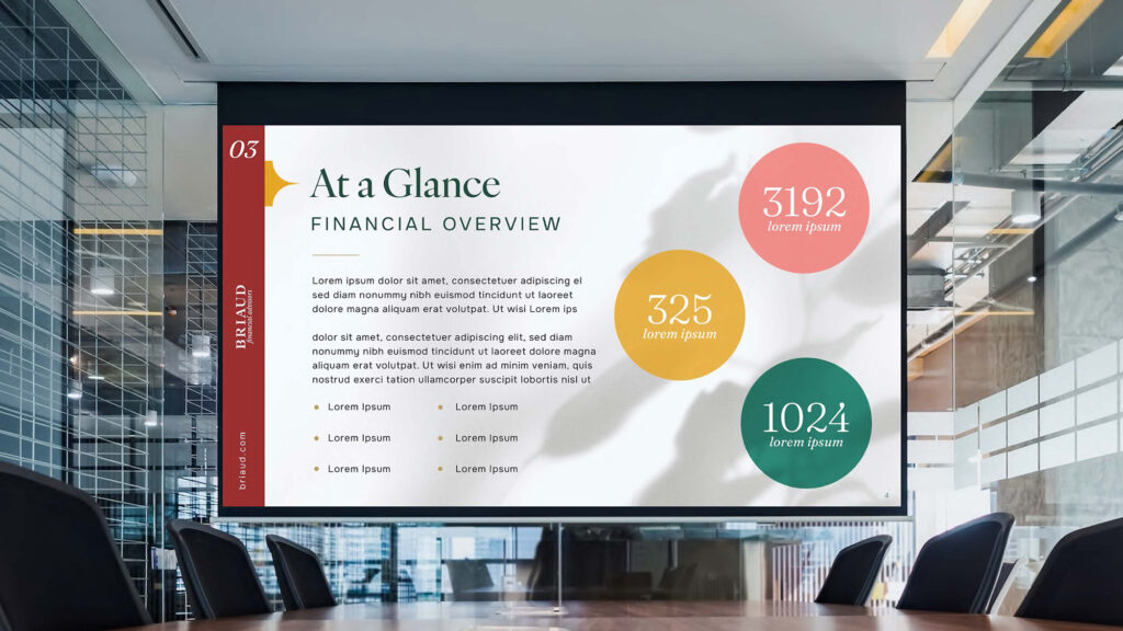
- Brochure + Collateral Design
- Stationery Design
Approach
Advocates, For Good
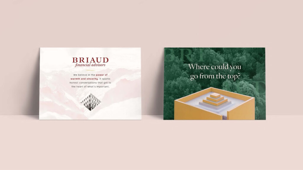
After going through the Frankel research process, we discovered a wide range of services. From helping companies reorganize, to finding healthcare benefits, to securing the future for families with special needs, Briaud stands out among their peers. We leaned into this spirit of advocacy and placed it at the center of the new brand.
Implementation
New Logo, New Look
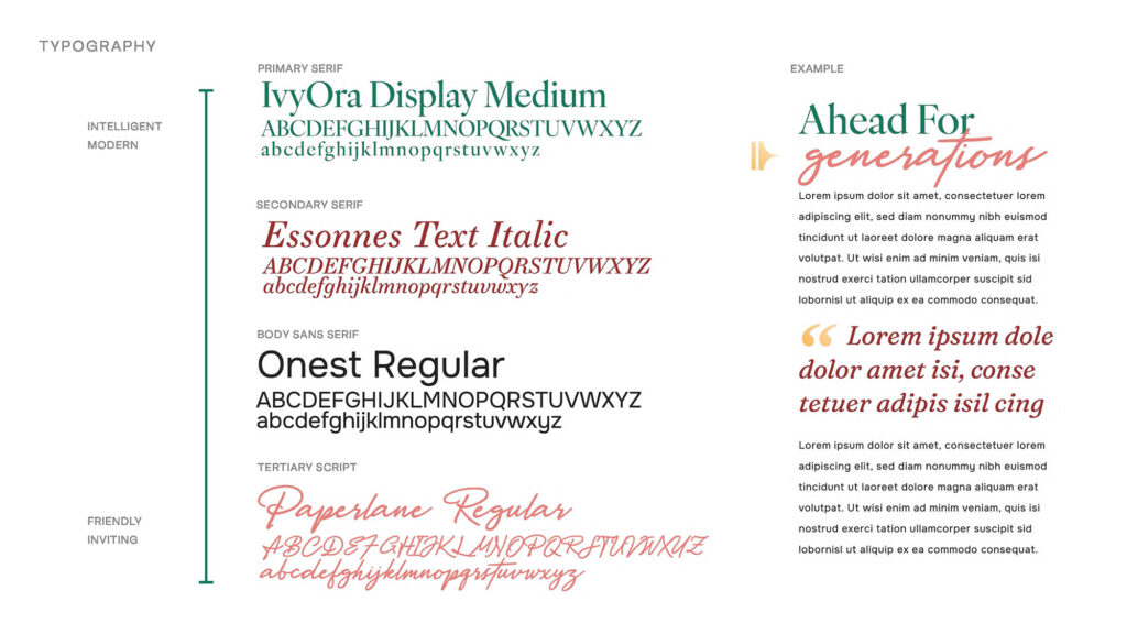
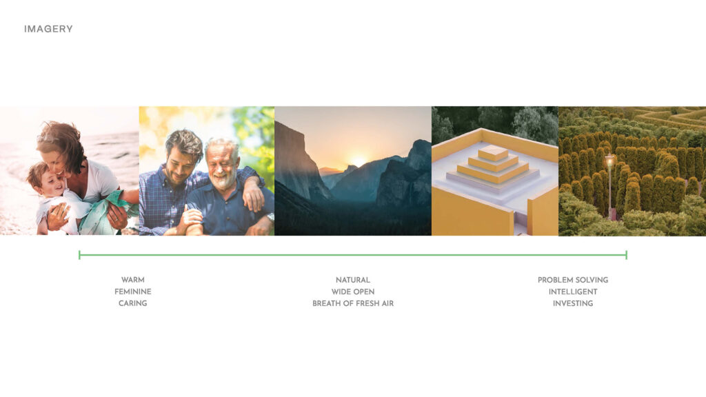
We started by modernizing Briaud’s existing logo and updating their verbal and visual identities, which included new typefaces, color palettes and graphic standards.
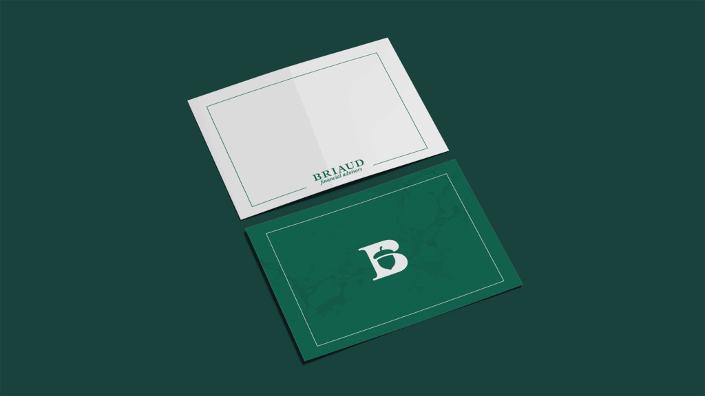
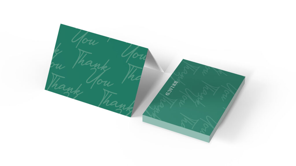
Stationery Suite
Making a good first impression often starts with a sharp looking business card. We updated Briaud’s business cards and notecards to do just that.

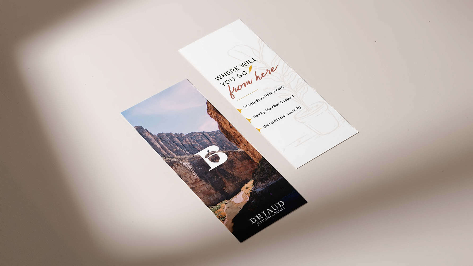
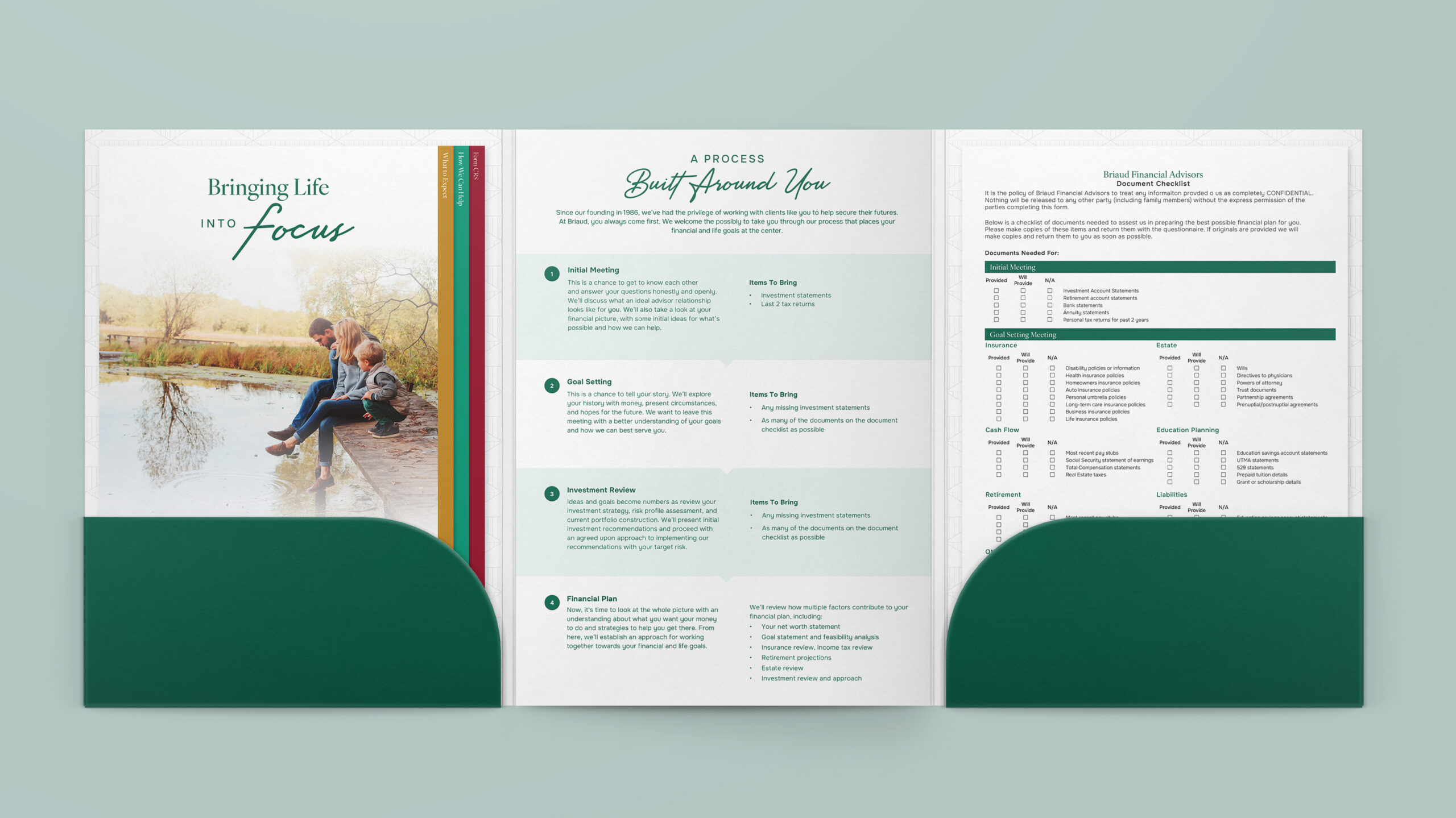
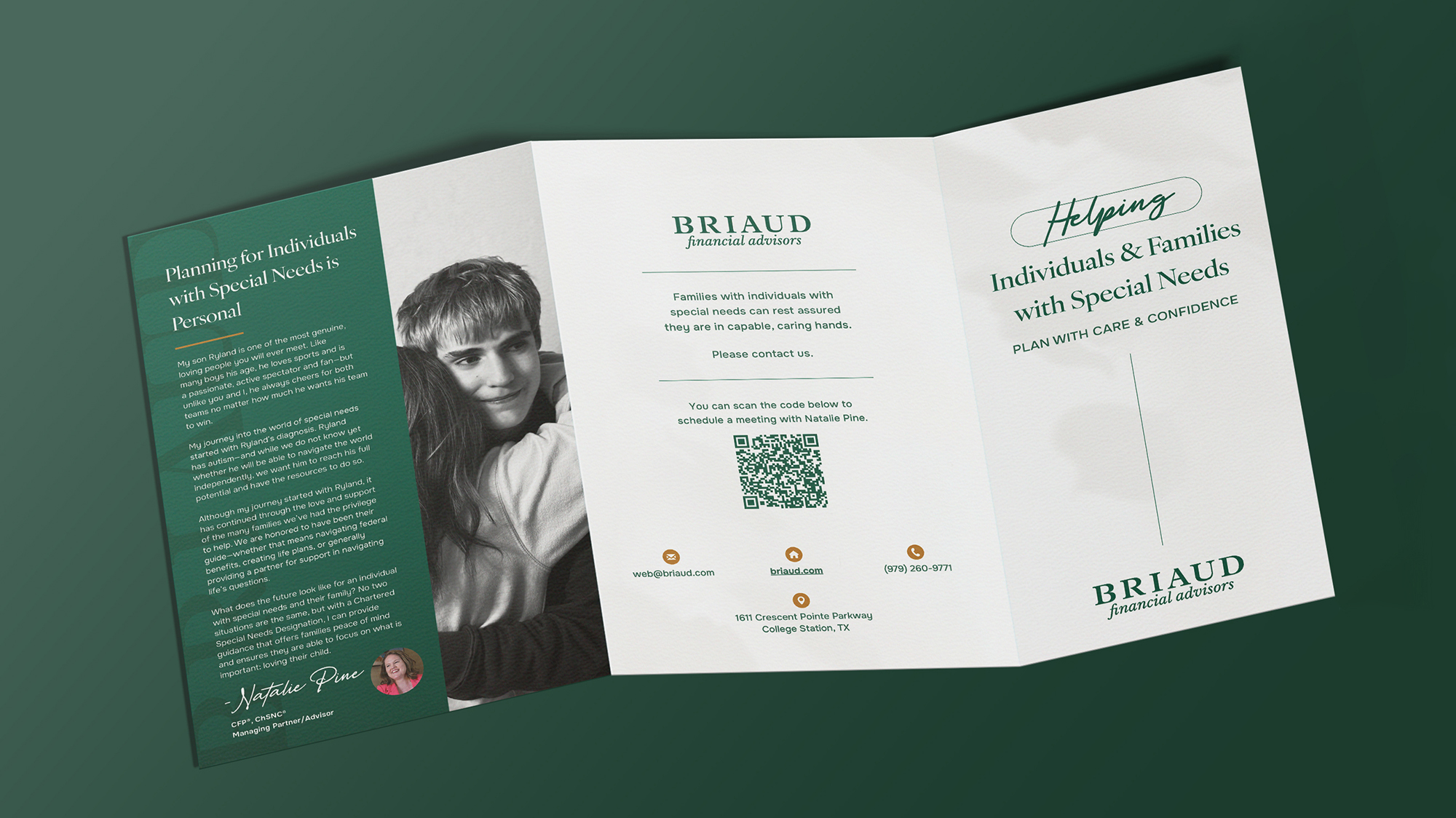
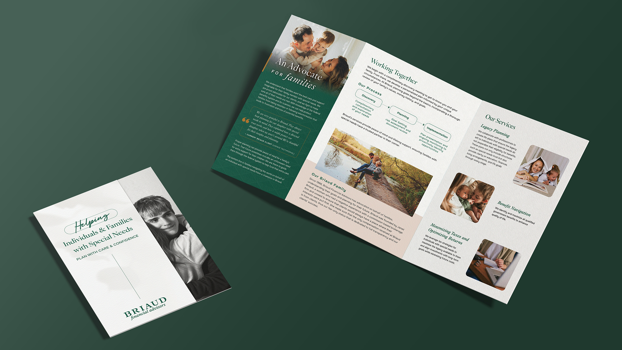
Special Needs Brochure
Connecting with and helping families who have members with special needs is deeply personal to Briaud. So we worked closely with them to create a brochure that not only told their story, but displayed their genuine passion to advocate for their clients.
The Ask
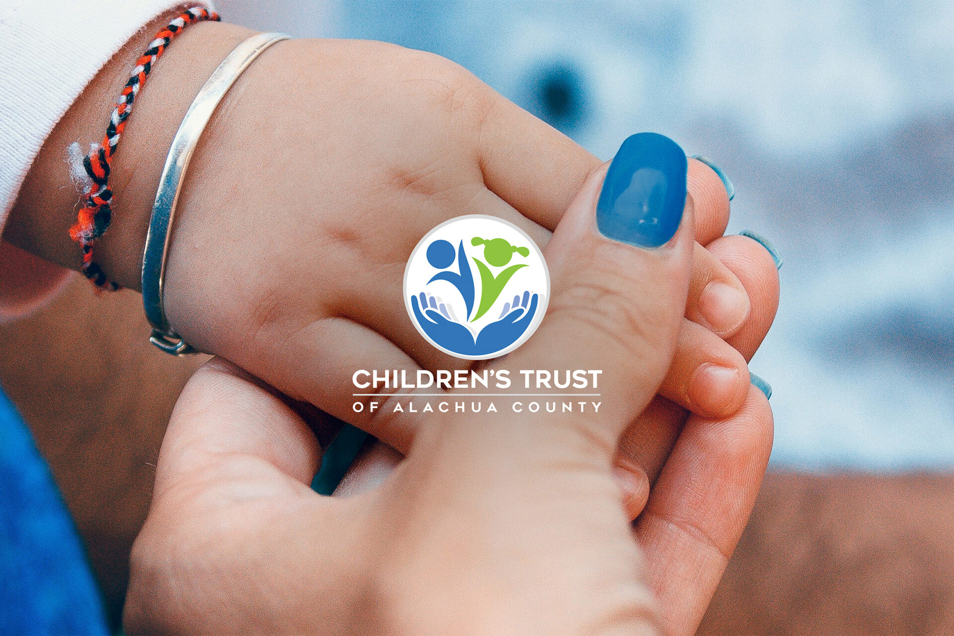
Bringing a Family Resource Magazine to Alachua County
When the Children’s Trust of Alachua County (CTAC), a publicly funded county initiative, came to us, they had a big idea to launch a community magazine that connects local families to helpful resources, real stories, and trusted support. They knew we had a long history creating publications—from strategy and writing to full design—and wanted a partner who could help bring their first-ever magazine to life.
But this wasn’t just about making something beautiful. CTAC recognized a deeper need: Alachua County didn’t have one easy, accessible place where parents, caregivers, and community members across all backgrounds and neighborhoods could find helpful, local information tailored to families. And for the funders and stakeholders who support CTAC, the publication also needed to reflect the value and impact of their investment in the community.
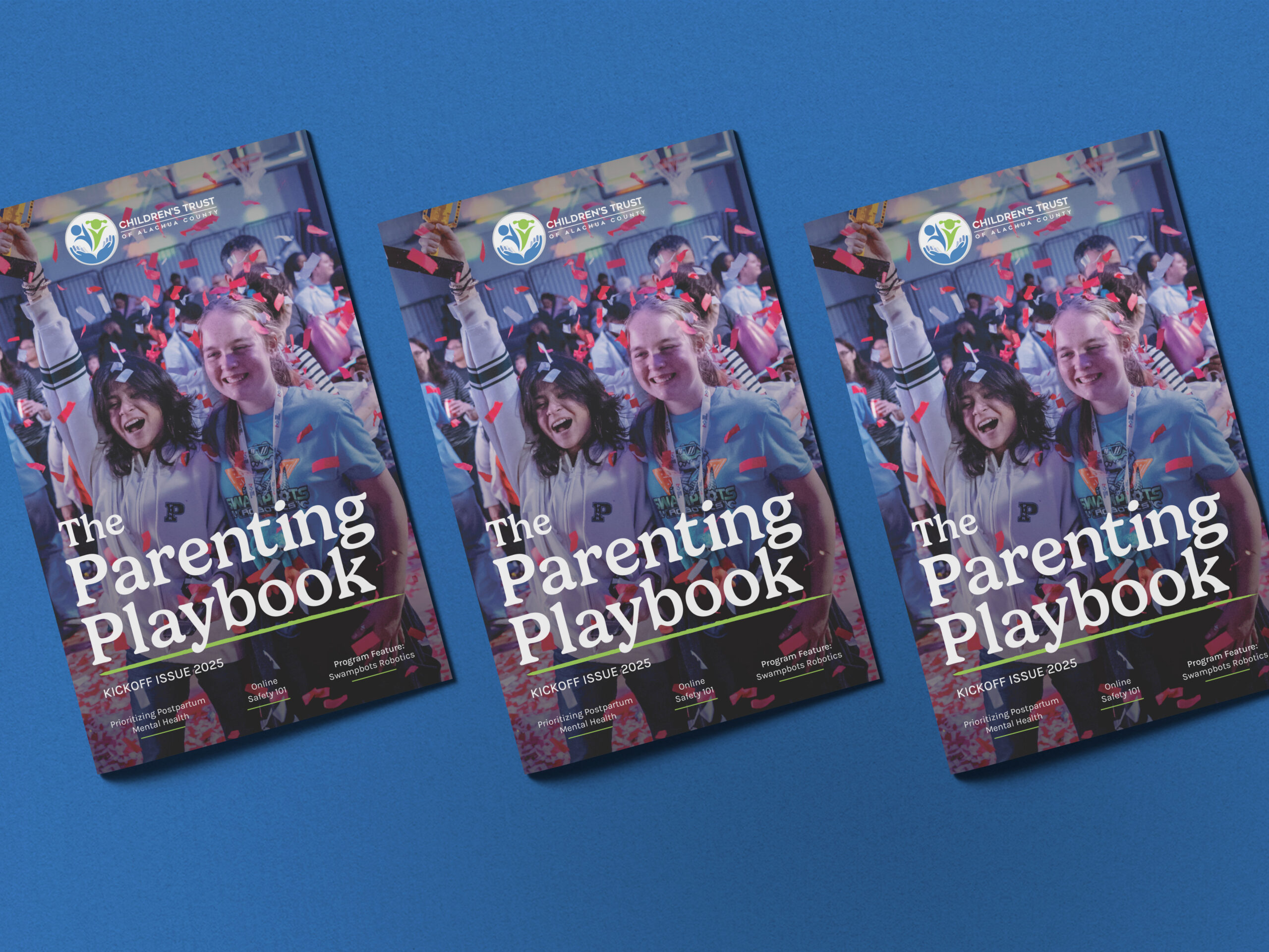
Together, we set out to change that. The Parenting Playbook print and digital flipbook made its debut in Spring 2025.
What We Did:
- Research and Business Planning
- Concept Development
- Media Kit
- Source Interviews
- Editorial Calendar Planning
- Magazine Copywriting & Design
- Printing & Production
Strategic Approach
Research & Discovery
Before working on concepts and initial designs of any project, our team engages in a thorough discovery process. To do this, we needed to learn about CTAC’s overall goals, core audience, competitors, and stories that need to be told.
This means understanding:
- Who we’re really talking to (not just parents—also grandparents, caregivers, teachers, mentors, community leaders, businesses, organizations)
- What age groups and topics matter most to community members
- Which voices should be front and center, from CTAC leaders to local family voices
- What types of recurring content could make each issue something readers come back to
- How CTAC’s own programs could be thoughtfully integrated into the magazine’s DNA
This early groundwork helped set the tone for everything to come and gave us a strong foundation to build something that was as strategic as it was community-driven.
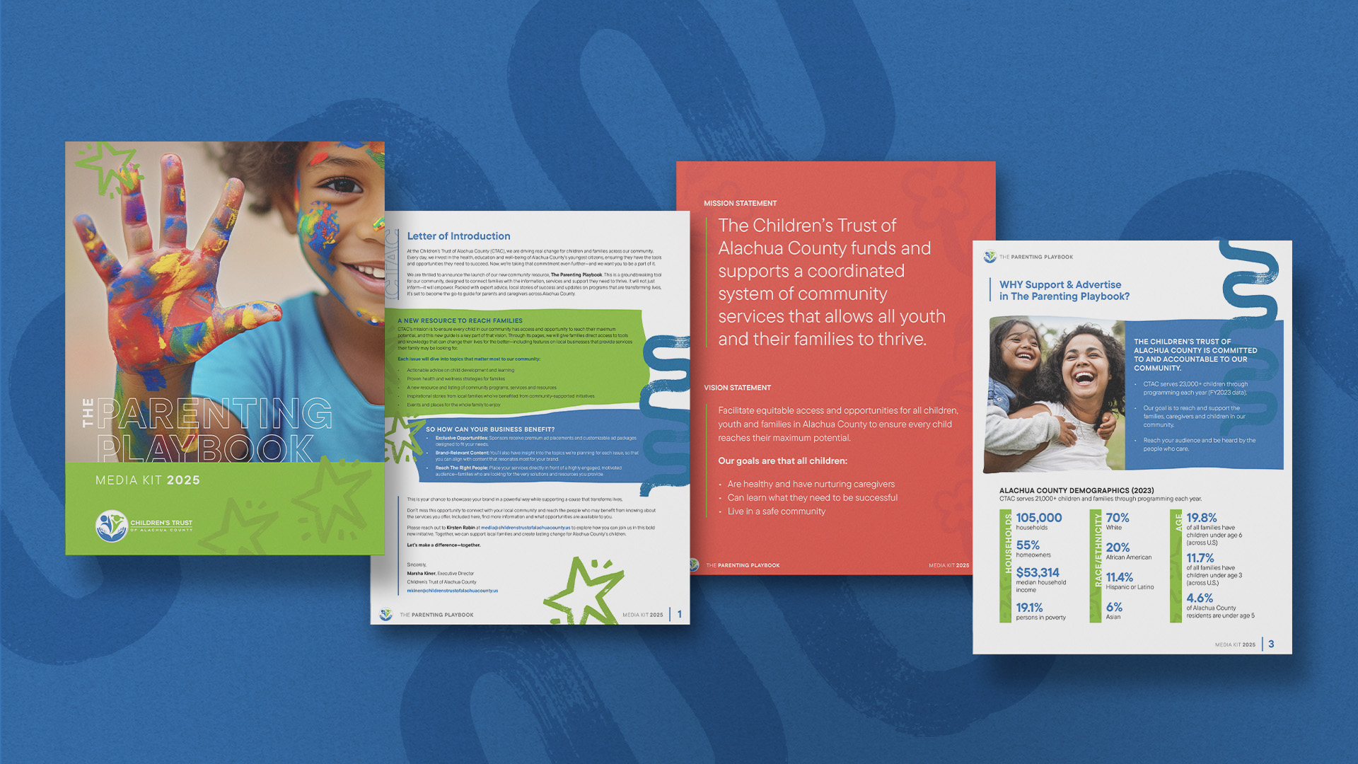
Media Kit
Establishing a Relationship with Advertisers/Sponsors
Before the magazine even hit print, we helped CTAC introduce The Parenting Playbook to potential sponsors and partners with a thoughtfully designed media kit. It framed the magazine as a new, much-needed resource for families across Alachua County and positioned CTAC as the driving force behind it.
The media kit clearly explained what the magazine is all about, who it’s for, and what kind of content readers can expect in every issue. It also outlined how community partners could align with the mission, support the publication, and connect with readers in a meaningful way. Like everything we do, it balanced clarity with creativity, giving CTAC a strong tool to start building long-term buy-in and support.
Source Interviews & Editorial Calendar
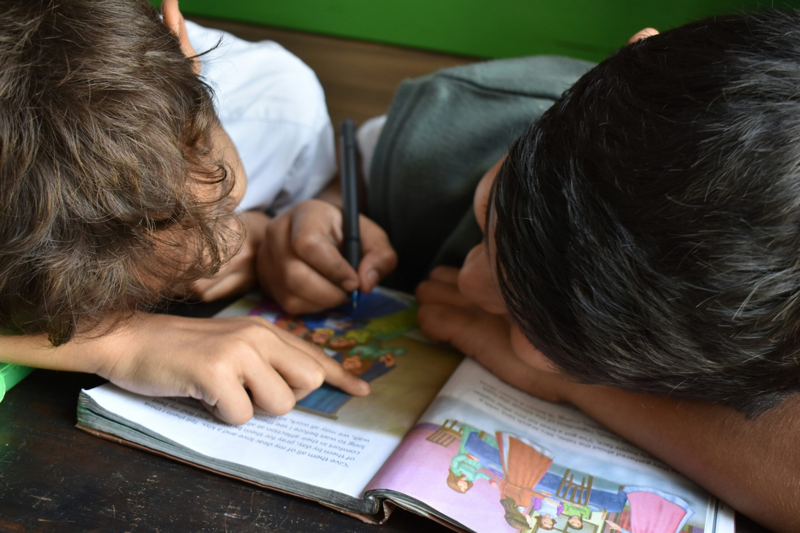
Real People. Real Stories.
From the start, we knew this magazine needed to reflect the community it serves. So we got to work talking with local families, educators, leaders, and more, to not only provide families with expert advice but also give a voice to real, relevant, and relatable people from the community.
At the same time, we collaborated with CTAC to shape an editorial calendar that organizes each issue by section and content type. That’s helped us keep the content both intentional and engaging, with a strong mix of helpful tips, heartwarming features, and local resources.
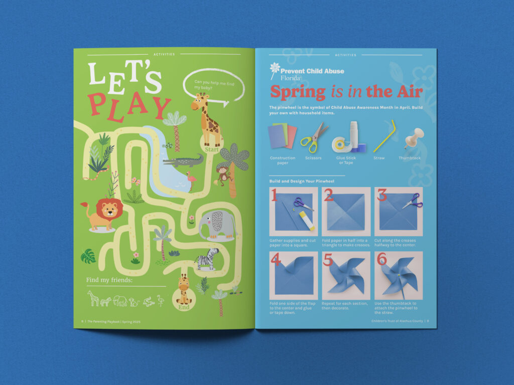
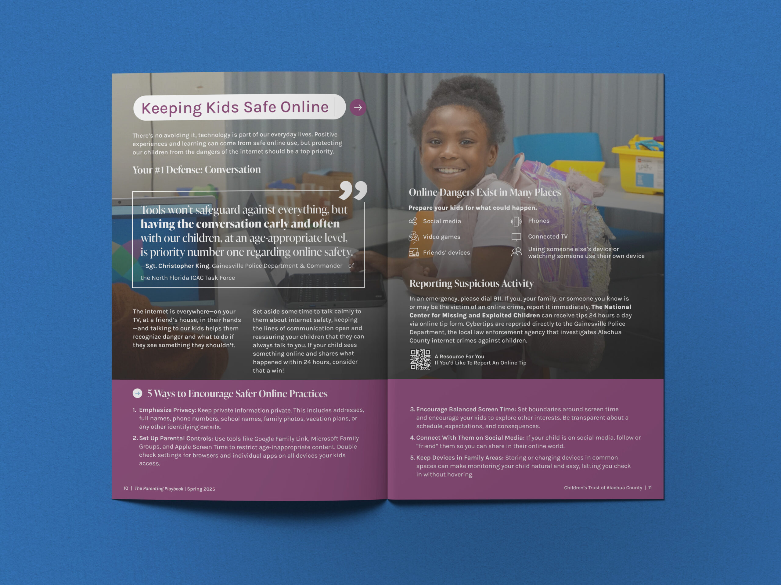
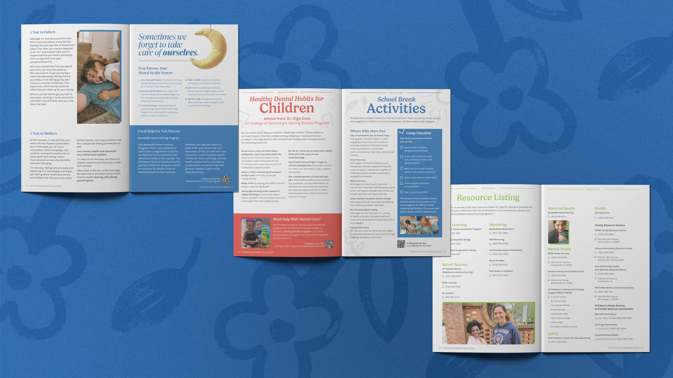
The Parenting Playbook
A Magazine Made for Families
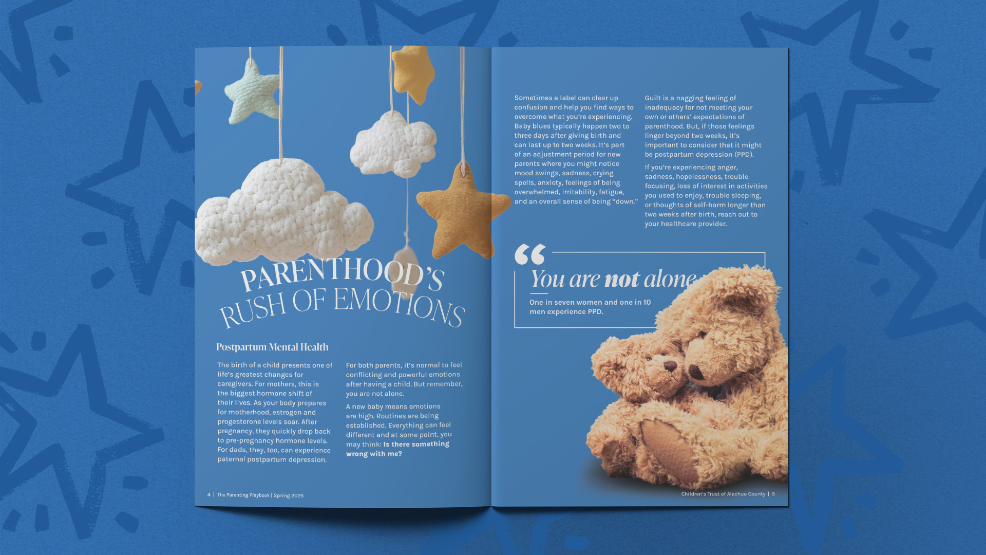
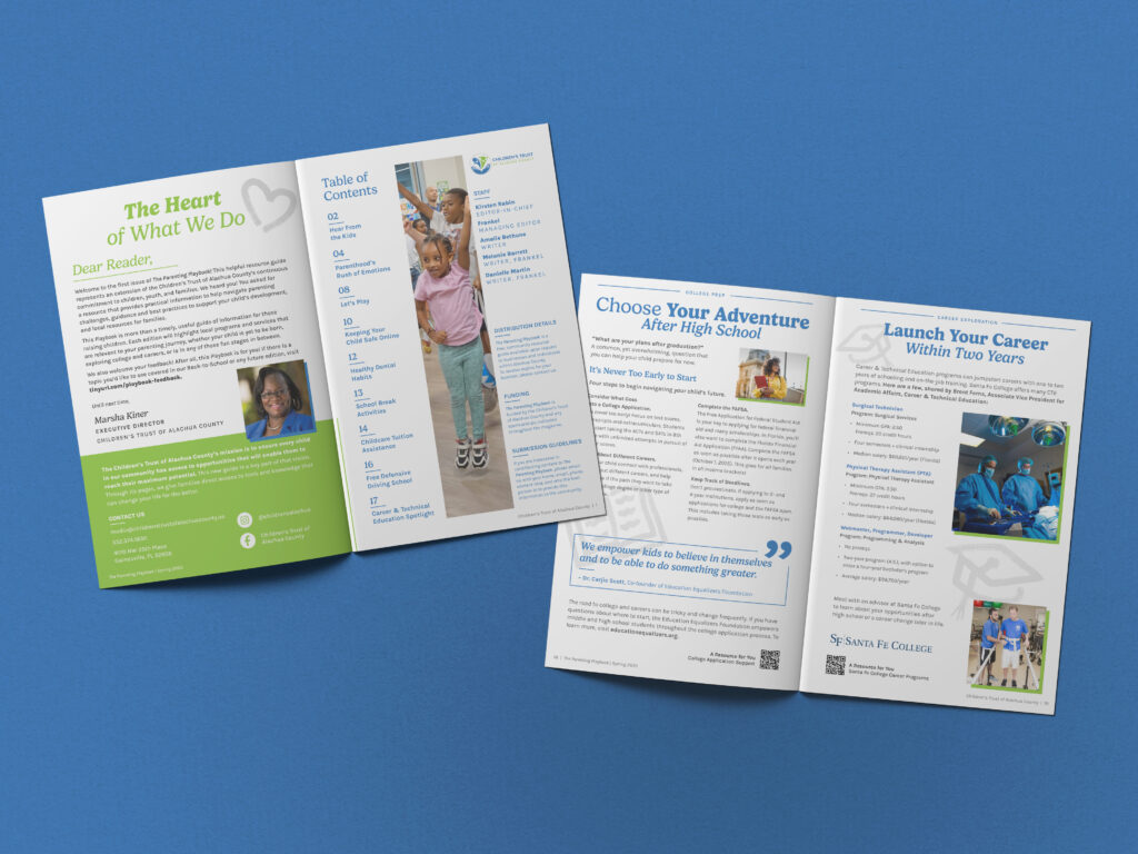
With strategy in place and stories in motion, we designed and delivered the inaugural issue, from cover concepts to final layouts, in early Spring 2025. The result was a high-impact, brand-aligned print magazine and digital copy filled with stories spanning early childhood, safety, health, high school, college prep, activities for kids, and more—stories people actually want to read and a compilation of local resources that everyone can utilize.
To keep readers coming back, we also developed templates for recurring content sections to maintain consistency from issue to issue, as well as to be recognizable to the audience.
And for the content that’s heavier on data or detail, we gave enough space for digestible, “snackable” formats. Think color callout boxes, easy-to-read lists, and dynamic visuals, all to keep readers engaged without overwhelming them. The digital version, published as an interactive flipbook, became a key part of CTAC’s outreach strategy, to reach more audiences outside of the print copies. View the digital flipbook.
The Result
5,000
copies distributed
300%
Increase in sponsorship from Issue #1 to #2
Expanded publication
Featuring increased page length and larger format


The Ask
Put an Identity to the Name
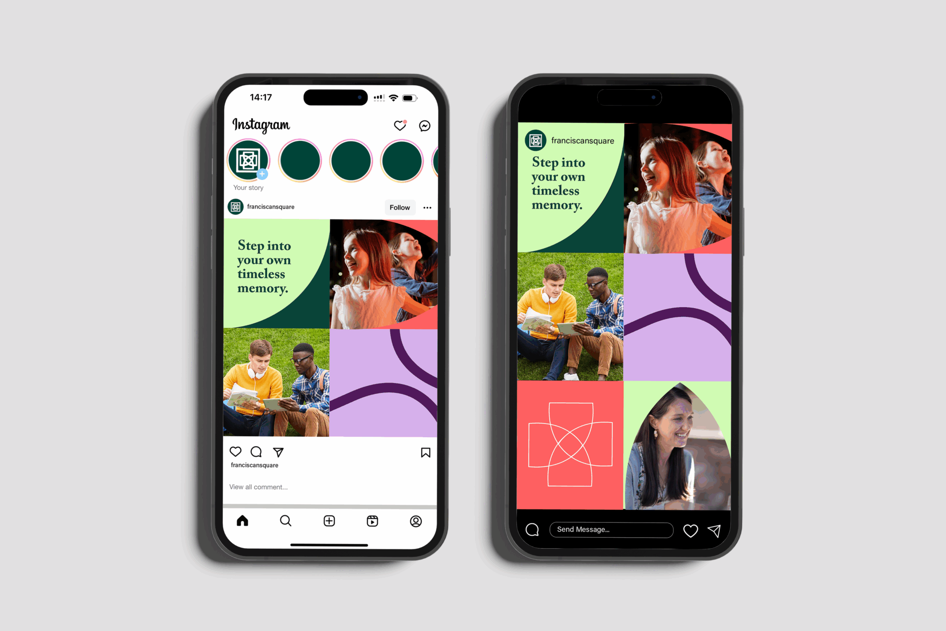
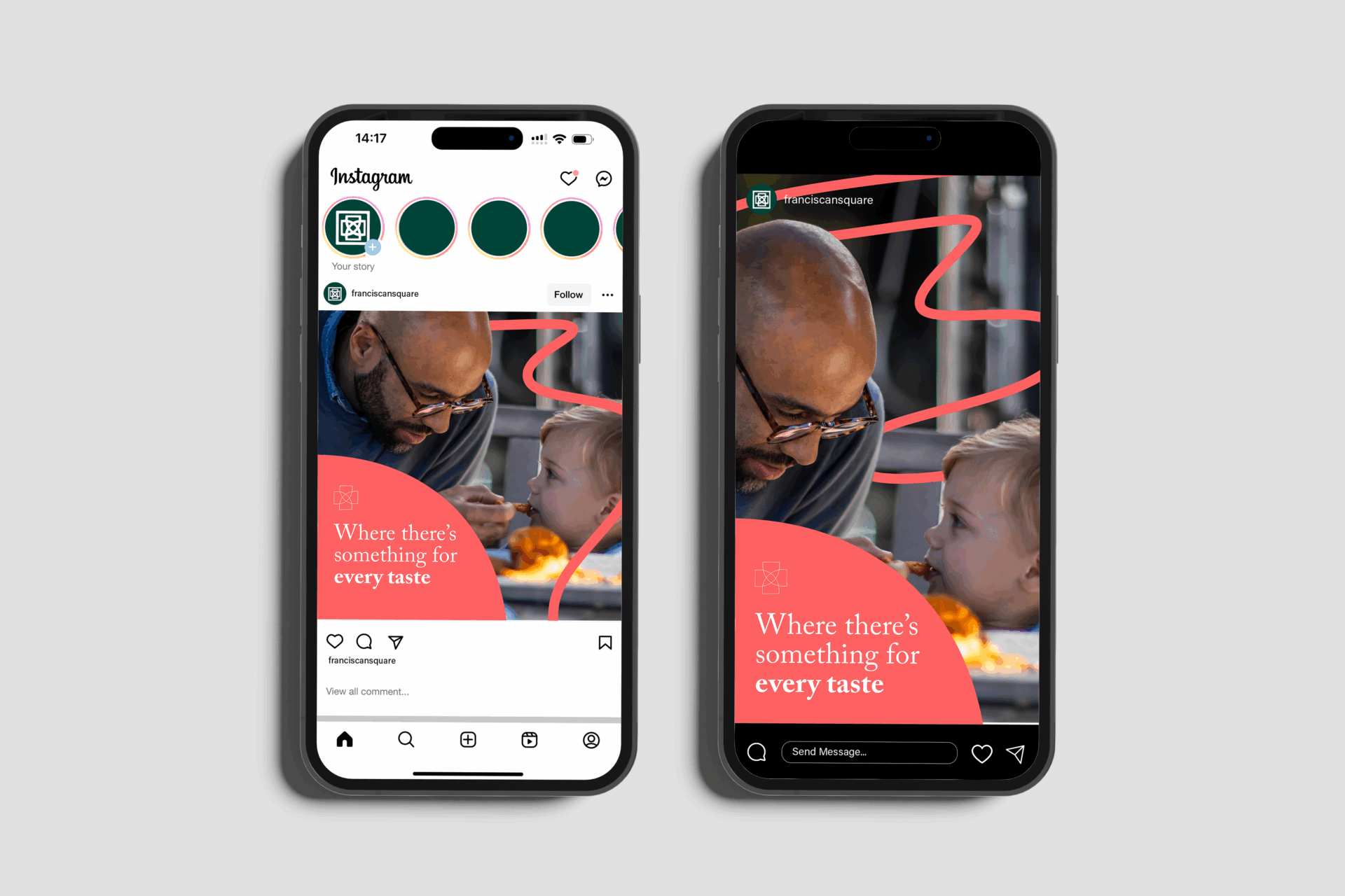
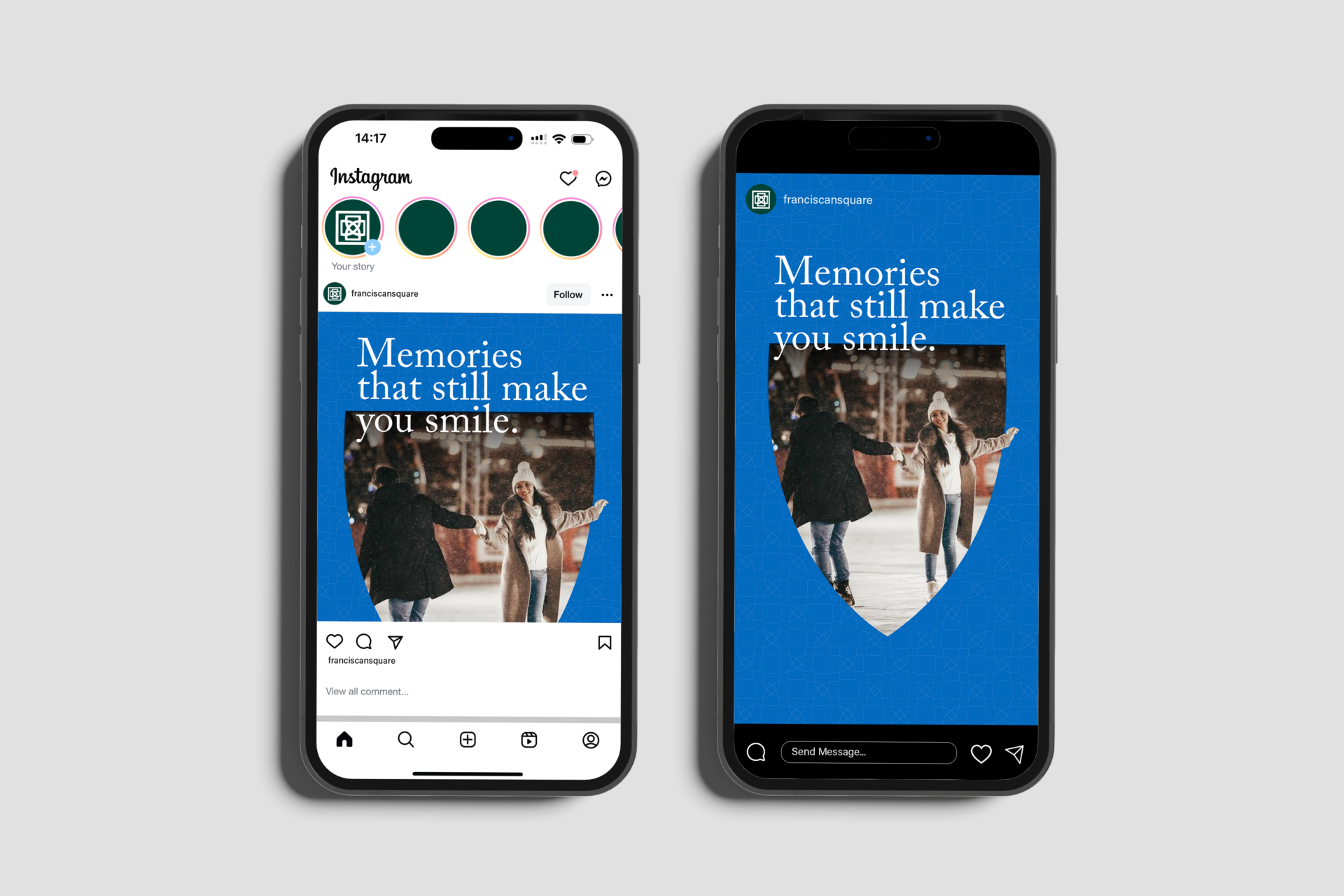
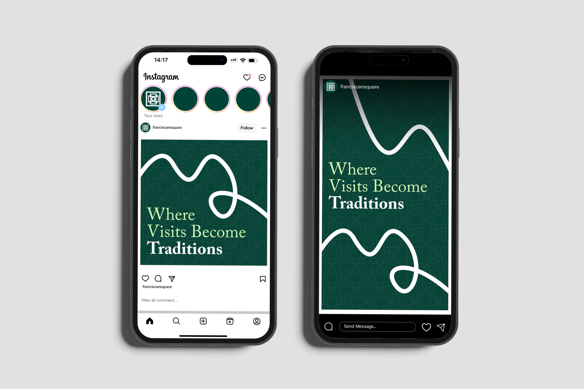
Franciscan Square is a mixed-use development located in Ohio and owned by the Franciscan University of Steubenville (FUS). Strategically positioned near the university, the Square serves as a gathering space for students, families, local residents and out-of-town visitors.
We were brought in to help evolve the Franciscan Square brand. Already popular in the community for its annual ice skating rink, the Square wanted to show how it’s growing across dining, living and entertainment.
Our team gave Franciscan Square the tools to better communicate and connect its offerings across diverse audiences. We started by gathering insights through in-depth research, then we translated those into a refreshed brand identity, a new website and a comprehensive strategic communications plan.
What We Did:
- Research & Discovery
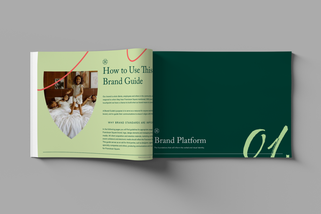
- Brand Platform
- Verbal Identity
- Visual Identity
- SEO Strategy
- Website Design & Development
Approach
Research & Discovery
To build a brand, we need to know the ins and outs. We began by setting specific, measurable goals and identifying the key questions our research needed to answer when interviewing Franciscan Square’s leadership. What we discovered was a deep sense of community pride rooted in the Square—one that’s forward-looking, family-centered and full of potential.
Competitive Benchmarking
We conducted a competitive audit of similar developments near Steubenville, analyzing websites, messaging and design to uncover gaps and opportunities. Our audit extended to social media as well, evaluating content strategies, platform choice, audience engagement and overall brand presence. This allowed us to make data-driven recommendations for enhancing visibility and encouraging a stronger community.
Brand Development
Bringing Joy to Everyone Who Visits
Verbal Identity
How a brand looks is equally important to how the brand speaks about itself. Taking our insight from the discovery phase, we created a verbal identity that captured the Square’s energy and sense of belonging. This included defining the brand’s purpose, positioning and messaging pillars, along with five brand tones mapped across four primary audience groups. We found that coming to the Square is a treat for everyone, and it should be reflected in the brand’s voice.
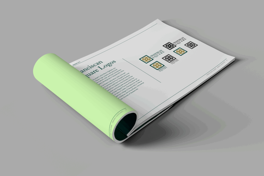
Visual Identity
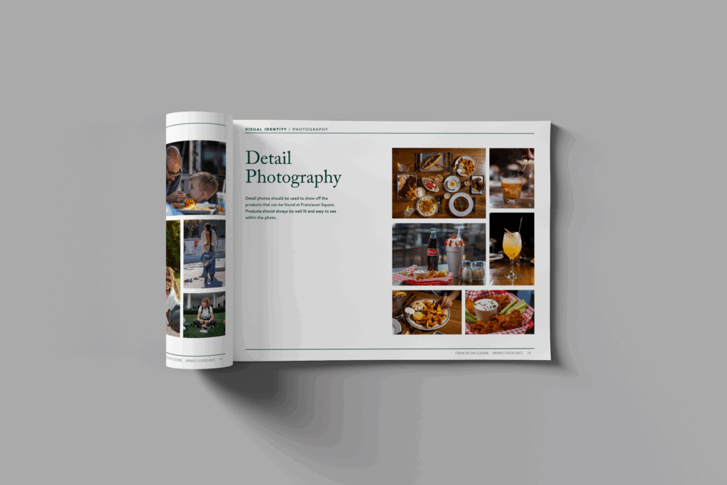
While the logo was already established, we built upon it with a comprehensive visual identity guide. We established primary and alternate color palettes, curated photography guidelines (action, detail and architectural) and developed visual patterns to reinforce the brand experience.
Branding Applications
To bring the brand to life, we showcased how the verbal and visual identity would apply across real-world touchpoints, from web landing pages and social ads to banner signage and a leasing one-sheeter.

Website & SEO Strategy
Fully Branded, Ready to Be Seen
A website is one huge culmination of brand development, with a mixture of digital strategy. Initially, we recognized a major SEO opportunity. Competitor keyword saturation was low, leaving the door open for Franciscan Square to rise in the ranks.
We conducted a full SWOT analysis and used it to guide our website build, from structure and content strategy to SEO-focused design and branding integration.
The result: a website that not only looked the part, but performed like it too.

The Situation
Without a name or a brand, this group of financial advisors came to Frankel to create a brand identity that would resonate with people who had never worked with a financial advisor before. They needed a brand strategy, a name, a logo, a brand, a website and everything that follows.
What We Did:
- Research and Discovery
- Brand Strategy
- Brand Development
- Naming
- Logo
- Verbal and Visual Identity
- Website Design
- Website Development
- Event Marketing and Collateral
The Approach
First, we started with deep-dive discovery conversations with the founders. Seeking to understand their vision for now and into the future as well as their real-business needs.
Then, we did our research. Our initial phase involved a thorough audit of the competitive landscape to identify opportunities for differentiation. This included conducting primary research with key target audiences, gathering both qualitative insights and quantitative data. This research allowed us to pinpoint specific areas where the client could effectively address unmet needs within the market.
We also looked at how competitors communicated with their audiences across platforms. This analysis revealed opportunities to strategically position our client as an advisor for first-time investors (a positioning that others were not leaning into), develop unique messaging that wouldn’t use industry jargon, and build a distinct brand identity that would resonate with the introductory audiences.
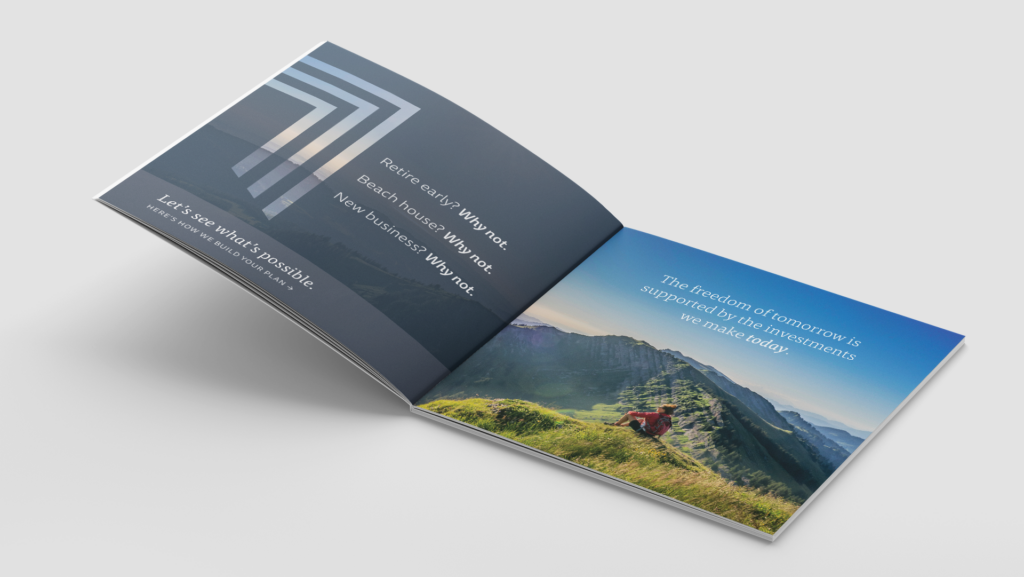
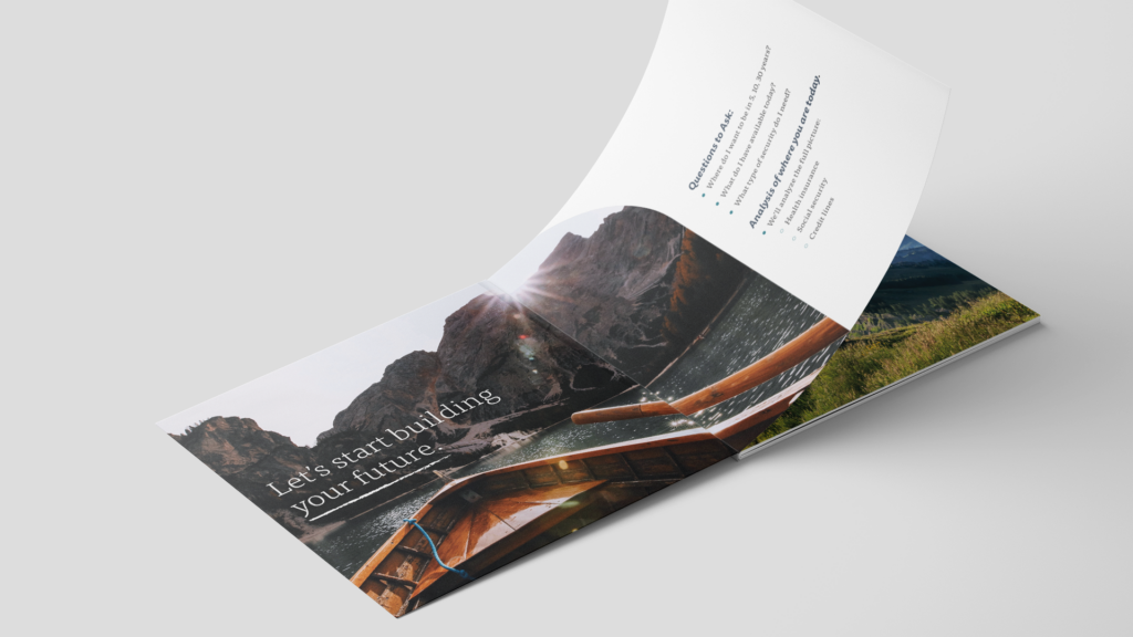
The strategy was to create a brand that first-time investors would feel safe with and feel comfortable asking questions. An advisory that felt professional, yet accessible.
Naming
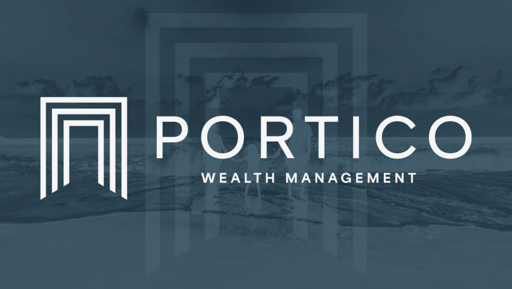
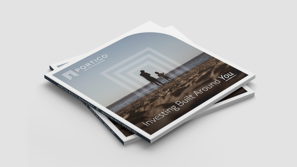
Through our naming process we landed on Portico. A place that evokes protection, yet a welcoming environment. A place where you could have trusted conversations. A space that has strong structural systems to support you and would invite you in.
Unlike other firms who lean on the name of their founder, the name Portico allows for the firm’s recognition to continue growing beyond any one person.
por·ti·co/ˈpôrdəˌkō/ noun a structure consisting of a roof supported by columns at regular intervals, typically attached as a porch to a building. |
|---|
Logo + Branding
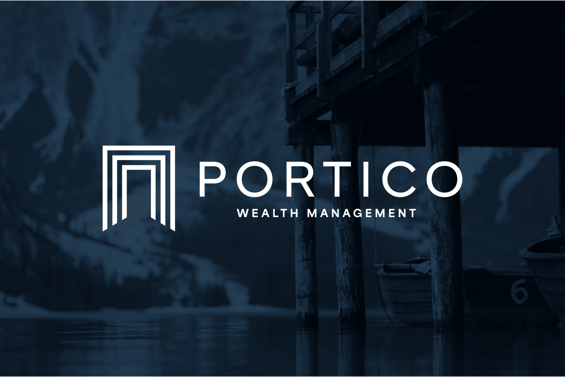
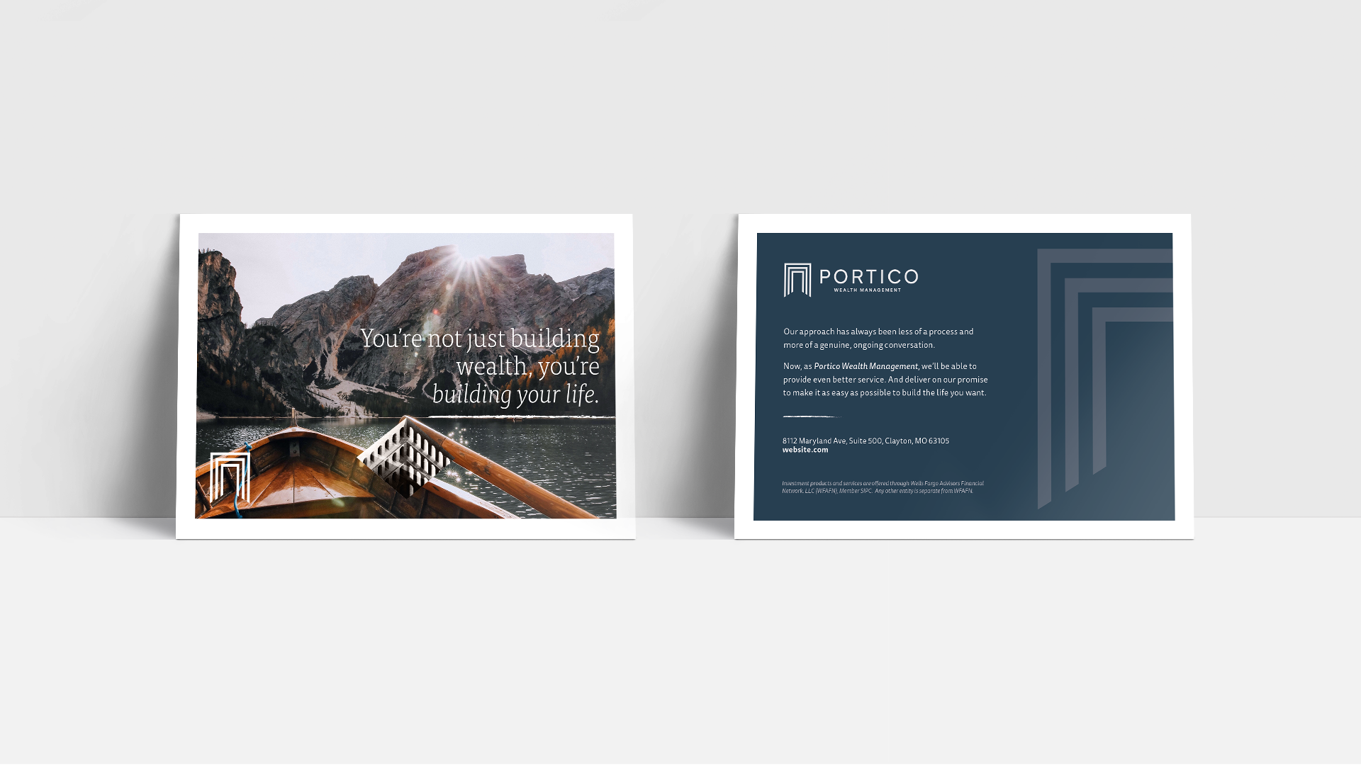
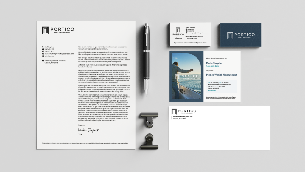
We created the logo as an artistic representation of a Portico. Designed to be a strong symbol that creates legitimacy and brand recognition.
The branding brings together everything we learned in the research and discovery. The messaging and tone connect with key audiences with jargon-free, introductory language, while also adhering to compliance regulations.
The visual identity conveys the serenity and trust Portico aims to provide to their clients. Leaning into imagery that speaks to the future life clients want. While the design elevates the overall branding of the Portico brand.
Website Design & Development
As the front door to the business, the website brought the brand’s identity to life. We designed the website and helped to bring this core piece of collateral to life, working seamlessly within a regulated industry. And explaining Portico’s services in a way anyone could understand, something that others in the space just weren’t doing.
Event Strategy and Marketing
We know that events are often pillars of an audience engagement strategy for financial advisors.
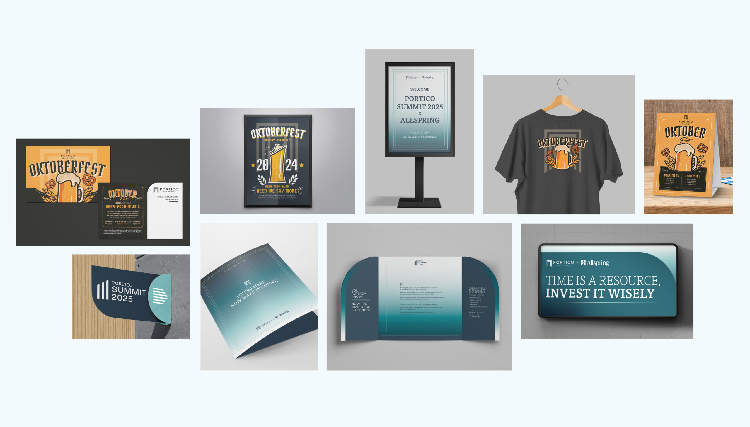
For Portico, their existing annual client appreciation event, Oktoberfest, was the avenue for officially announcing the new brand to clients. We helped prepare the presentation that would reveal and explain their branding efforts. We also beefed up their Oktoberfest event design and event materials.
Then, from a strategy standpoint, there was a need to engage prospective clients. In response to that, we worked with Portico to develop a conference that would be educational, a value-add, and a way to speak to prospects and current clients in a new format. We created the Portico Summit to be a place where the team can share insight and educational opportunities – further positioning Portico as a resource to clients.
We developed theming, messaging, invitations, signage, and collateral for the Portico Summit conference. Building another facet to their brand.

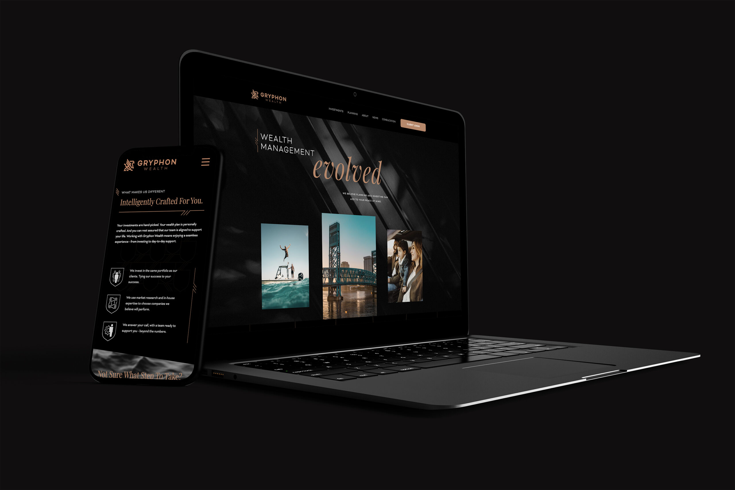
The Ask
Establishing an Elevated, Independent Brand
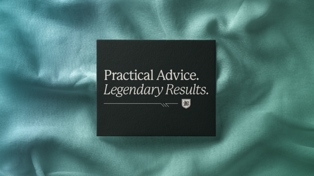
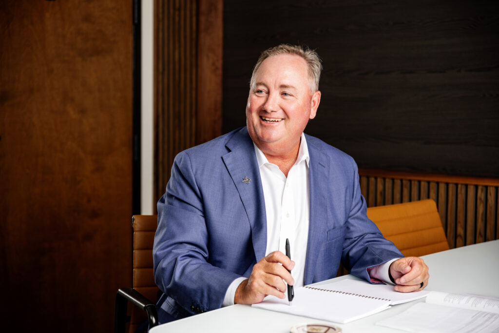
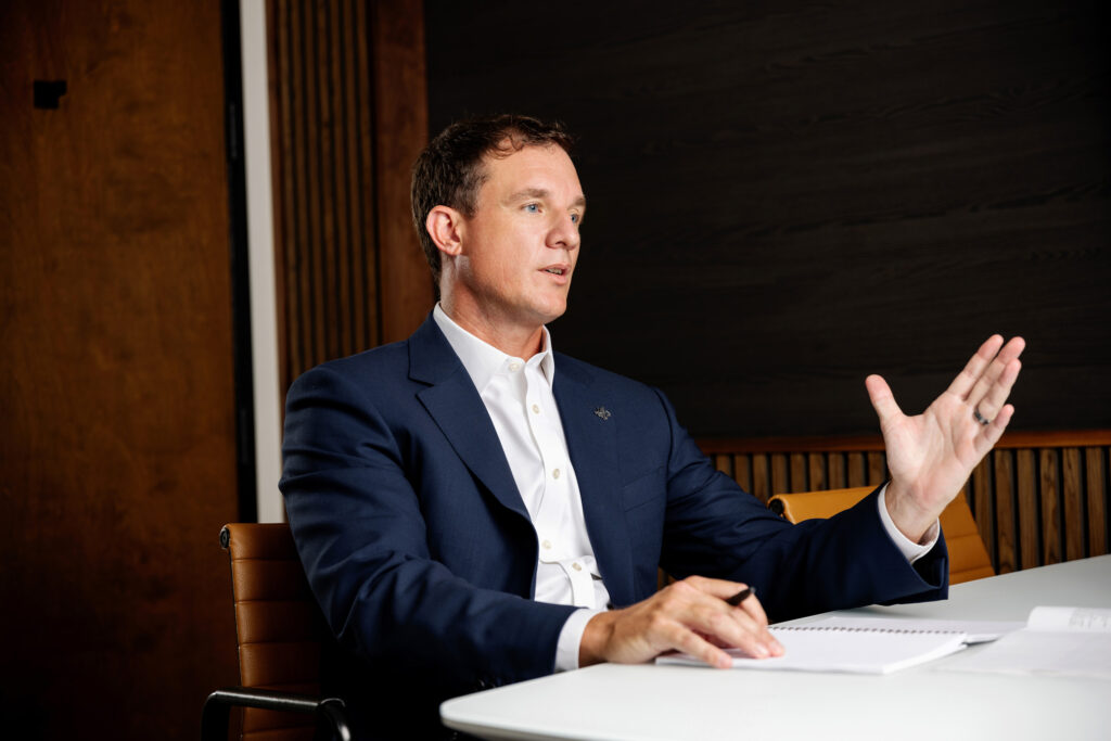
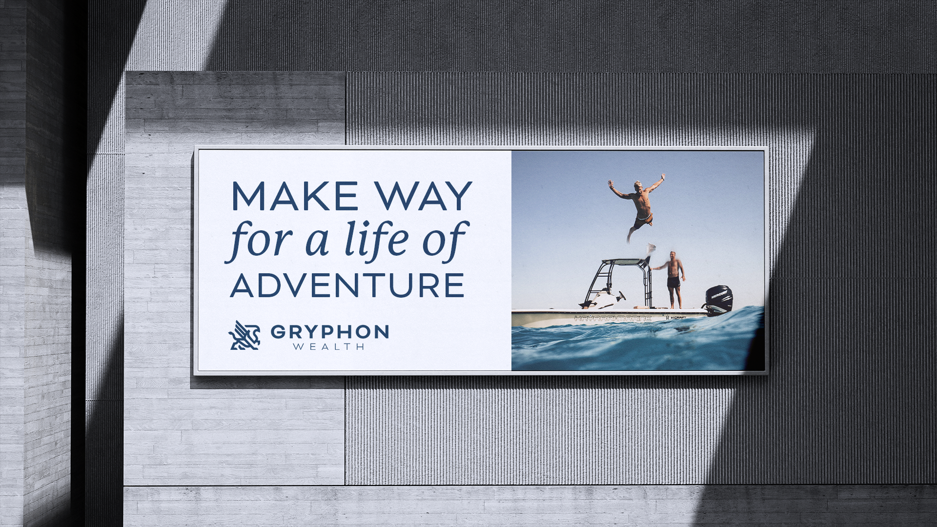
After branching off from Wells Fargo FiNet to launch their independent advisory firm, Gryphon Wealth needed a brand that could stand confidently on its own. With their name already chosen—a nod to the mythological guardian of treasure—it was our job to build everything else: the identity, the visuals, the voice, and the strategy to carry them forward.
From day-one discovery to ongoing marketing solutions, Frankel helped Gryphon Wealth create a cohesive, refined brand that reflects who they are and the clients they serve.
: What We Did
- Brand Strategy & Development
- Logo Design
- Web Development
- Strategic Communications Plan
- Ongoing Marketing Collateral
Strategic Approach
Research & Discovery
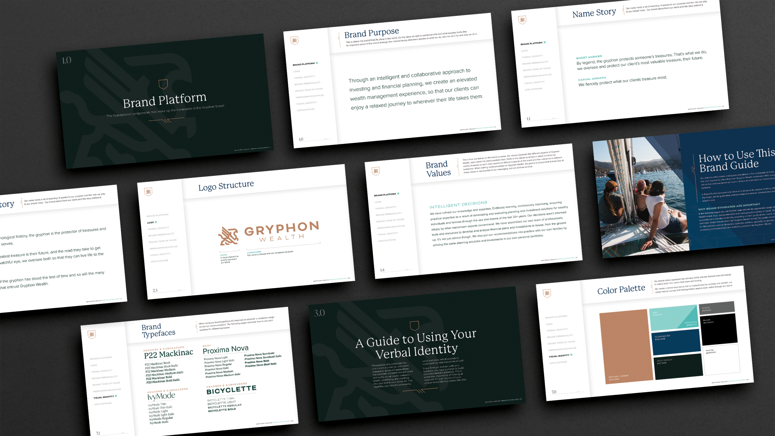
Every new client goes through a research and discovery phase. Through a mix of team interviews, surveys, and one-on-one conversations, we dug into what makes Gryphon Wealth different. We explored their values, client philosophy, and internal culture. Common themes emerged and helped us define a unified brand voice and identity that the entire team could stand behind.
Brand Development
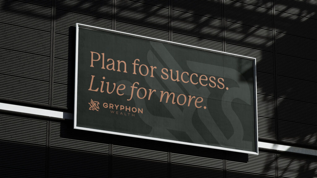
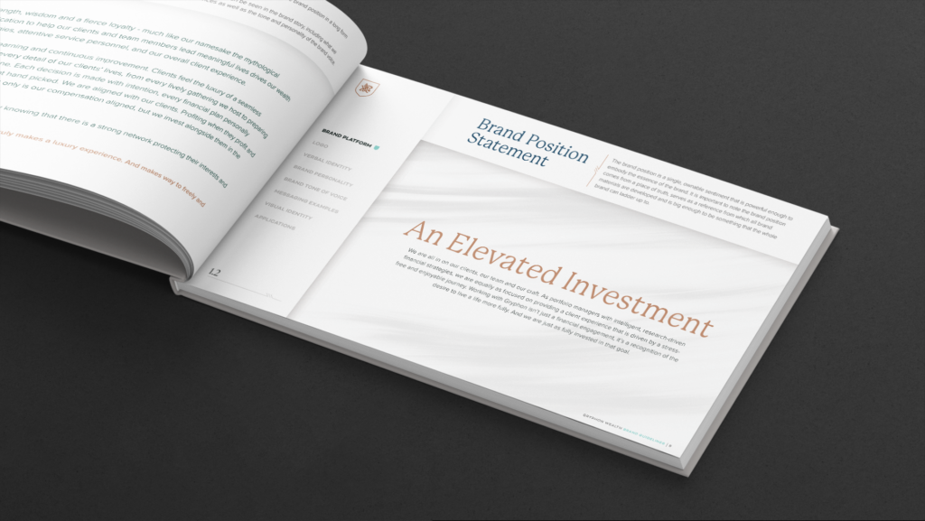
Using insights from discovery, we developed Gryphon Wealth’s verbal identity: a clear position, a few strategic words to define tone of voice, and key messaging that would resonate with high-net-worth clients and prospective partners. We then translated that into a cohesive visual identity—a modern, elevated brand look that projected strength and trust without feeling stiff or outdated.
Brand Art
Bringing the Brand to Life
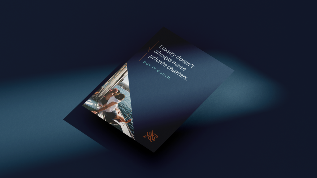
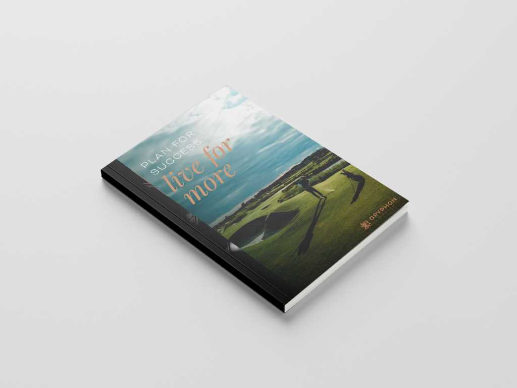
Once the voice and visuals were established, we showed Gryphon Wealth how to put their brand to work across every touchpoint from client-facing to internal. That included:
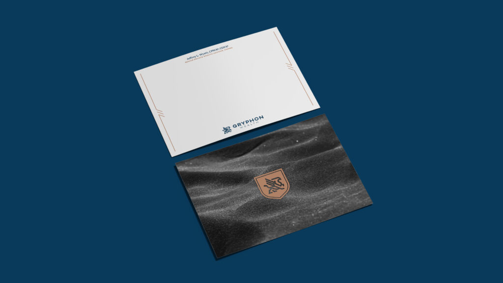
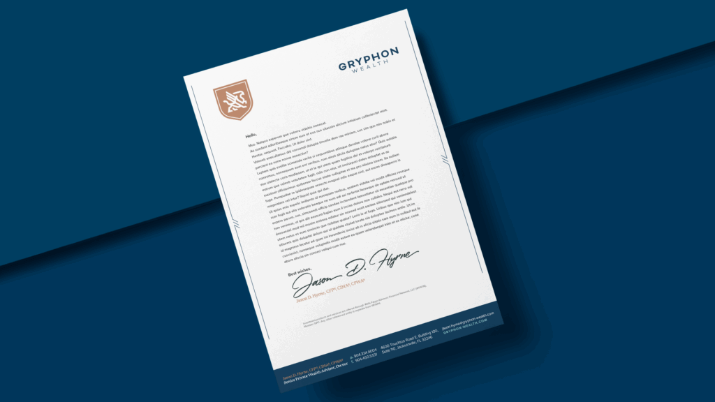
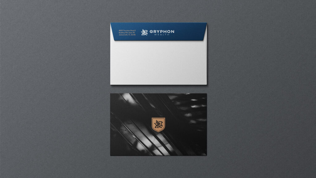
- Stationery (letterheads, envelopes, business cards, folders)
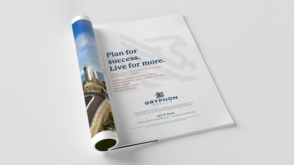
- Print Collateral (brochures, ads, investor materials)
- Digital Assets (website landing pages, social graphics, presentation templates)
This not only set the tone but also created a toolkit they could choose to use in the future.
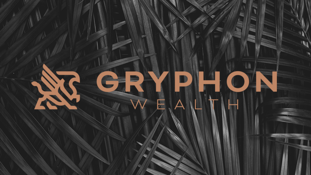
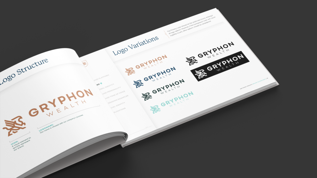
Logo Design
The gryphon symbol stood out as the heart of the brand, and we made sure it looked the part. Our design struck the right balance between mythic symbolism and modern sophistication. Less “coat of arms” and more Art Deco elegance. The refined black and desert-colored palette completed the visual strength, giving the brand gravitas without leaning too traditional.
Strategic Communications Plan
Launching a brand takes more than putting creative together and switching a website to “live.” It includes a very strategic, actionable plan covering brand launch and ongoing marketing approaches for the upcoming calendar year. We created a detailed communications strategy to support Gryphon Wealth’s launch and beyond by identifying key marketing priorities, internal education tools, and external messaging prepared for four distinct audience groups. It gave Gryphon Wealth a roadmap rather than just a brand guide to take.
Strategic Work
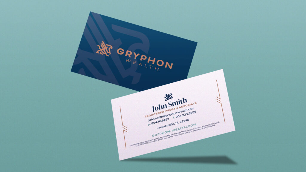
Business Cards
We carried the visual identity into Gryphon Wealth’s business cards, ensuring a professional, polished look that aligned with the rest of the brand experience. This small touchpoint can make a big impact as prospective clients and advisors can use it to recall Gryphon Wealth later.
Website
The website became the anchor for Gryphon Wealth’s new identity. It was built to reflect both the elevation of the firm and the client experience. It included essential features for client service, like a secure login portal, while also serving as a first impression for prospects. Everything from the navigation to the copy reinforced the new brand.
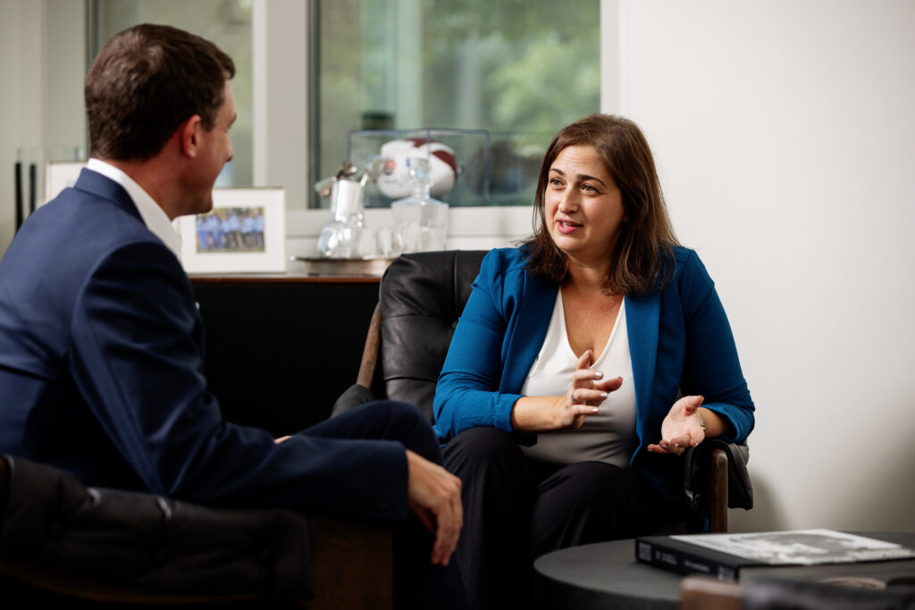
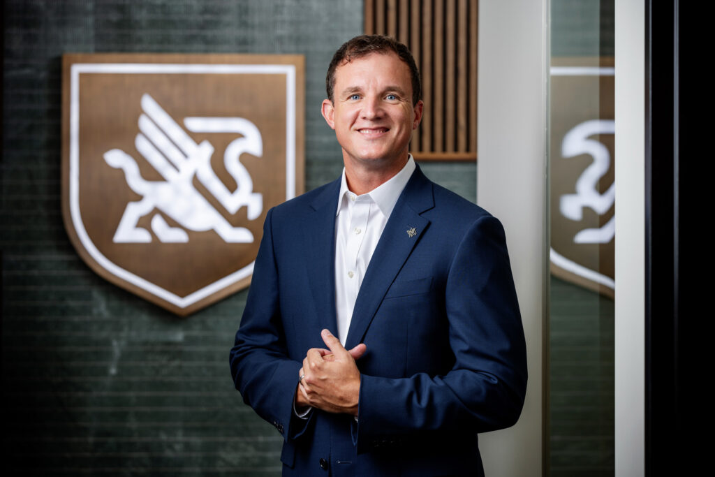
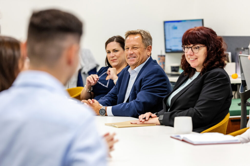
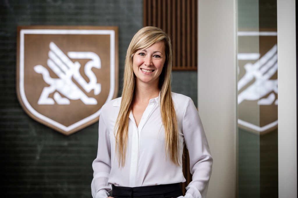
Photography
We captured clean, confident portraits to put faces to the brand. In a trust-driven industry, visual transparency goes a long way.
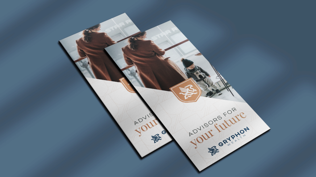
BrochuresFrom bond and stock investment strategies to holistic wealth management philosophies, we developed a suite of brochures that explain Gryphon’s approach in a clear, digestible way, even for clients new to complex investing topics. |
The Result
A Brand They Can Own and Grow On
Gryphon Wealth now has a fully realized brand built on research, strategy, creative, and thoughtful execution. This brand work instills confidence in where the firm is going, and gives the team a full suite of tools they can use to stand out in a competitive market. Now, when advisors meet with new clients or prospective team members, they have a brand that truly reflects who Gryphon Wealth is.
The Ask
Create the Right Brand for a Riverside Development
Preston Hollow Community Capital (PHCC) came to Frankel with a vision for RiversEdge, a landmark mixed-use development along Jacksonville’s St. Johns River. After an initial partnership with another agency fell short of expectations, PHCC needed a fresh perspective. They were looking for a creative partner who could understand the scope, define the story and bring the brand to life from the ground up.
What We Did:
- Brand Development
- Logo Design
- Microsite
- Event Planning & Management
- PR & Media Relations
- Ongoing Marketing Communications
Approach
Research & Discovery
We began by listening. Through in-depth interviews with PHCC, we got a sense of what RiversEdge really meant to them—and what it could mean to the city of Jacksonville. We then took that intel to the digital landscape, auditing social media, conducting a competitive analysis and taking a deep dive into mixed-use development trends.
Why choose to work in an office when remote is the norm? Why mix living, dining and culture in one place? Because proximity breeds innovation. Because connection matters. These are the questions we anticipated—and answered—throughout the brand development, microsite and further PR-related work.
Brand Development
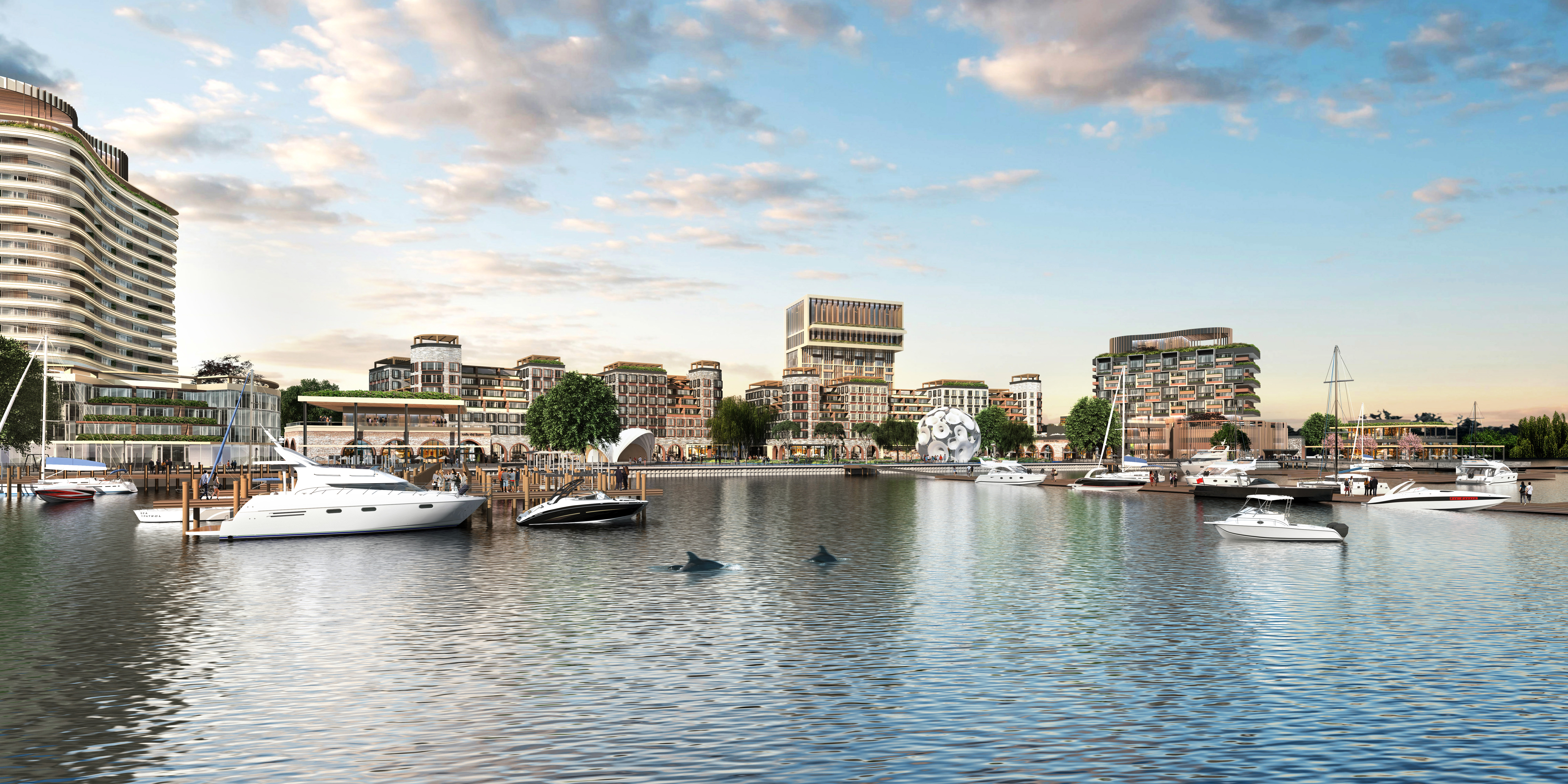
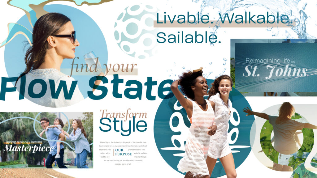
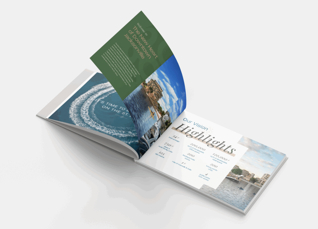
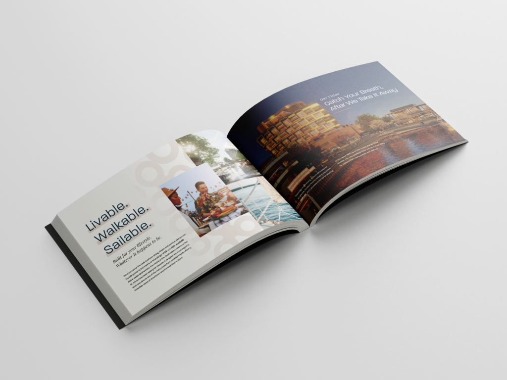
Defining Life on the St. Johns
Through research and discovery, we understood that RiversEdge was designed to be more than real estate. It was designed as a destination that the people of Jacksonville had been waiting for. It was meant to be a lively walkable neighborhood with sweeping river views, public art, riverfront shops, restaurants and to help promote health-forward living.
From that vision, we built a full brand platform:
- Clear positioning and values
- Compelling brand story and tones of voice
- Messaging architecture for long-term use
- Visual identity that reflects the vibrance of this waterfront location
The brand board acts as an overview of the visuals, voice and feel of the brand that inspires future marketing collateral. It also gives PHCC and partners everything they need to stay on-brand from now through future marketing decisions.
Logo Development
Letting “The Pearl” Shine
At the heart of RiversEdge is The Pearl, a striking 50-foot sculpture by artist Marc Fornes of THEVERYMANY. We used this centerpiece as the inspiration for the logo, incorporating soft curves and fluid forms to echo both the art and the movement of the St. Johns River. The wordmark flows like water, nodding to the energy and motion of life at the edge of the river.
PR, Media Relations and Event Planning & Management
To debut the brand and share the vision with the public, we organized a private on-site event for local leaders, partners and press. Our team managed everything from invitations to setup and strike, including planning timelines, vendor securements, talking points, production and media coordination. We also secured coverage by inviting local press and arranging interviews with PHCC, city officials and project partners like Kimley-Horn.
Ongoing Marketing Communications
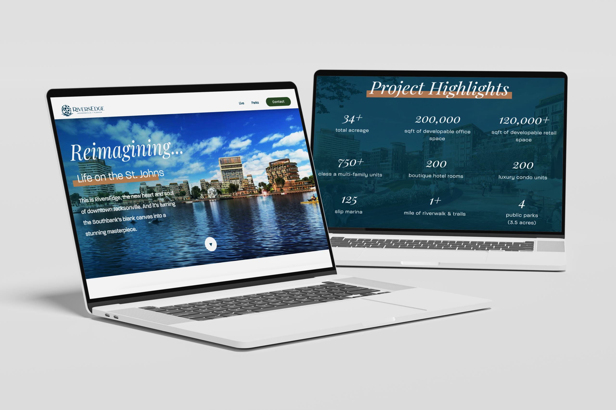
Microsite
We built a microsite to serve as the central hub for all things RiversEdge, where developers, residents or anyone curious about what’s coming to the riverfront could gain more information. The site tells the story of what life looks like at RiversEdge, highlighting key project details. It also invites visitors to request the full vision book, another piece of marketing collateral we created that gives a transparent overview and outlook on the future of the project.
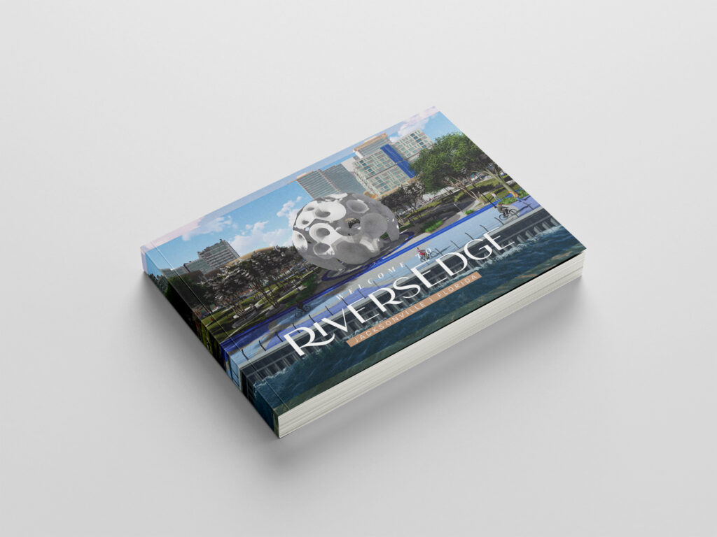
Vision Book
Thinking of it as the public-facing playbook for RiversEdge, we wrote, designed and laid out the vision book with rich copy and visually-driven details. We outlined the vision, master plan, site details, community benefits and more to show stakeholders exactly how the development would take shape.
Art Installation Purpose Video
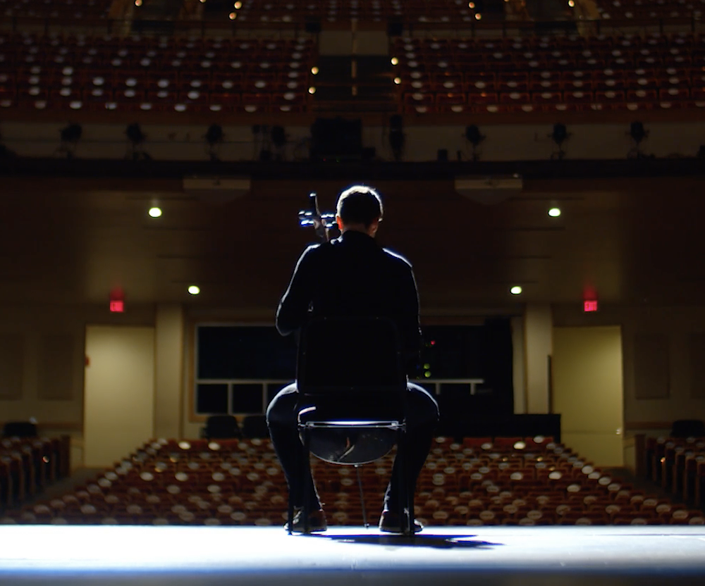
To showcase the story and connections behind The Pearl, like its role as both the logo inspiration and symbolic heart of RiversEdge, we created a short video that captures the meaning, the scale and the excitement around the installation. Told in conversation between PHCC Managing Director Ramiro Albarra and Marc Fornes, it’s a showpiece that defines RiversEdge and reminds everyone that the purpose of this project is all about bold ideas made real.
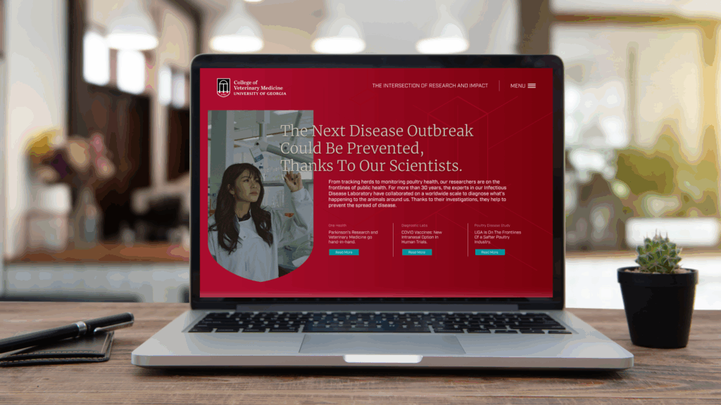
The Ask
Redefine a Nationally Top-ranking School
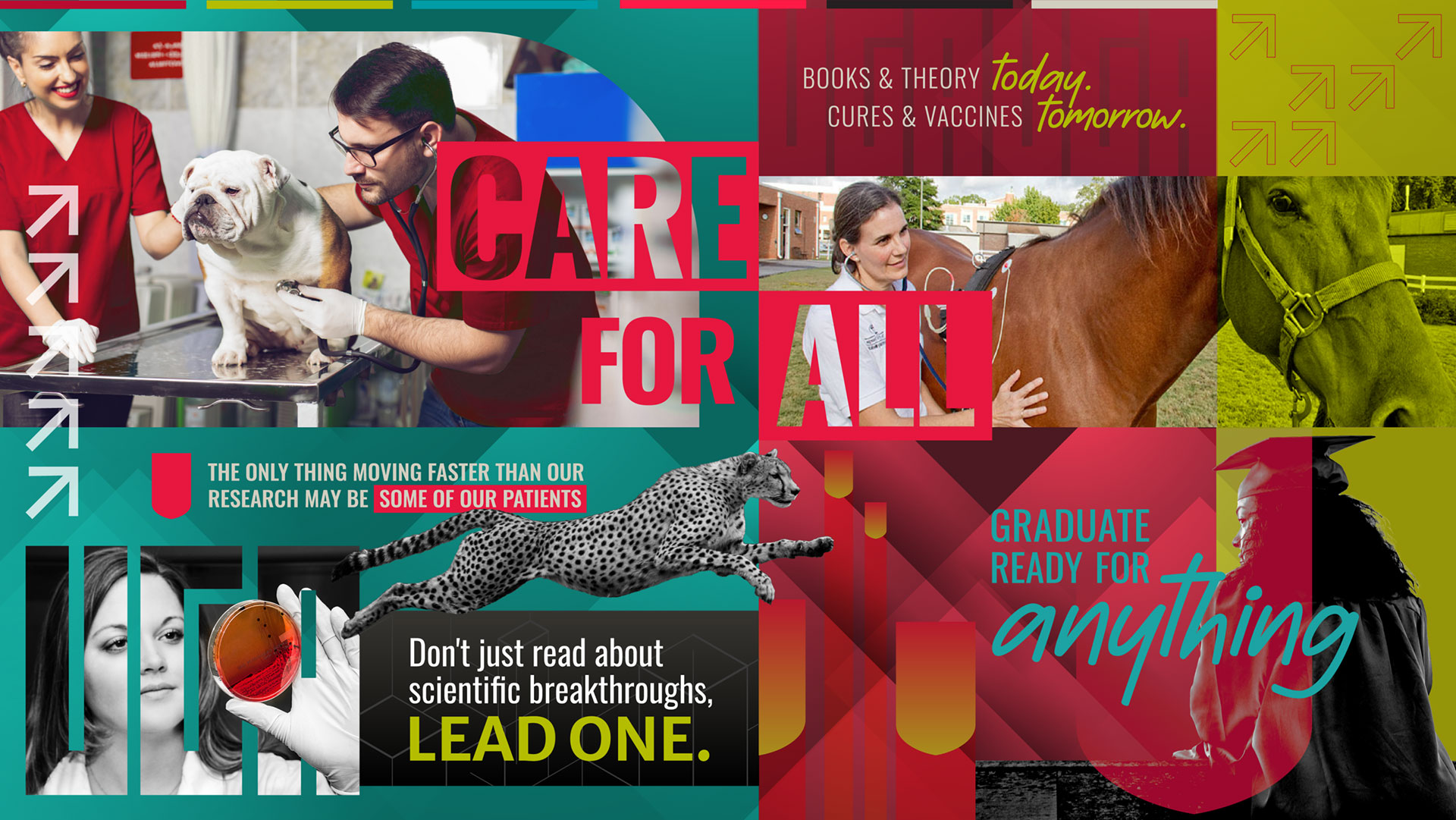
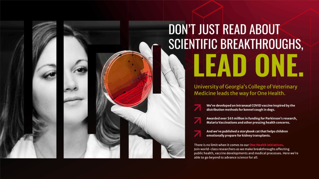
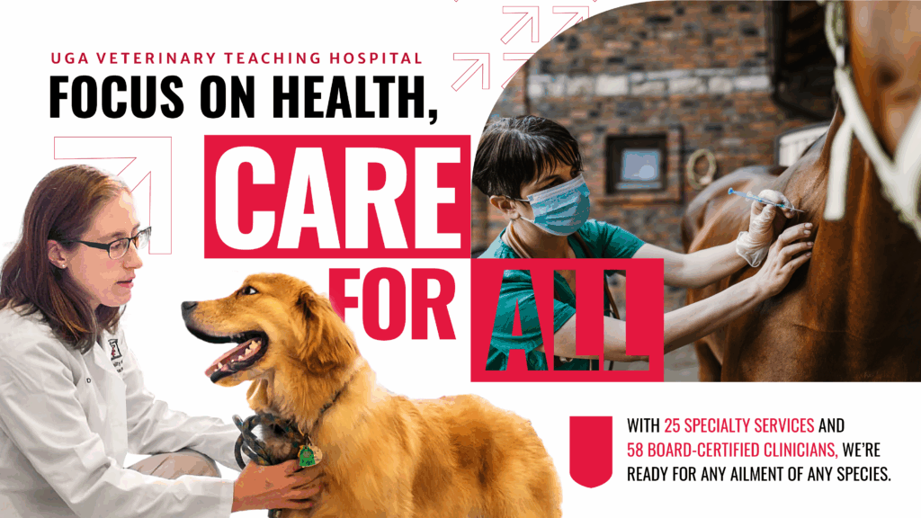
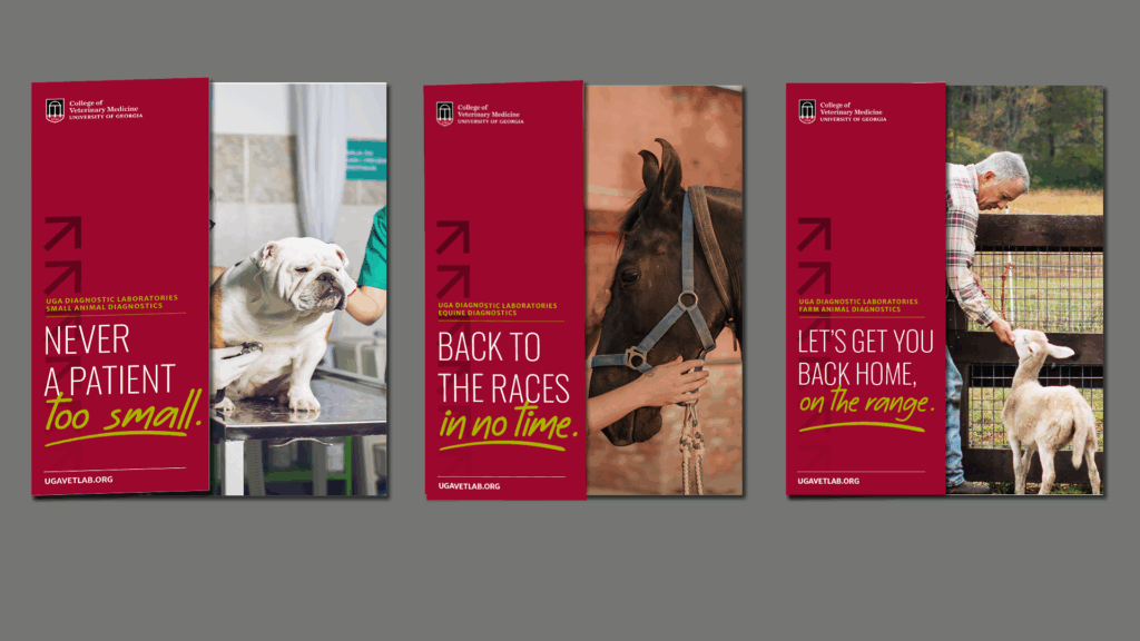
UGA CVM consistently ranks among the top 10 veterinary schools in the nation (U.S. News & World Report), and while its branding aligned well with the overall UGA brand, its positioning lacked the distinction needed to break into the top 5. Our charge: strengthen the brand to reflect its leadership in veterinary education and research, while increasing large animal service visibility and amplifying recognition for its graduate programs and research funding.
The Result
![]()
+3 Spots
UGA CVM jumped three spots in U.S. News & World Report rankings—from #10 to #7—in the first year of our engagement
Strategic Approach
Research Audits, Focus Groups, & Surveys
We began with a full brand audit, including primary and secondary research, stakeholder interviews, and competitive analysis. This uncovered gaps in perception, highlighted key differentiators, and clarified UGA CVM’s short- and long-term goals.Through surveys and focus groups with students, alumni, faculty, donors, and referring veterinarians, we gauged how UGA CVM was perceived—and how it needed to evolve. These insights anchored our creative and messaging strategy.
Brand Identity Redefined
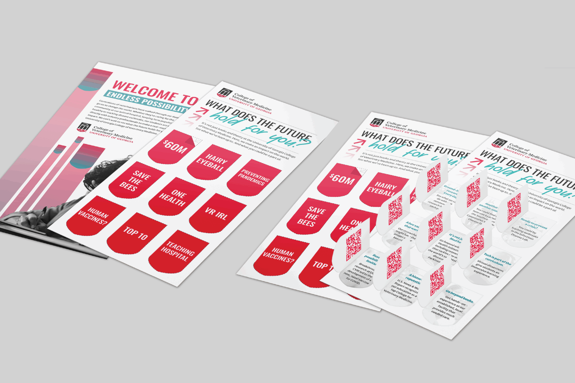
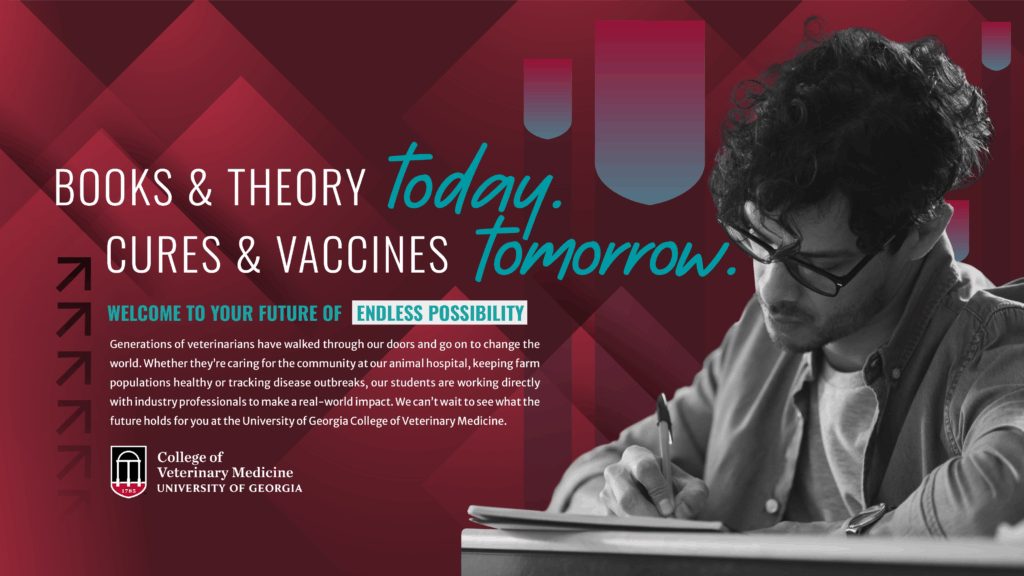
We established a new verbal and visual identity that aligned with the UGA master brand but gave CVM its own voice. This included:
- Updated brand narrative and positioning
- Messaging pillars and personality
- Visual assets: typography, imagery, color palette, and art direction
- A comprehensive brand board to guide implementation
From Strategy to Campaign
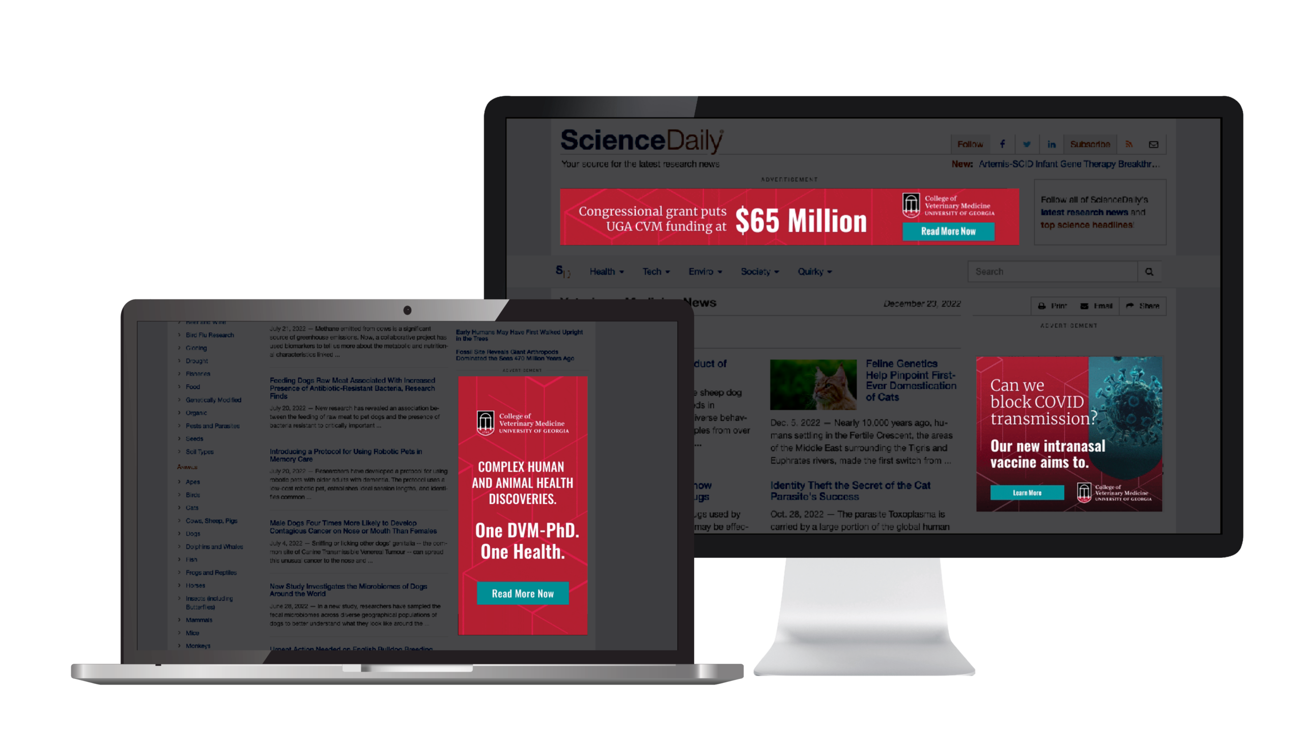
We activated the brand across a multi-channel awareness campaign designed to meet audiences where they are. Deliverables included:
- Digital ads and organic social content
- Targeted emails and direct mail
- Print ads focused on student recruitment and research leadership
Strategic Work
Brand Development
Our brand board showcases the outcome of a brand development overhaul, including identifying UGA CVM’s verbal identity through facets like brand positioning to messaging pillars, and marrying this core messaging with a visual identity.
Brand Awareness Campaign
All the efforts of the brand research and discovery were implemented into a full brand awareness campaign.
Brand Art by Audience
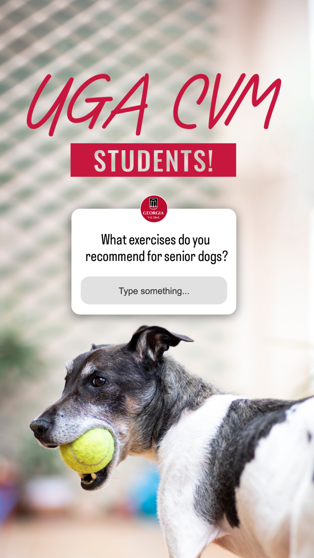
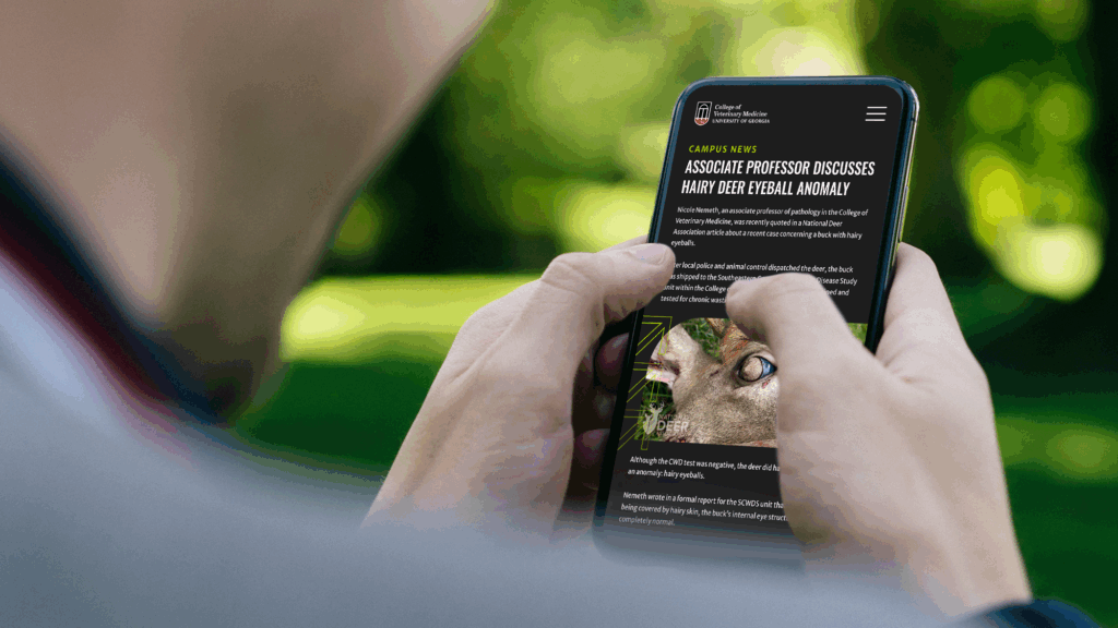
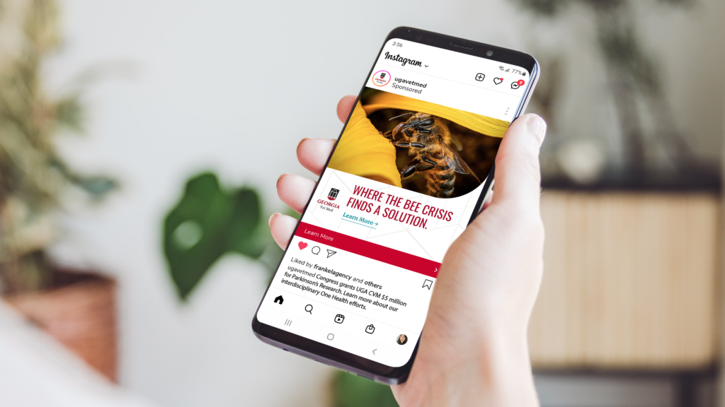
To prove out the brand development, we created artwork that showcases how the brand works across multiple channels and audiences.
For Students
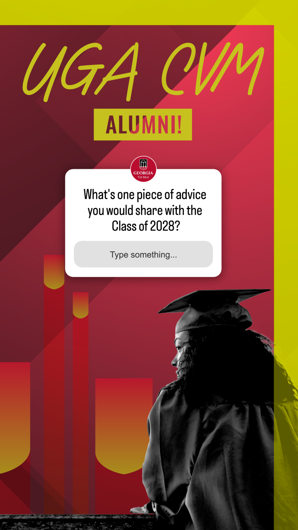
We highlighted the rigor, reach, and rewards of a UGA CVM degree.
For Researchers
We spotlighted the college’s momentum in funding, innovation, and research leadership.
For the Community &
Animal Owners
We showed the heart behind the science, reinforcing trust and capability.
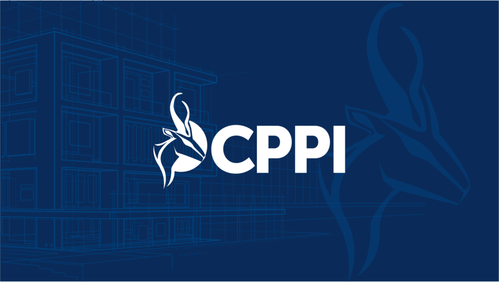
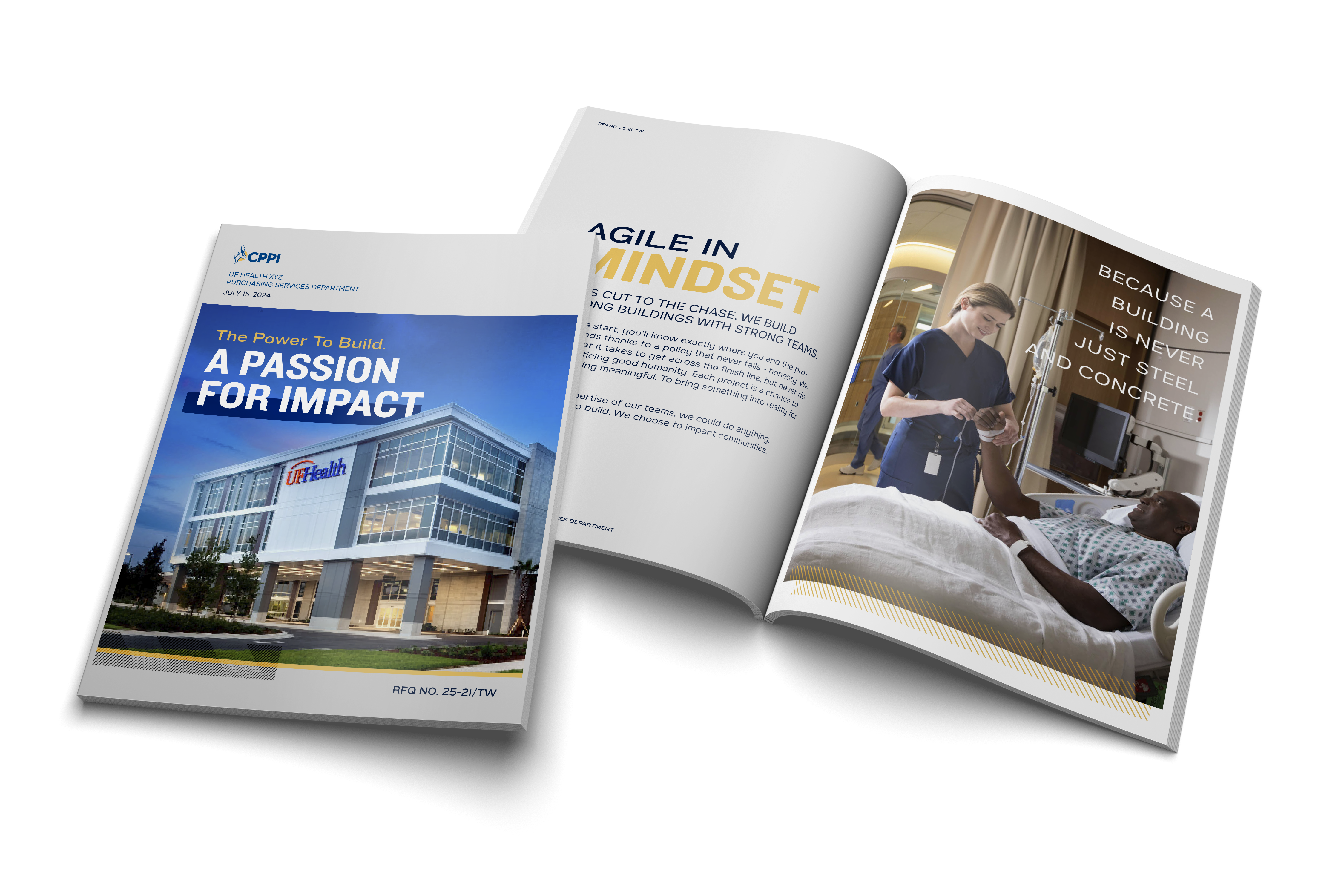
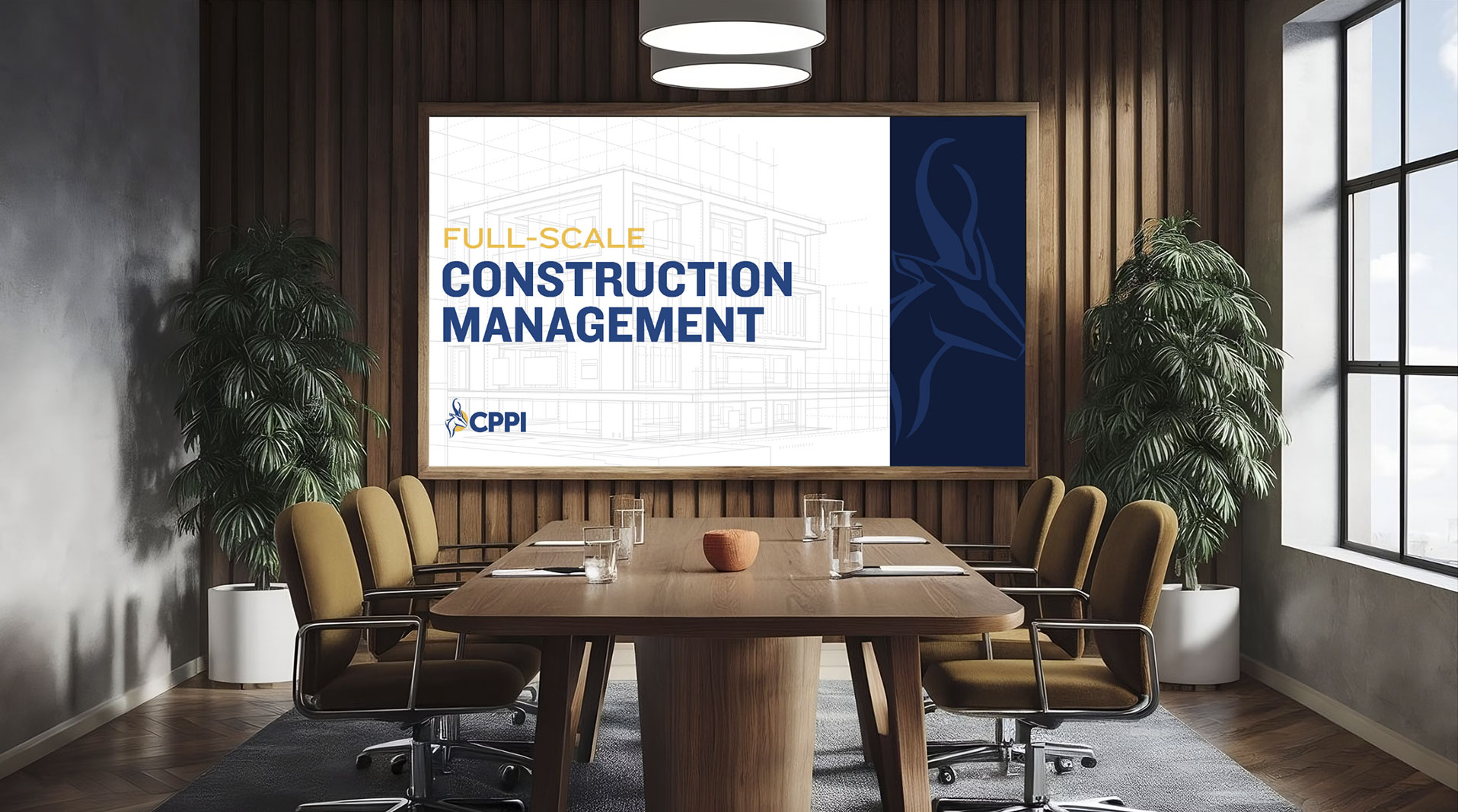
CPPI is a return client for Frankel, initially working together 10 years ago. In that time, CPPI has expanded significantly – both geographically and in expertise – growing into a full-service construction partner that works with developers to bring buildings to life from the initial idea to ribbon cutting. They have over 210 employees across eight offices in the Southwest U.S.
As CPPI’s footprint grew nationally, so did the need for a brand evolution. CPPI needed a brand that reflected their scale, ambition and core values. They turned to us to help redefine their brand strategy, ensuring it represented who they are today and where they are headed. Through deep research and collaboration with leadership and employees across departments, we uncovered key truths that CPPI could own, which would ultimately become the foundation for their new brand and would ensure a powerful and differentiated presence in the construction industry.
What we did:
- Research and Discovery
- Brand Strategy
- Brand Development
- Verbal and Visual Identity
Research and Strategy
In the construction industry, it’s easy to get lost in the crowd. What sets a company apart?
Our research revealed that CPPI’s edge lies in their direct communication, transparency and relentless commitment – qualities that build a strong connection with builders and developers, ensuring projects align with both community impact and financial goals. CPPI’s hands-on involvement and commitment to getting the job done makes them stand out.
Through conversations with employees and partners, we identified CPPI’s core differentiator:
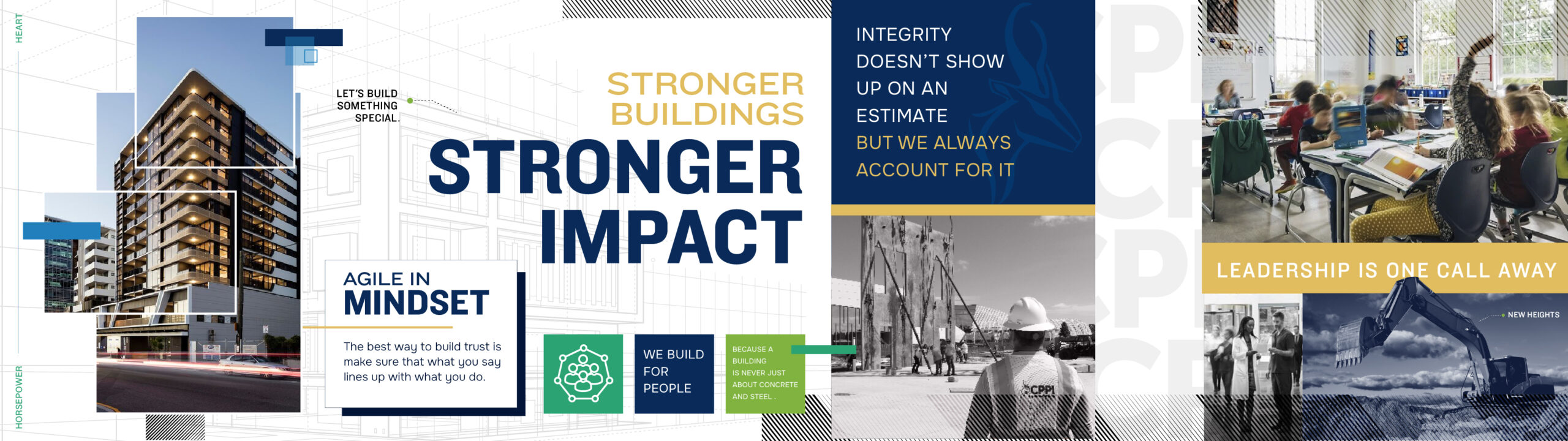
“Horsepower and Heart.”
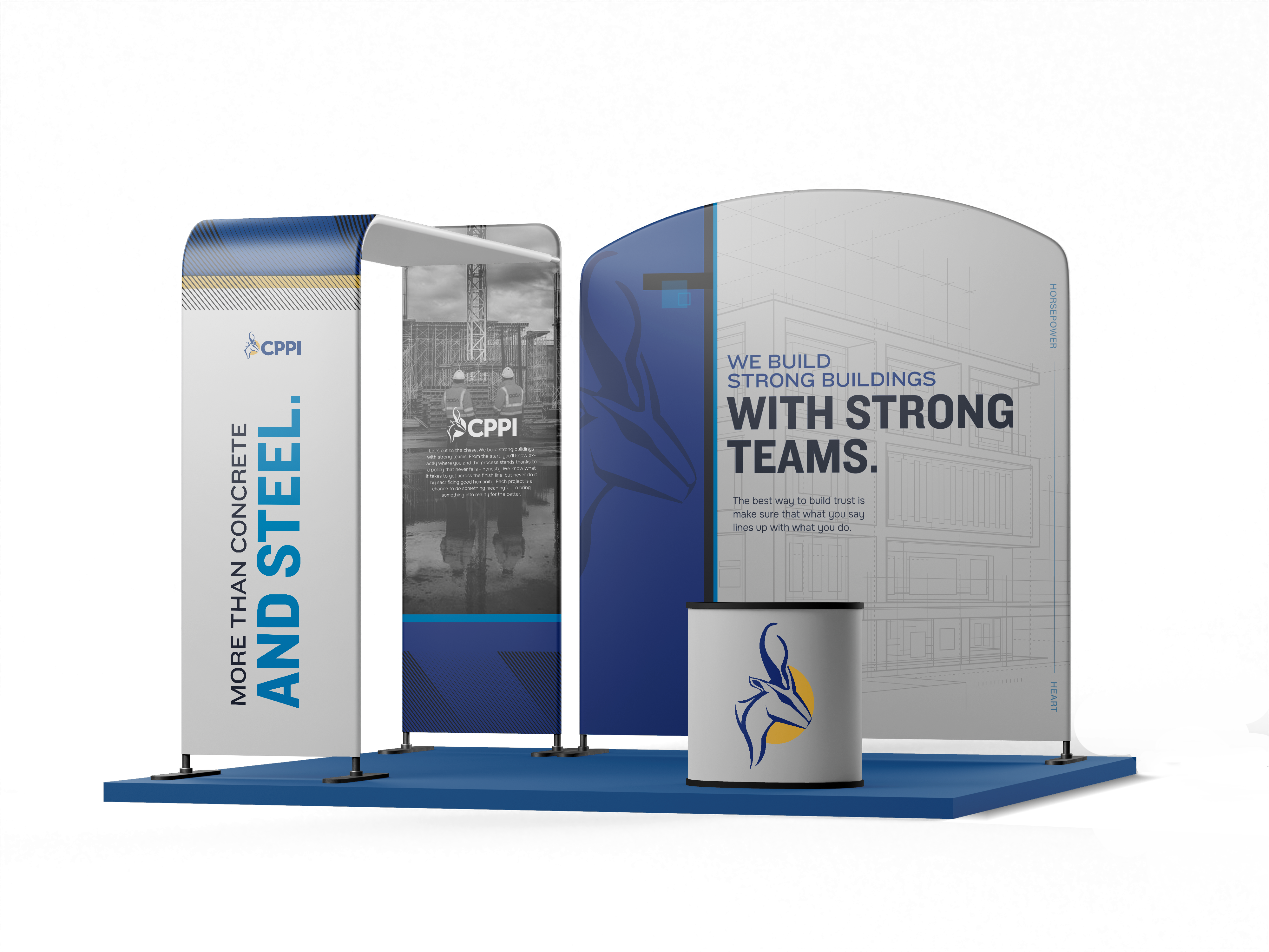
This combination of strength and dedication is the foundation of their brand refresh. Every aspect of the branding is designed to reflect this truth and set CPPI apart in a competitive industry.
Verbal Identity
CPPI’s new brand voice is bold, fearless and no-nonsense – just like the way they work. Their messaging revolves around their get-it-done mentality. No matter what. It’s a strong promise. And so the way CPPI talks needs to have as much conviction.
Frankel created “Building Blocks” to guide CPPI’s brand voice and to help bring the new voice to life by showing what we mean, instead of just telling.
- More Than Concrete and Steel.
There’s heart in every project. We know it’s never just a building, and we don’t shy away from the deeper conversations.
- The A-Team. Every Time.
We’re passionate about what we do. Plain and simple. Our motivation is built into who we are.
- Cut Out The Useless.
Say what needs to be said and do what needs to be done.
- Do What You Say. Talk When It’s Done.
It’s a no nonsense approach. We can celebrate when the project’s complete.
Visual Identity
The “Horsepower and Heart” concept comes to life through intentional visual elements, starting with the strategic use of color. The dark blue conveys strength and professionalism, while the green represents growth and commitment. White offers clarity and balance, ensuring a clean and consistent visual presence.

The Situation
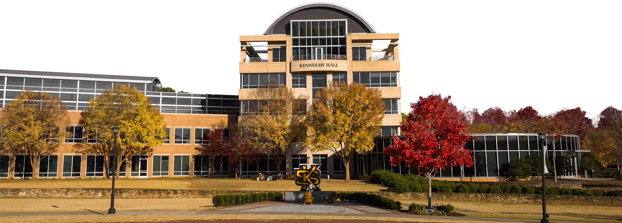
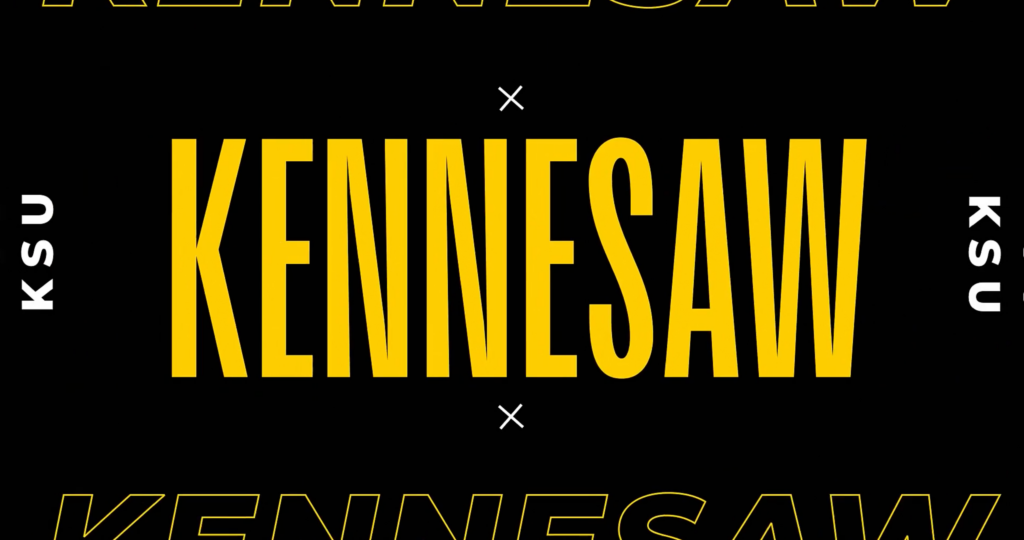
KSU – The Best Kept Secret in Georgia
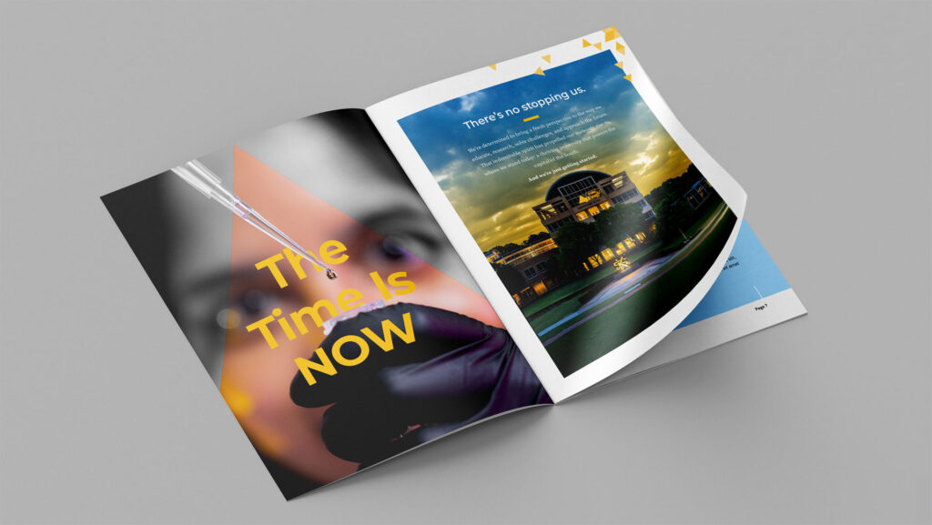
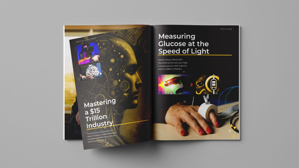
Although Kennesaw State University has the 3rd largest student population in Georgia, it has largely flown under the radar. Our extensive research uncovered KSU is a major economic driver and community growth developer. It was one of the first schools to offer a Masters in AI and has the state’s #1 Executive MBA program among other impressive accolades. To draw awareness to these unexpected discoveries, we created a very unexpected campaign.
What We Did:
- Graphic Design
- Copywriting
- Programmatic Display Ads
- Print Ad
- Email
- Direct Mail
- Social
- Native
- Microsite
Approach
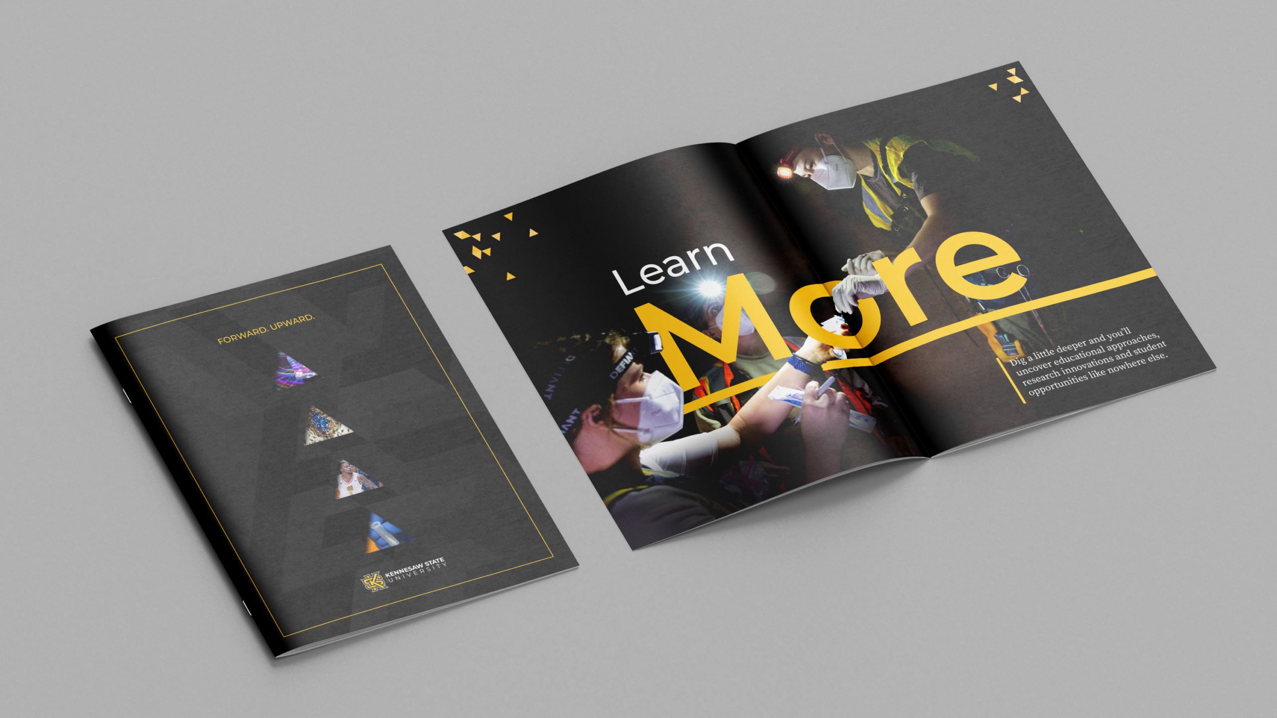
Make an Intro by Breaking the Mold
To grab the spotlight as KSU took the big stage for the first time, we designed pieces that told the story of each accolade using attention-arresting artwork. It’s a look that’s unlike anything else in higher ed (or any industry for that matter). For copy, we wrote bold, thought-provoking headlines giving KSU a distinct voice while prompting peers to learn more.
Owl Accolades
KSU’s mission is to serve its students, many of whom are first-generation college, and communities in Georgia and around the nation. Their goal is to make an immediate impact, which is why their breakthroughs don’t stay within the walls of academia. We combed through their accomplishments and picked the most intriguing and innovative stories that made a difference in people’s lives.
Implementation
Spreading the Word
The campaign included several touchpoints, yet highly targeted to our main audience. Our display, native and social ads succinctly and effectively communicated KSU’s impact.
The executions drove to a landing page which housed all of the accolades and provided the full story.
A direct mail piece, which highlights several accolades, and a print ad in the Chronicle of Higher Education expanded the campaign outside of the digital space.
We also launched an email campaign where we shared a little more about the story behind the accolade.
Getting Results
*During the first 30 days of the campaign
Kennesaw State University CUSA Commercial
Kennesaw State University is the best kept secret in Georgia, and as the newest member of Conference USA, they wanted to introduce themselves to the nation with a :30 TV spot. With national placements during KSU sporting events, it had to be bold, unique and attention-grabbing, just like the Owls themselves. A typical campus drone shot (yawn) students in labs (ho hum), fight song blaring (meh) just wouldn’t do. So we wrote and produced an original track and matched the energy with visually arresting motion graphics showcasing what makes KSU great. The commercial has been a hit with KSU fans and competitors alike.
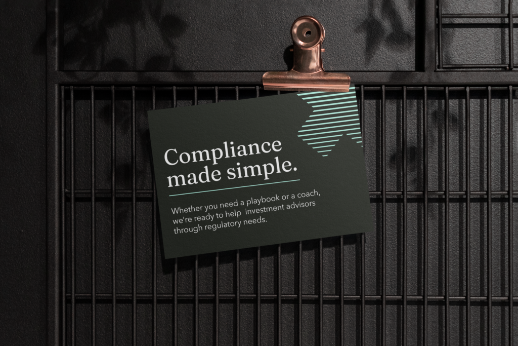
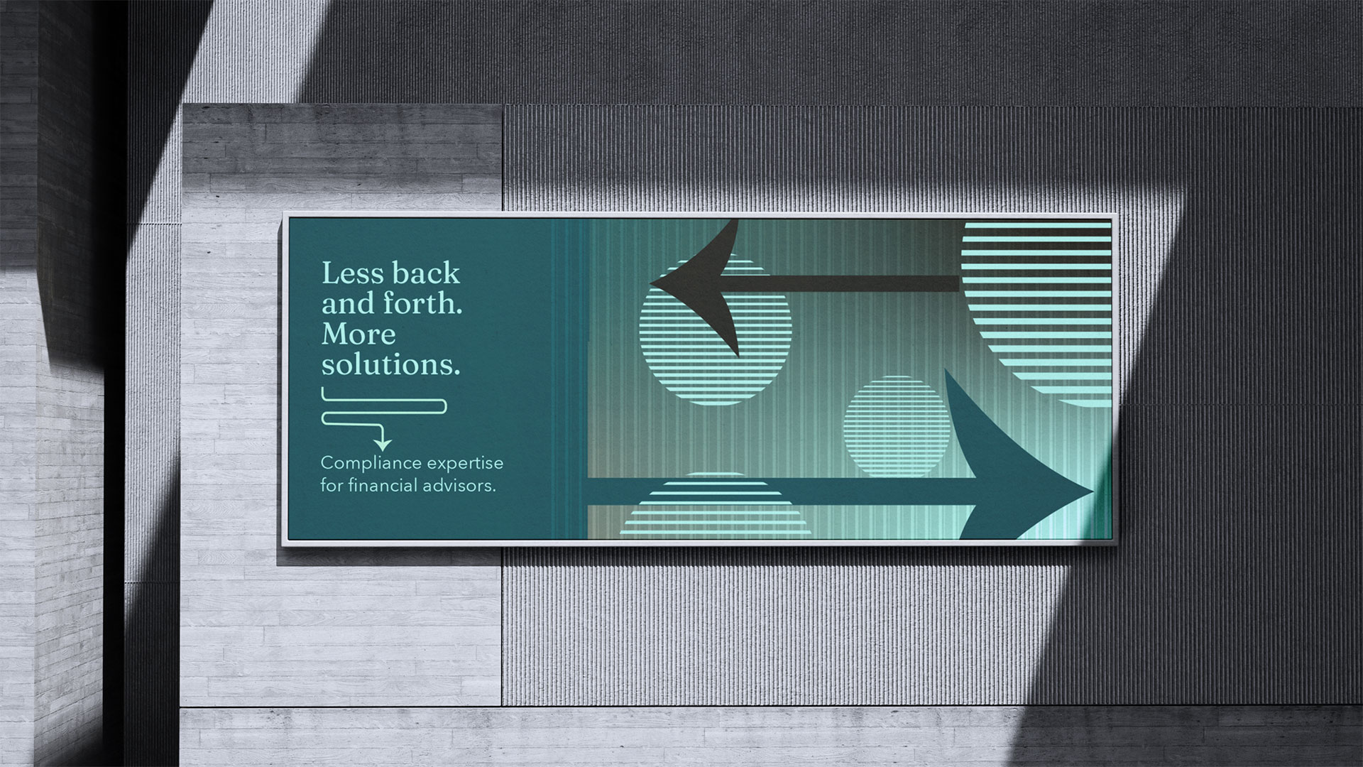
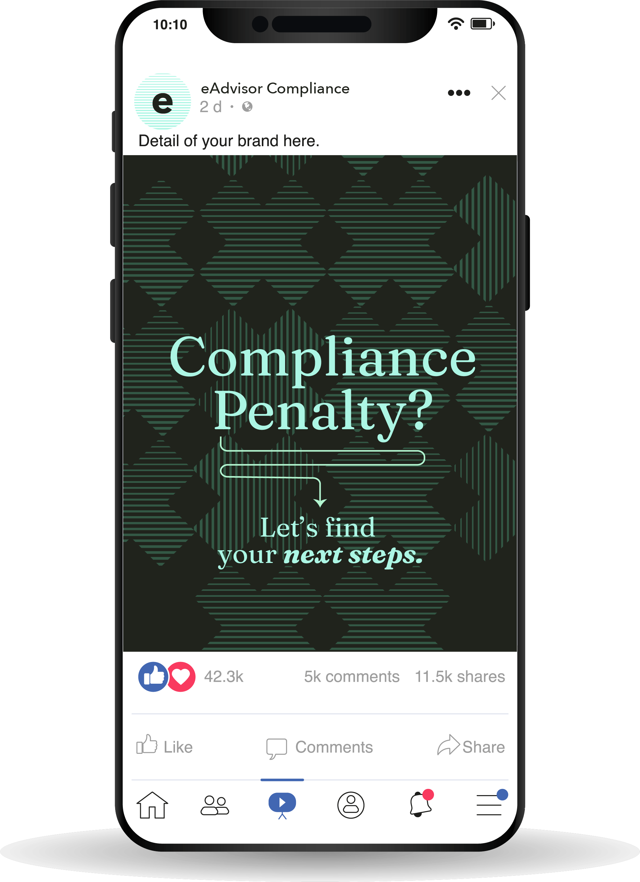
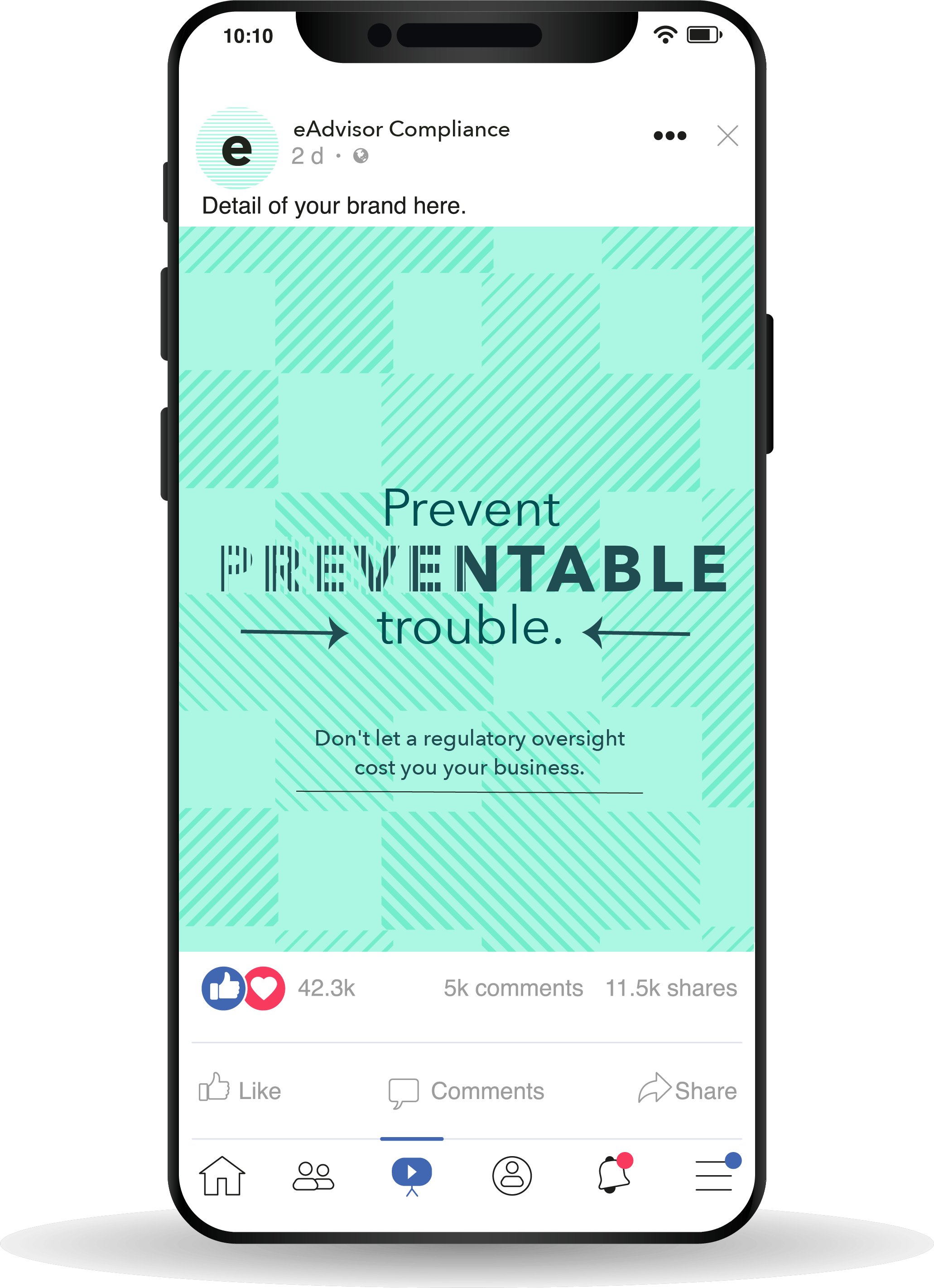
Financial advisors operate within a highly regulated landscape and they need someone to help them navigate one-time and ongoing requirements. That’s where eAdvisor Compliance, their personal compliance experts, steps in. When eAdvisor was looking to expand their reach and connect with more advisors, we stepped in to elevate eAdvisor’s brand.
What we did:
- Research and Discovery
- Review of Business Services
- Brand Strategy
- Brand Development
- Verbal and Visual Identity
- Logo
- Website Design
- Website Development
- Social Marketing

BEFORE
AFTER
Cutting Through:
Research and Strategy
Whether it’s navigating state regulations or looking to register with the SEC, not only is compliance nuanced, but many advisors are unsure of where to begin. RIAs can become overwhelmed with ongoing updates and the need to prove that they’re doing their due diligence. So, where would they even begin to find help?
Brand Development
Through our strategic verbal identity process, we were able to establish a brand voice that helped eAdvisor cut through the humdrum of paperwork and legal jargon, and speak directly to RIAs in need of their expertise. The distinct brand voice we crafted for them highlights the benefit of choosing eAdvisor – a direct relationship with the person who is going to help you through every step of the process. Freeing up advisors to spend their time focusing on their clients.
Website Design and Development:
Using Design To Solve A Complexity Problem
eAdvisor has a wide range of services and each one provides great value to their clients. We wanted to make sure that the benefits came through loud and clear. Through design we were able to make sure the volume of information was easy to navigate and beautifully presented.
The Need
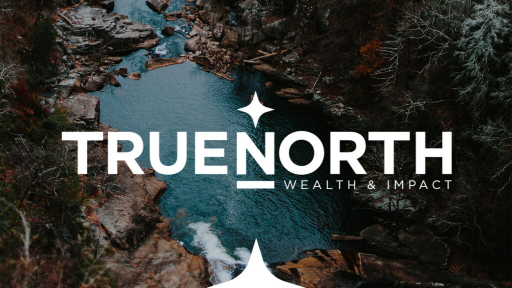
After more than a decade of serving clients together, as part of the Wells Fargo network, Bryan Vowels and Troy Stovern decided to step out on their own as an independent RIA firm. They had a calling to help people with more than just wealth or retirement planning. Knowing that finances touch every part of a person’s life, they saw themselves as guides to help individuals and families maximize their wealth in order to live a fulfilling life of purpose, beyond the bottom line.
Our Approach
In an industry of regulated sameness, the firm has the potential to own a unique position in their marketplace. The challenge would be to craft an identity that speaks to the table stakes of their services, but makes room for building plans that look beyond their clients’ bottom line.
Naming
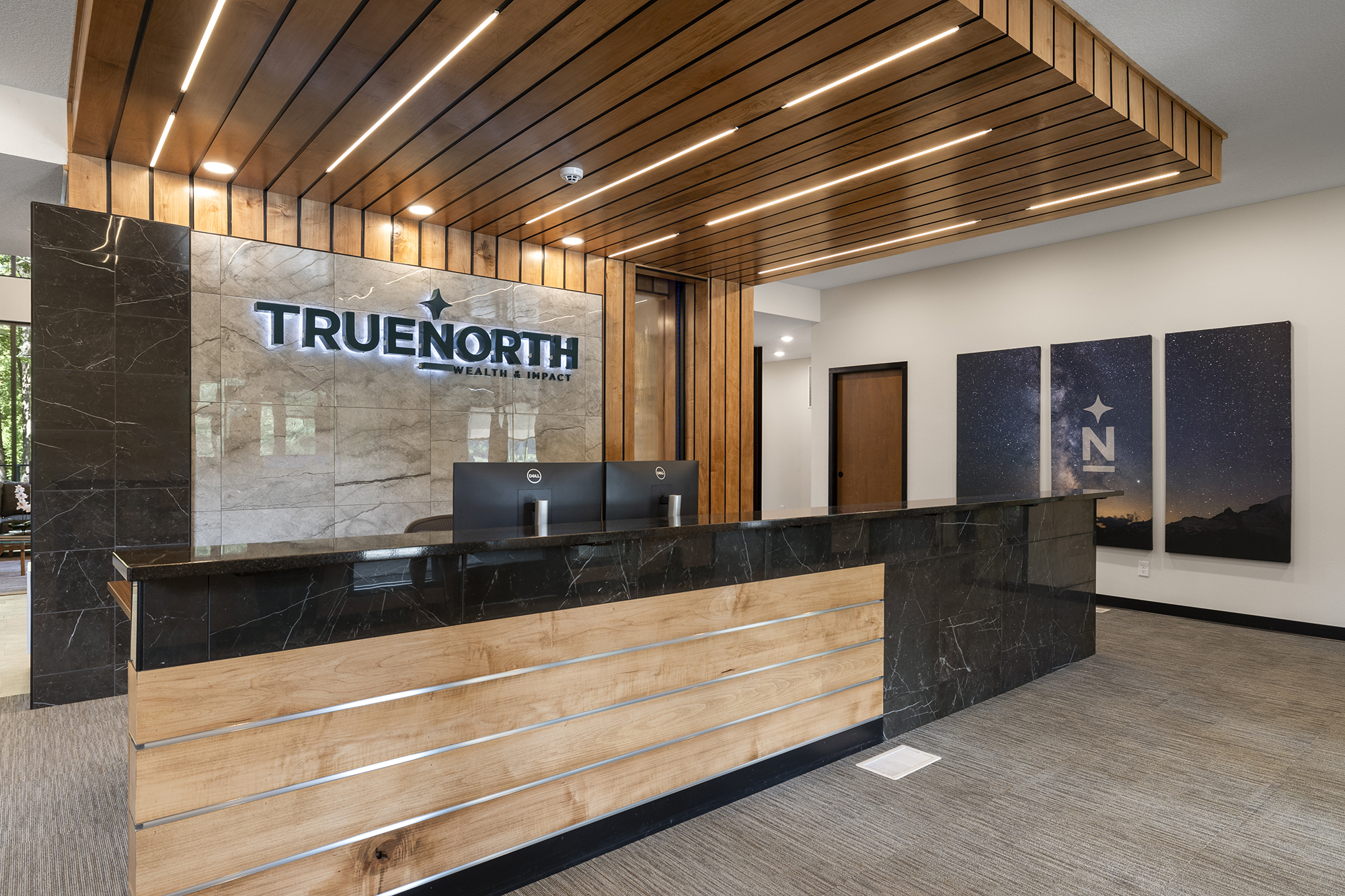
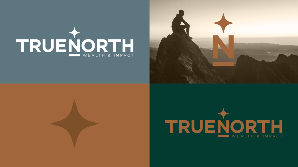
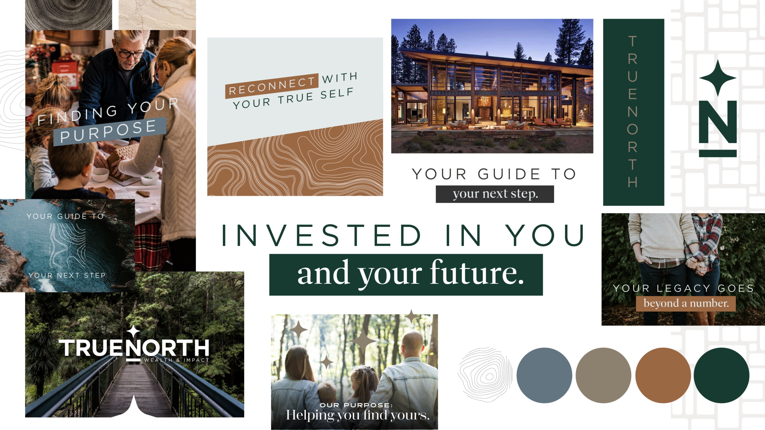
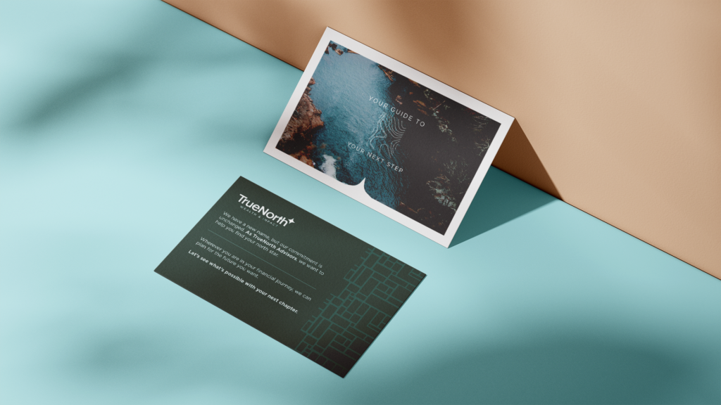
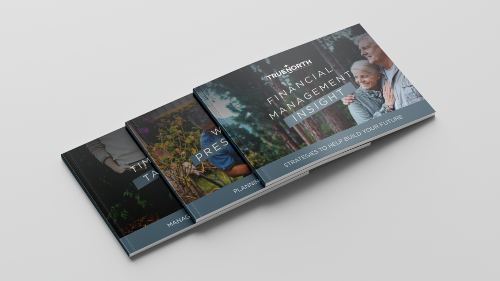
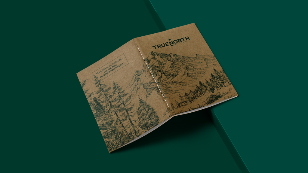
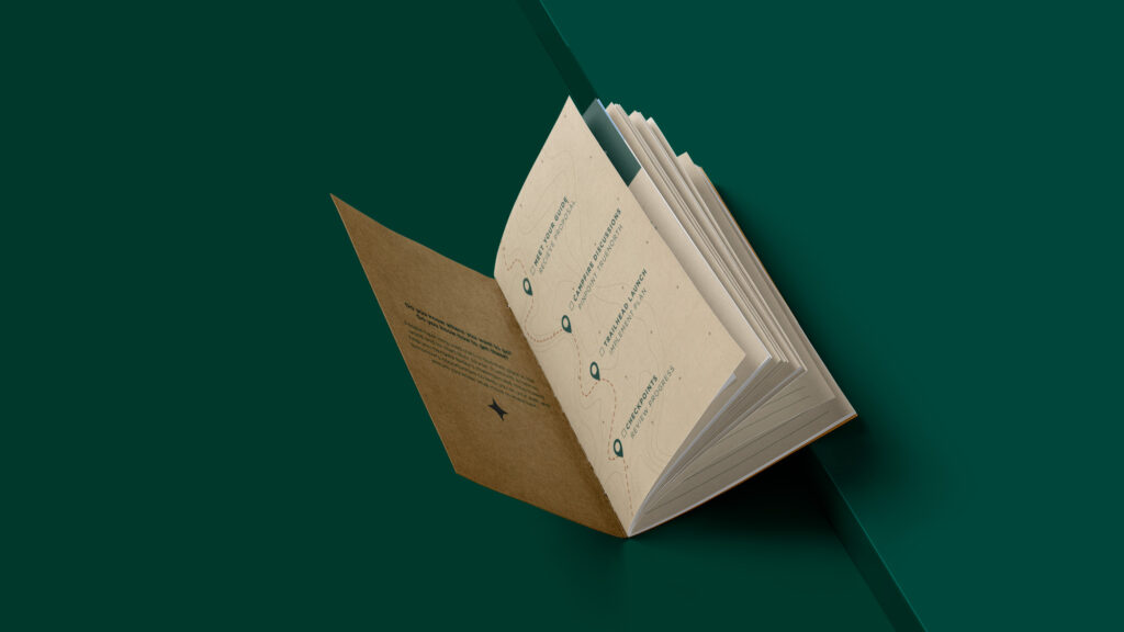
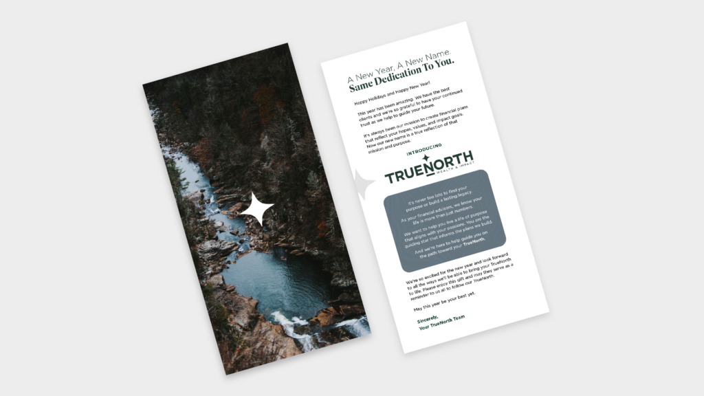
Through in-depth discovery, Frankel helped to find the essence of who they wanted to be for their clients. They saw themselves as guides, helping people find their purpose and their passion—their ‘true north’. And much like people have used stars to find their place and chart their way, the firm looks to help clients navigate challenges and steer them towards opportunities. Committed to making an impact in the lives of their clients and their community, Frankel created a name and unique qualifier that speaks to both aspects of their mission: TrueNorth Wealth & Impact.
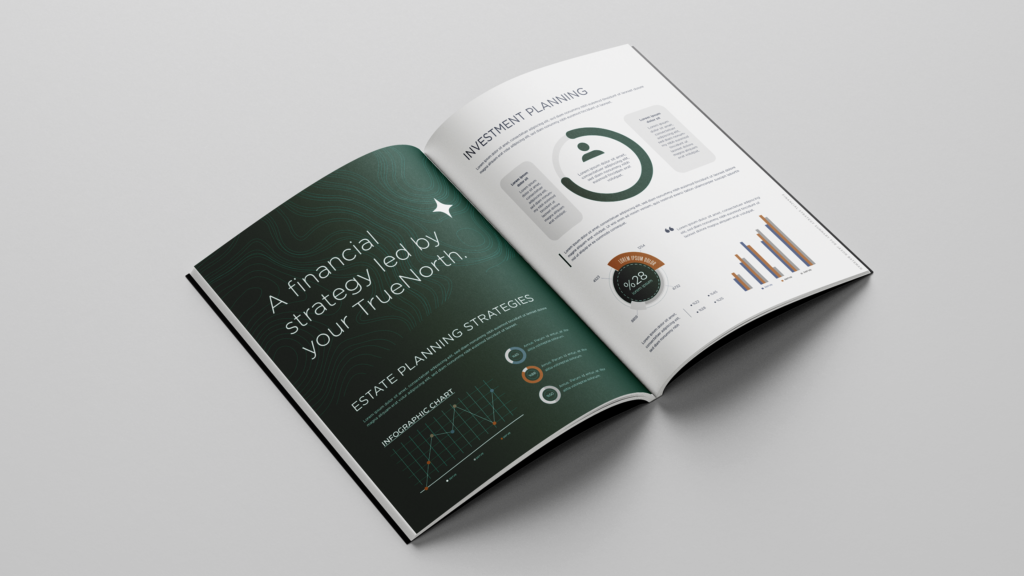
Brand Identity
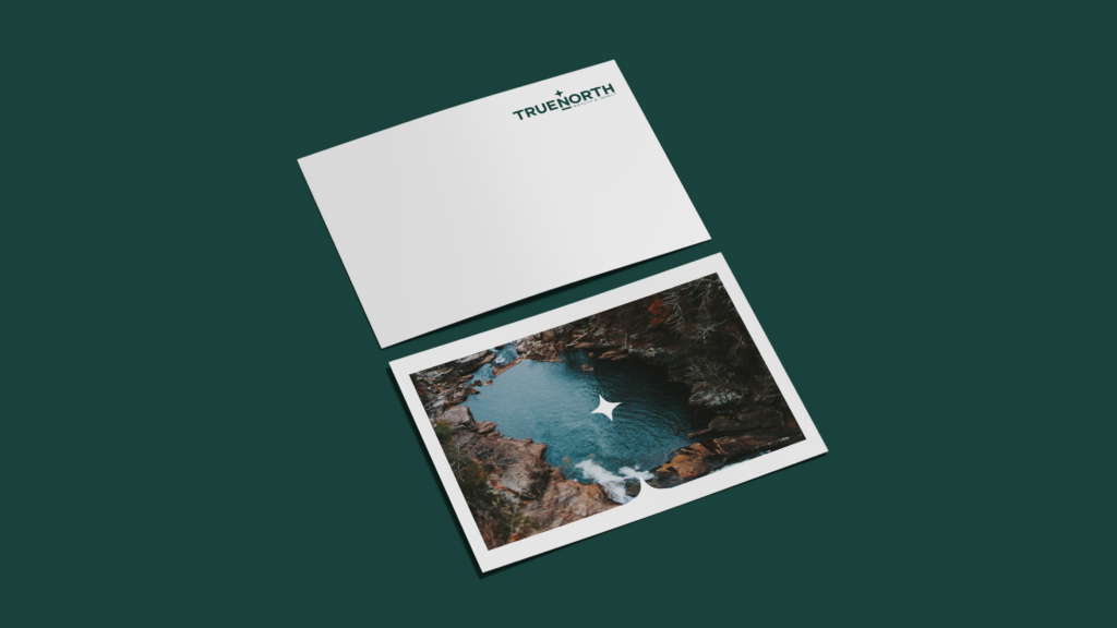
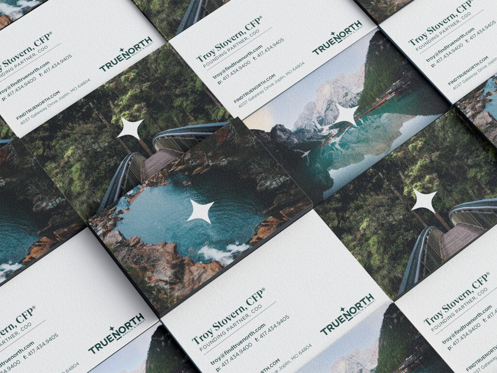
Leaning into the idea of TrueNorth as a guide and navigator for clients, the brand identity prominently features a star in all versions of the logo. The primary version sets the full name atop a solid horizontal bar—referencing the sturdy foundation of the brand’s approach—with the Impact & Wealth qualifier underneath. An abbreviated variation of the logo pairs the star with the letter N, giving a nod to the name, and a shortened version of the horizontal bar. A brand palette of rich, calming earth tones allows the logo to be used in a variety of placements.
Brand Position
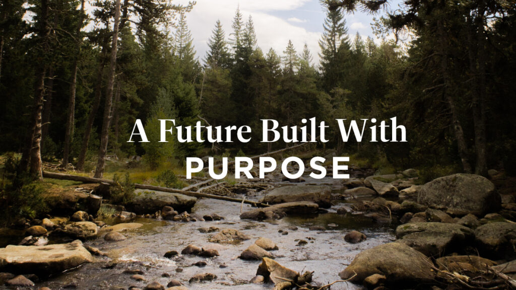
The first piece is distilling that big idea into a single, ownable statement. Something that serves as the true north (pun intended) for the brand:
A future built with purpose.
This statement carries many meanings. “Future” speaks to the wealth planning we provide. “Built” conveys the many pieces taken into consideration by all parties. “Purpose” is layered with the goals, passions, and the individual purpose of each client.
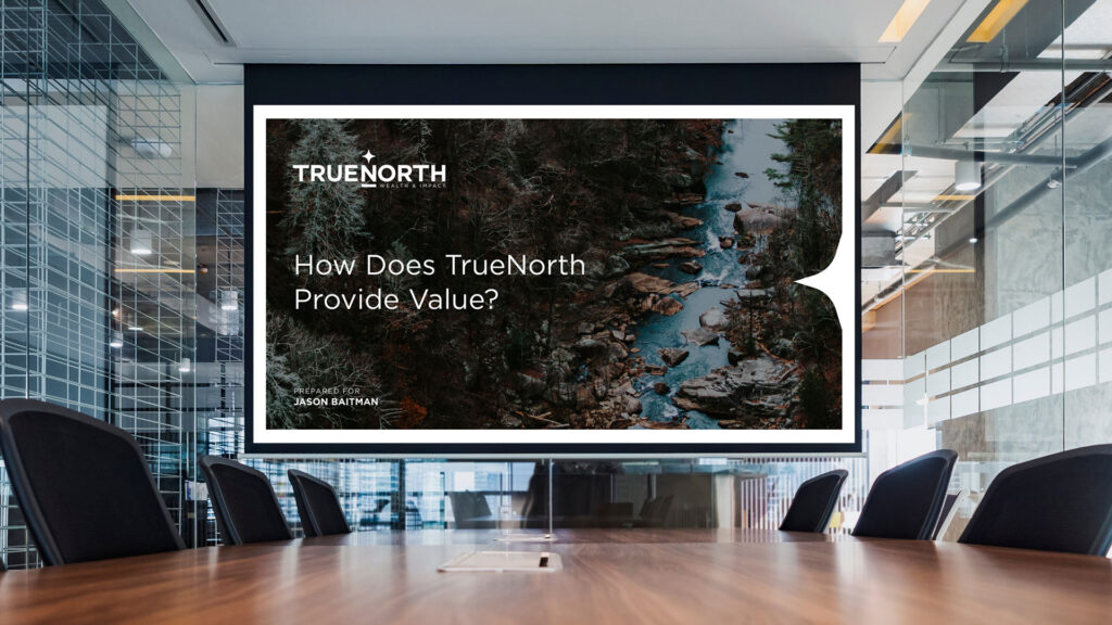
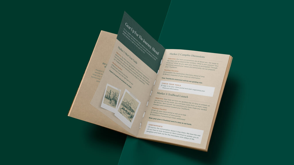
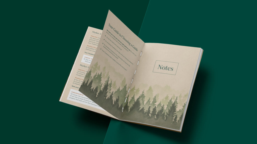
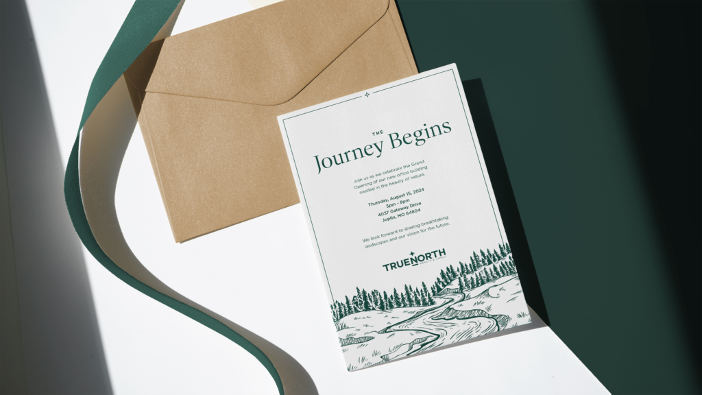
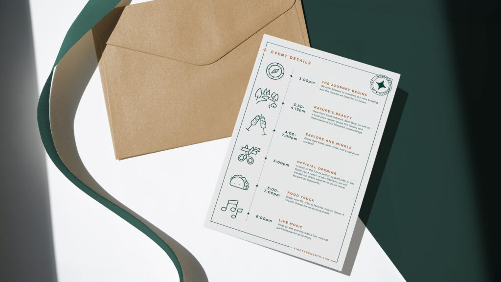
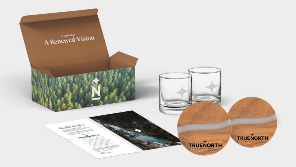
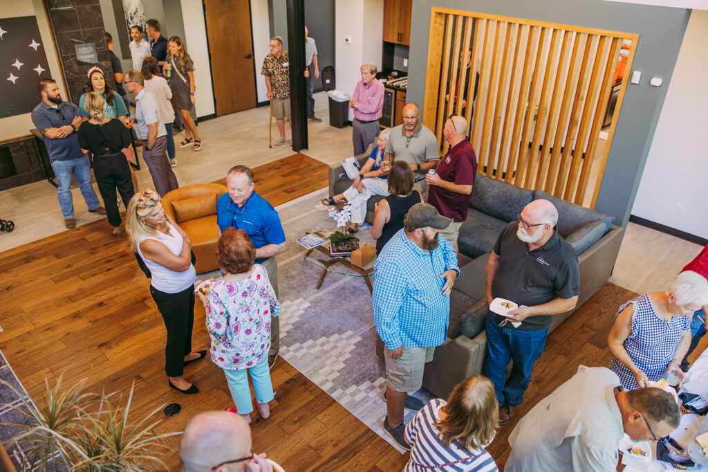
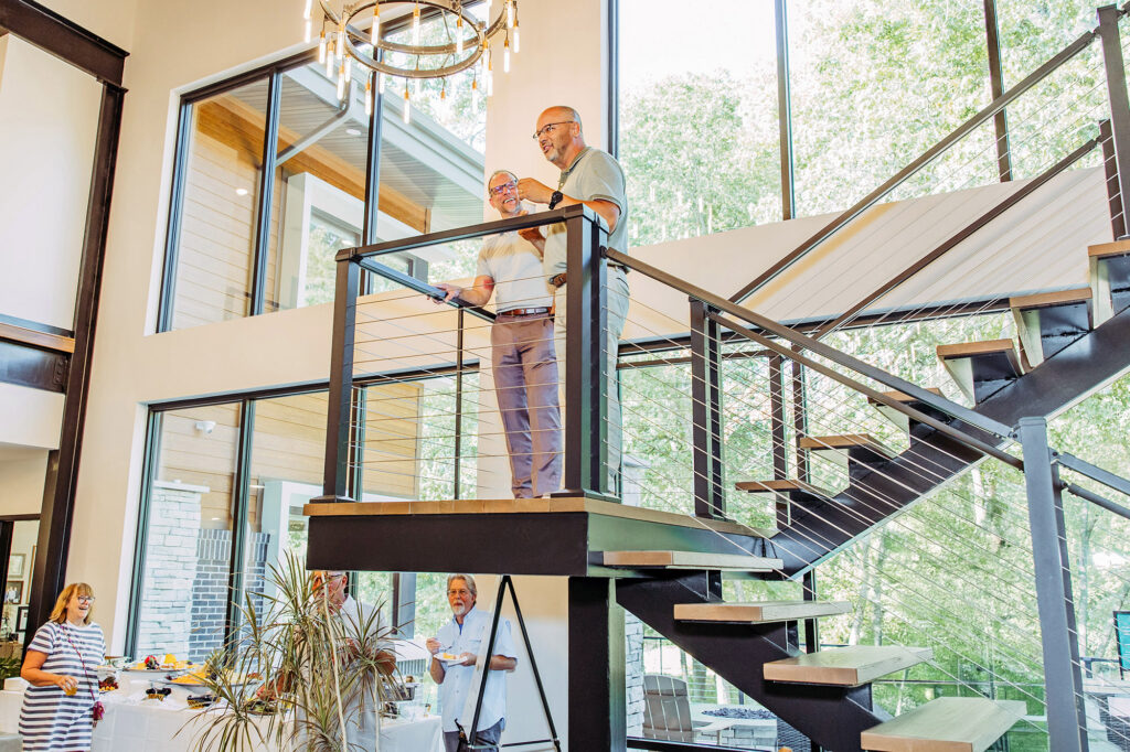
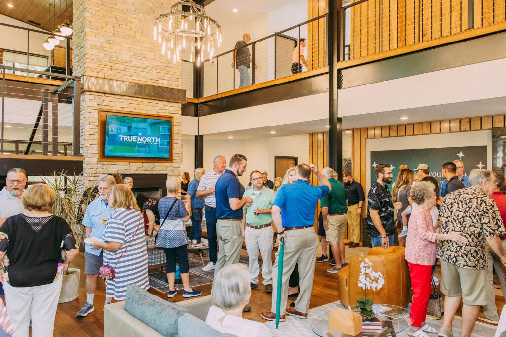
Gearing Up for the Path Ahead
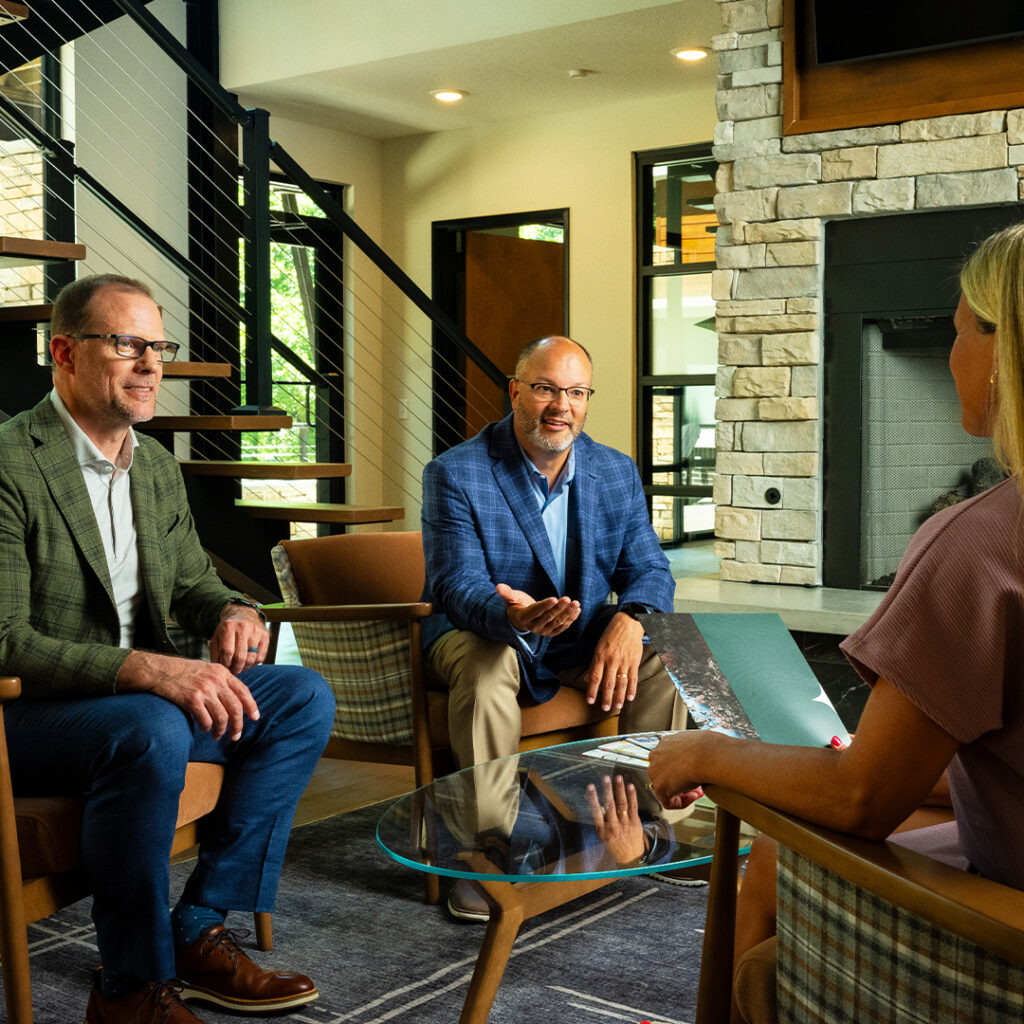
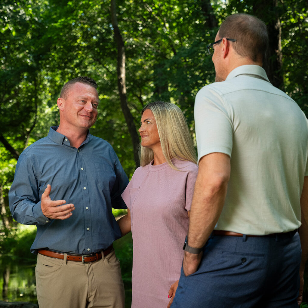
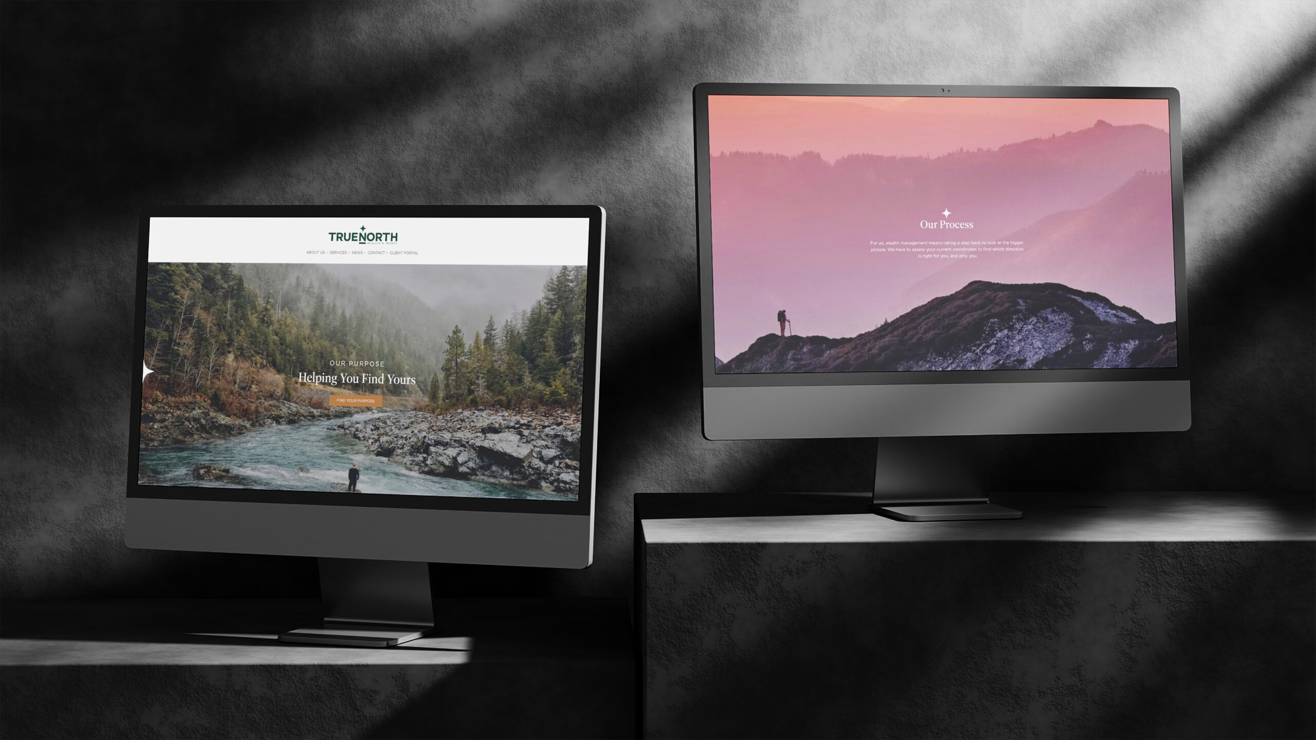
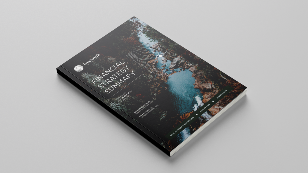
After developing the brand’s verbal and visual identities, we set out to work to equip TrueNorth with the core assets necessary to launch the brand. A new website, print collateral and promotional materials were developed to showcase the message and service offerings, all leading up to a grand opening event showcasing the brand and TrueNorth’s new office space.

Concept Companies
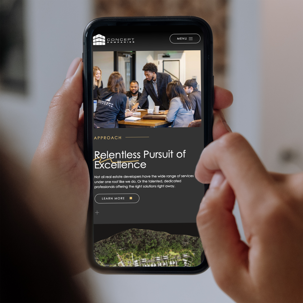
Concept Companies is a real estate developer that takes on some of the most imaginative and future-thinking projects. They came to us because they needed their new website to represent the truly unique approach of their organization.
Full Website Development
We went through our full process to develop their new website: benchmarking, SEO strategy, funnel strategy, wireframing, content development, design and development.
Custom Footer Illustrations


Insight
Our analysis of their old site during the benchmarking phase told us that most visitors to the site viewed the Projects and People pages. This meant the site was being used as a legitimizer for future clients. So our strategy hinged around creating something that spoke to the diversity in their portfolio and expertise in full scale projects.
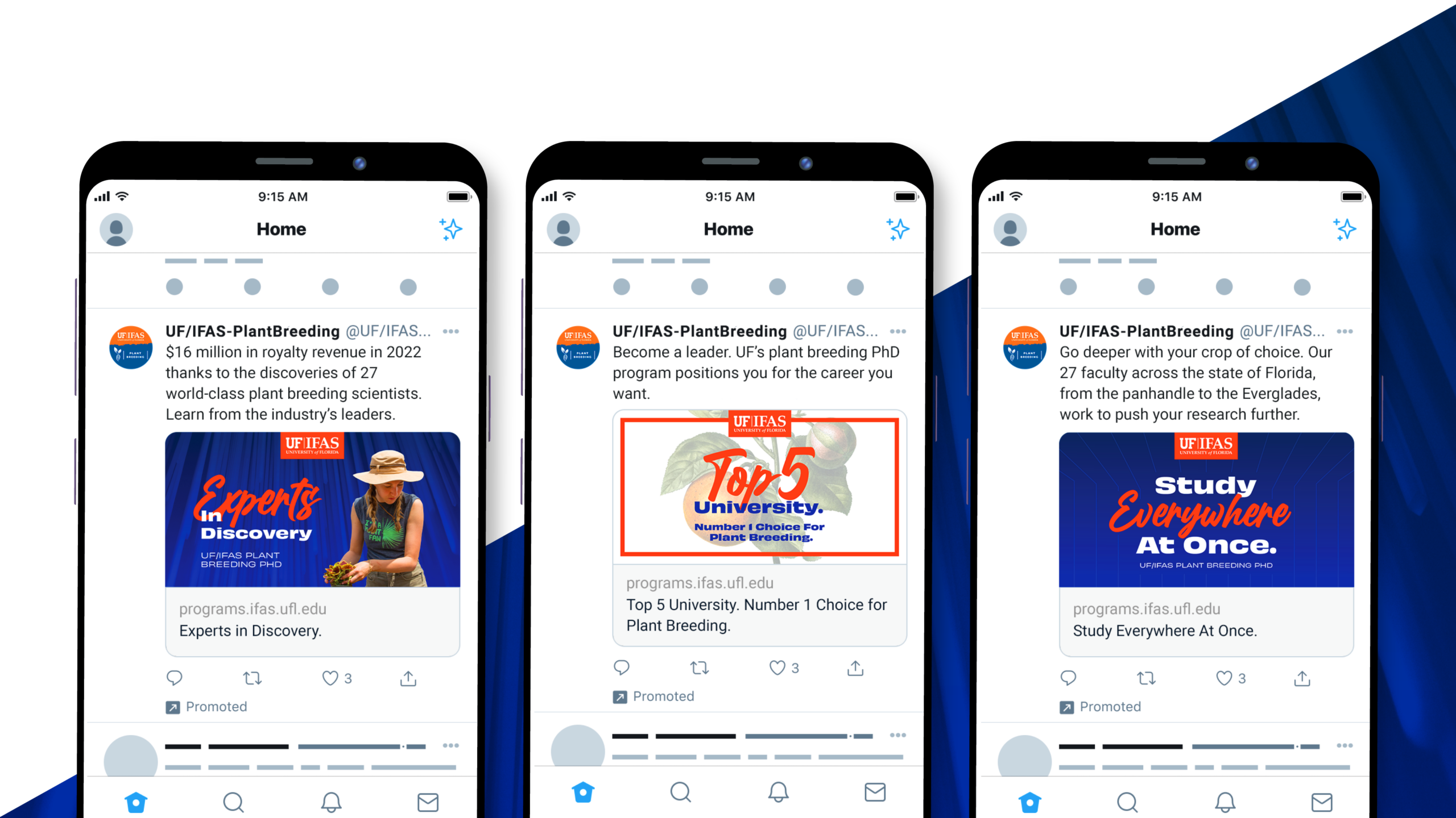
UF/IFAS Plant Breeding
The University of Florida’s Institute of Food and Agricultural Sciences is home to one of the world’s leading Plant Breeding programs. Their PhD program gives students an edge in the field because of their ability to cultivate a variety of crops in a range of climates and learn from the scientists who are actively pushing the industry forward.
Our goal? Reach more applicants and keep them engaged through the application deadline.
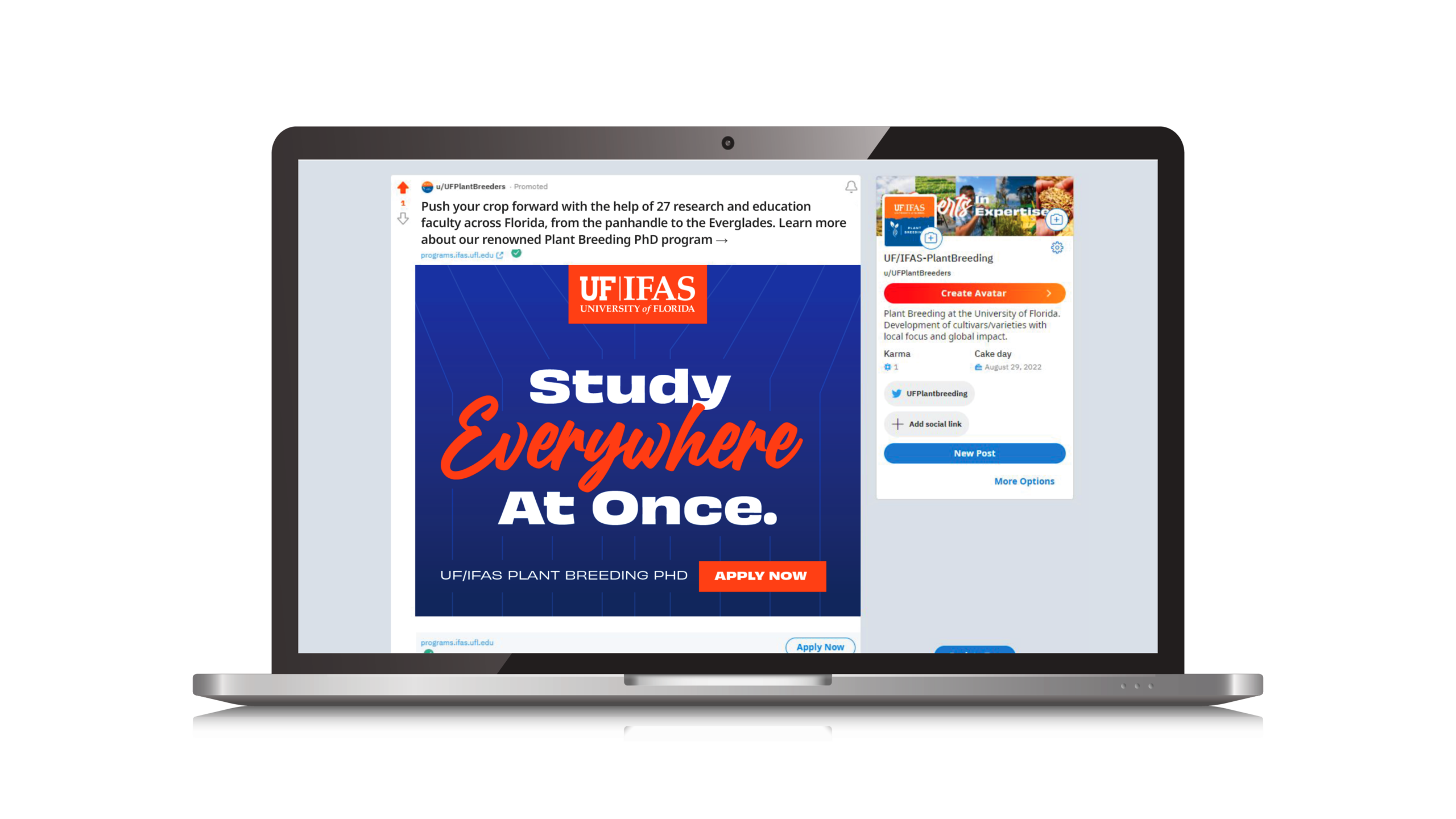
Email Campaign
This drip campaign engaged applicants by sending them more information about the programs, its accomplishments and students’ stories. Marketing 101: When we create content, offer some value to your audience, don’t just make ask after ask.
As a full-service advertising agency, we have creative and digital teams in-house. For this campaign we handled all creative development (design & copywriting), digital strategy and deployment, tracked placements and analytics.

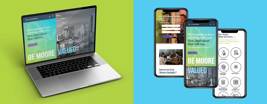
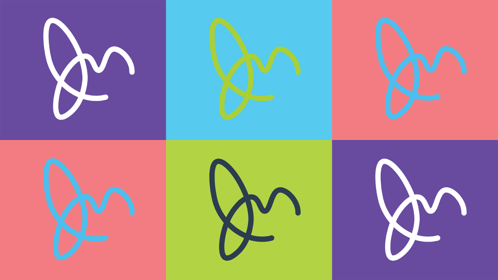
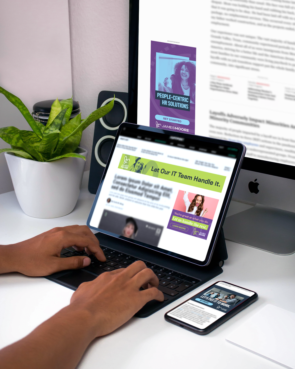
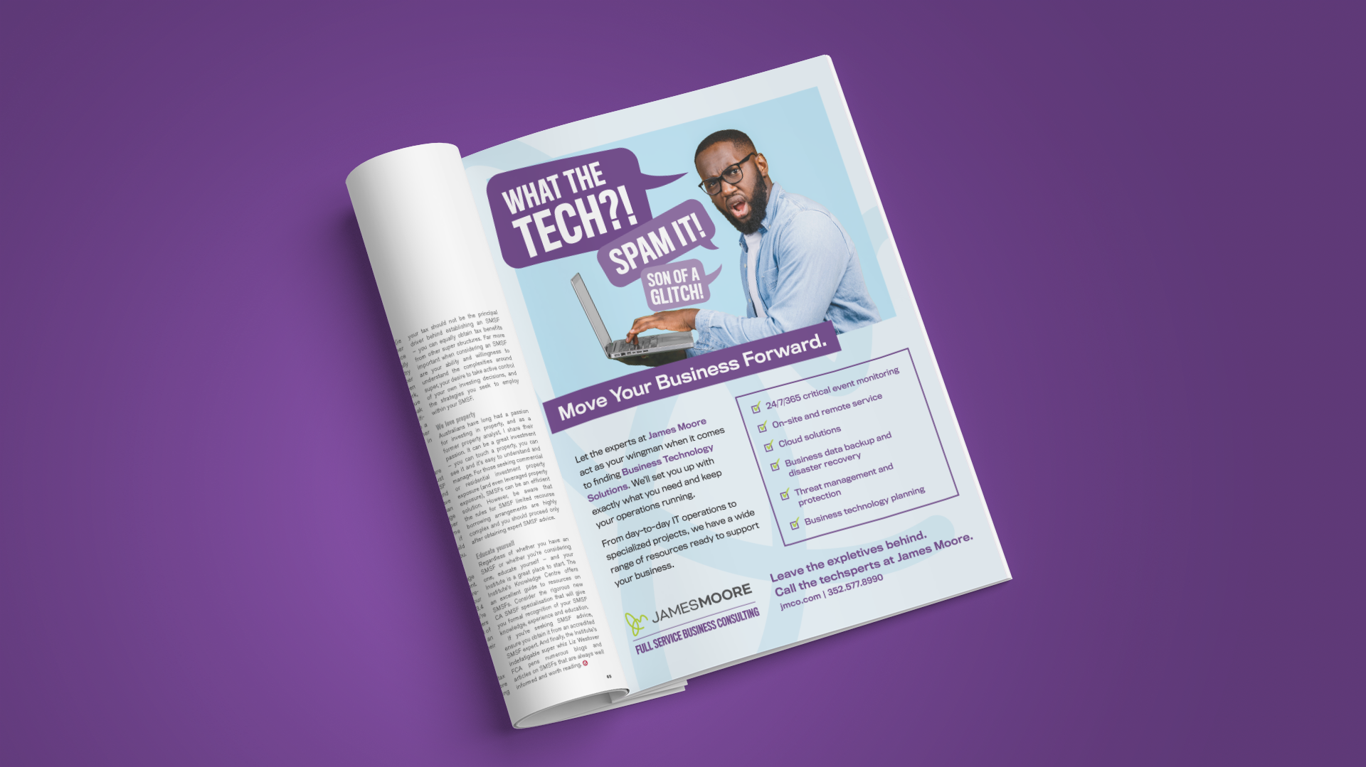
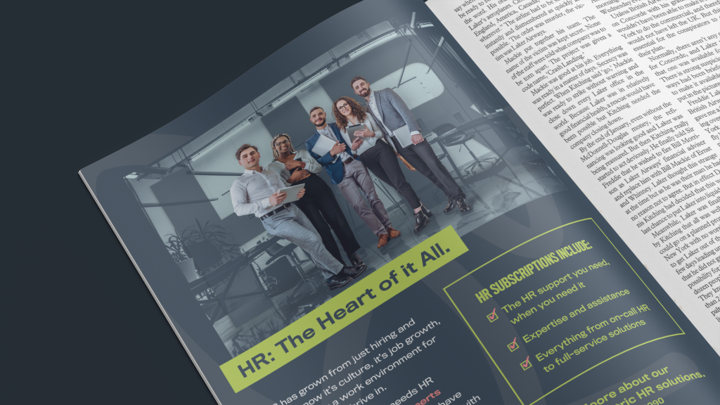
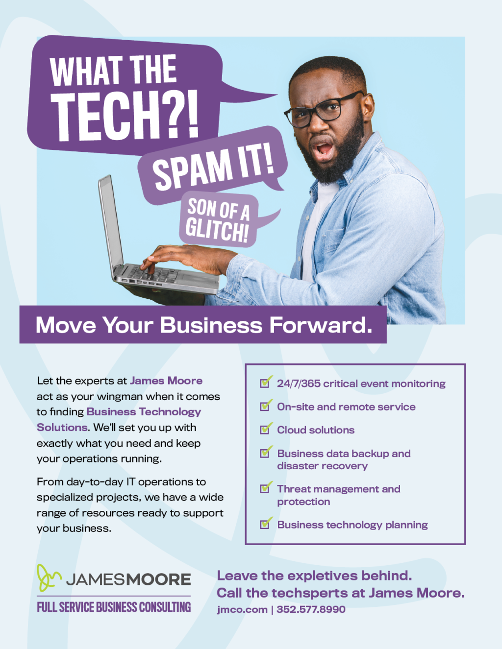
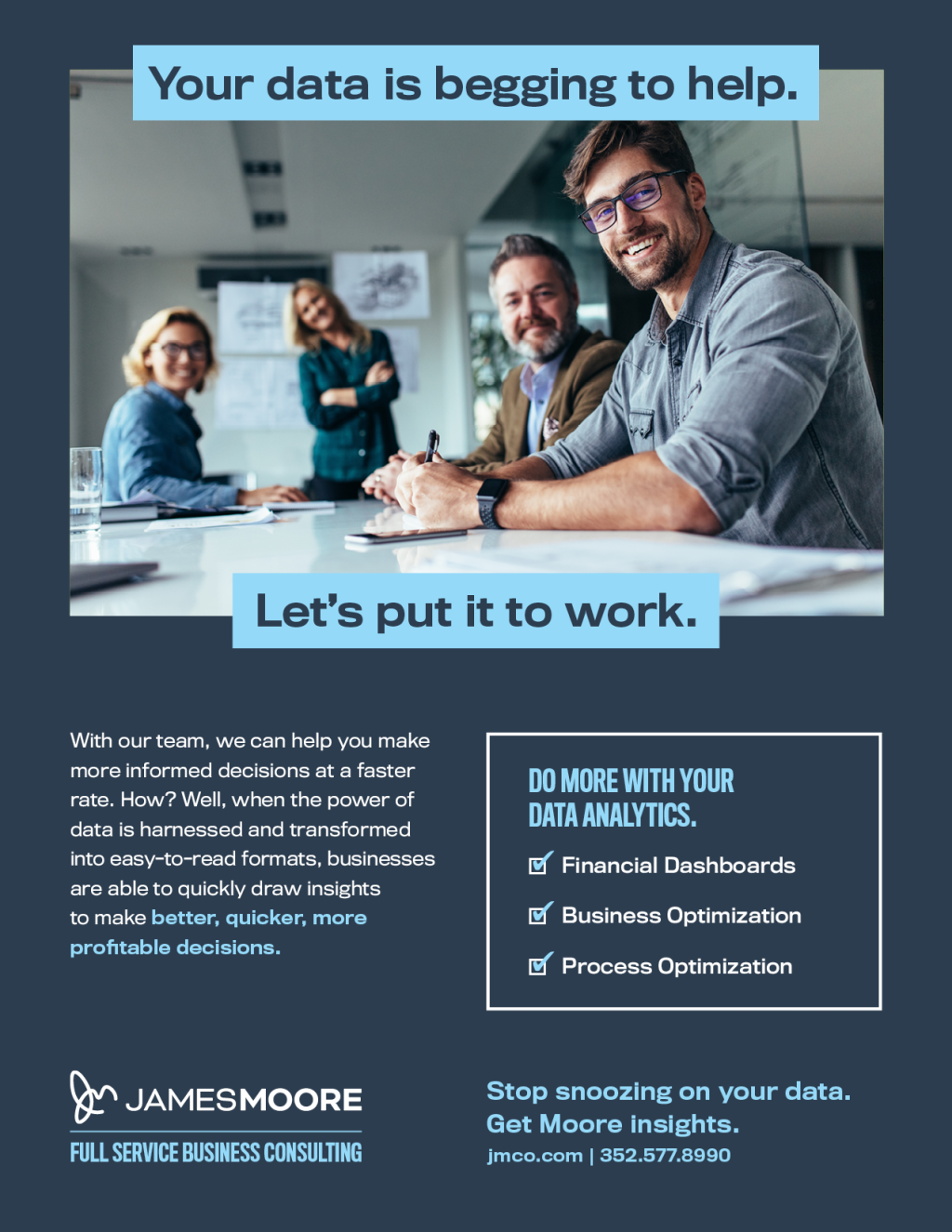
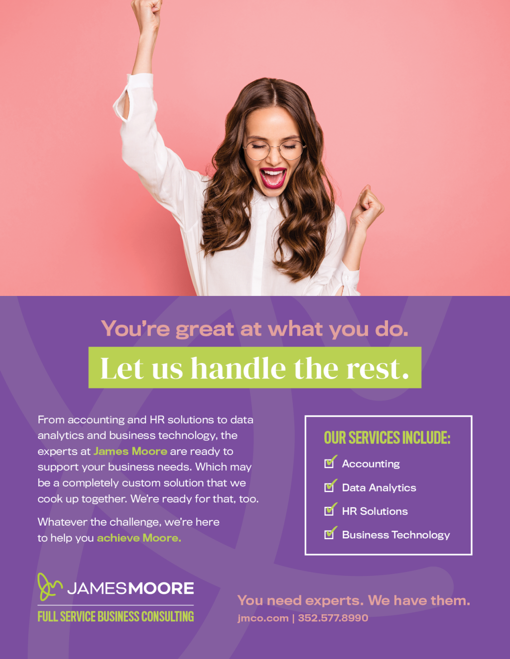
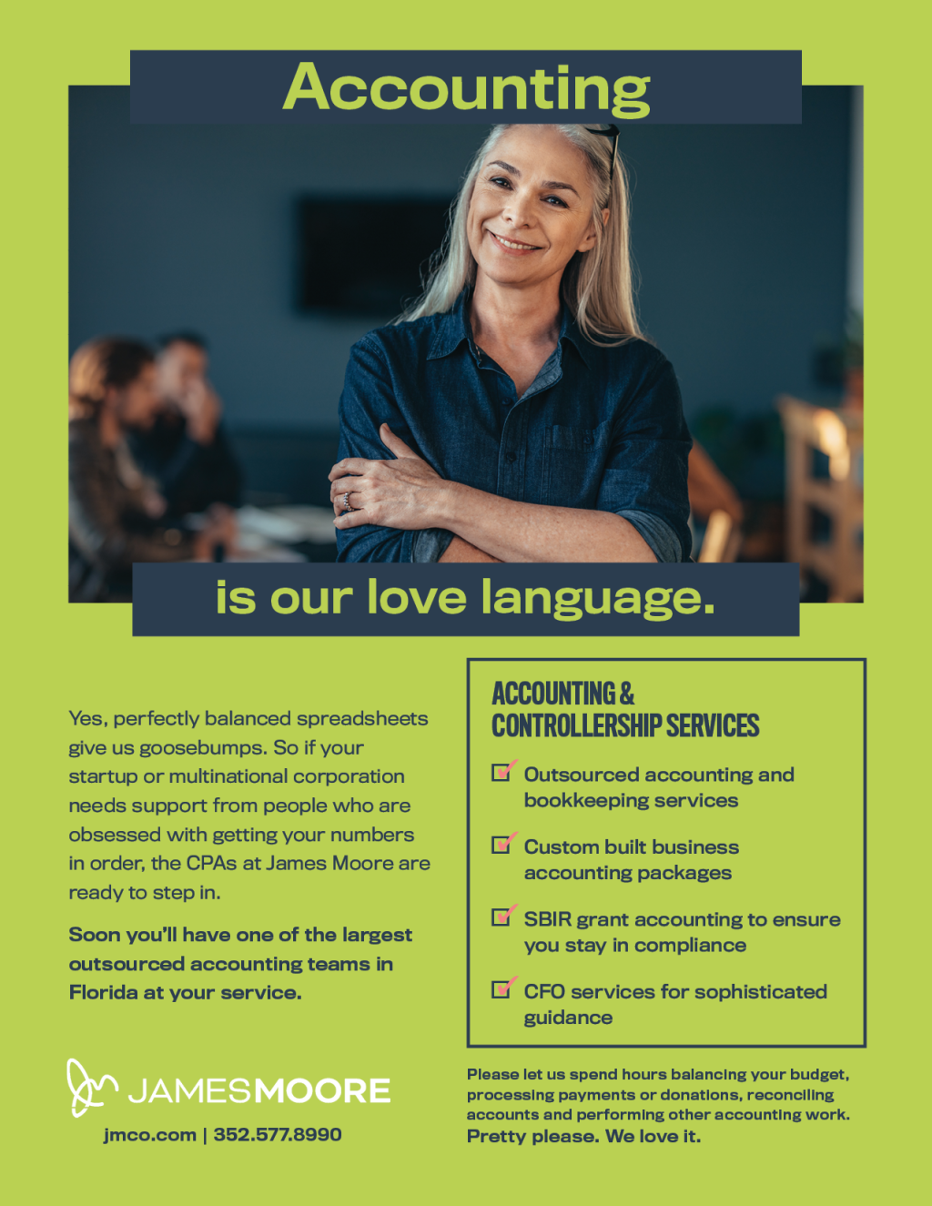
James Moore is a professional accounting and consulting firm with lots of personality. We developed a new brand complete with logo, tone of voice and design elements that brought it to life. See the featured project here.
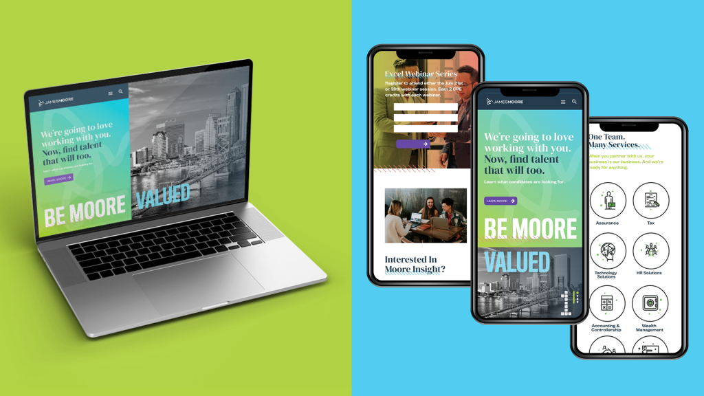
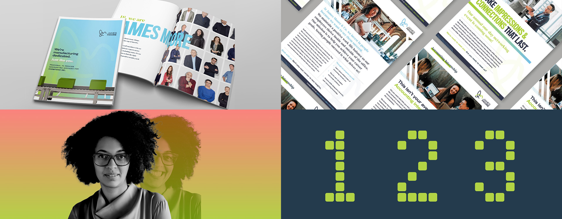
From Brand To Branded Communications
Don’t just sit on a new brand. Once you do the work, keep it going.
For James Moore, we’ve carried its new look and feel through to their communications. This campaign focused on five key messages for their audiences. Each has its own design sensibility, finds strength in branding, and engages the audience across various media.


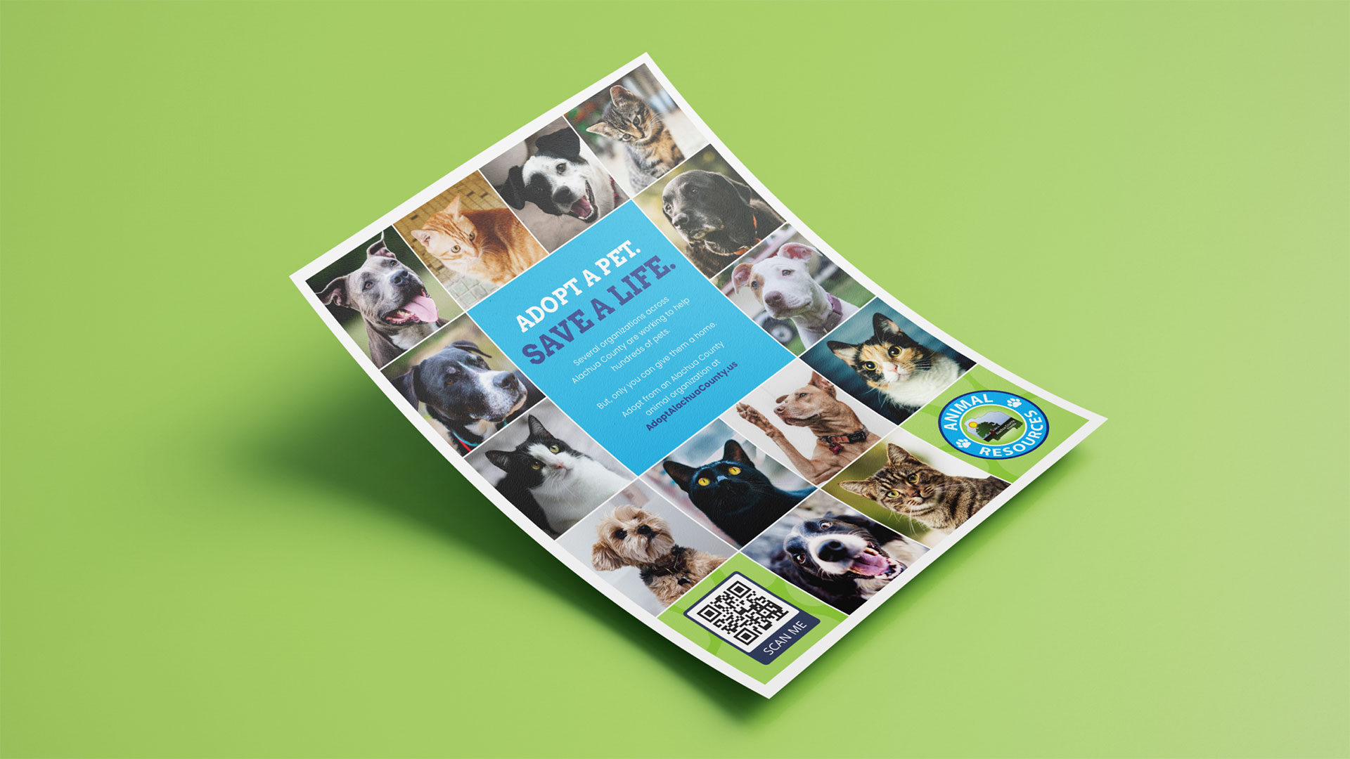
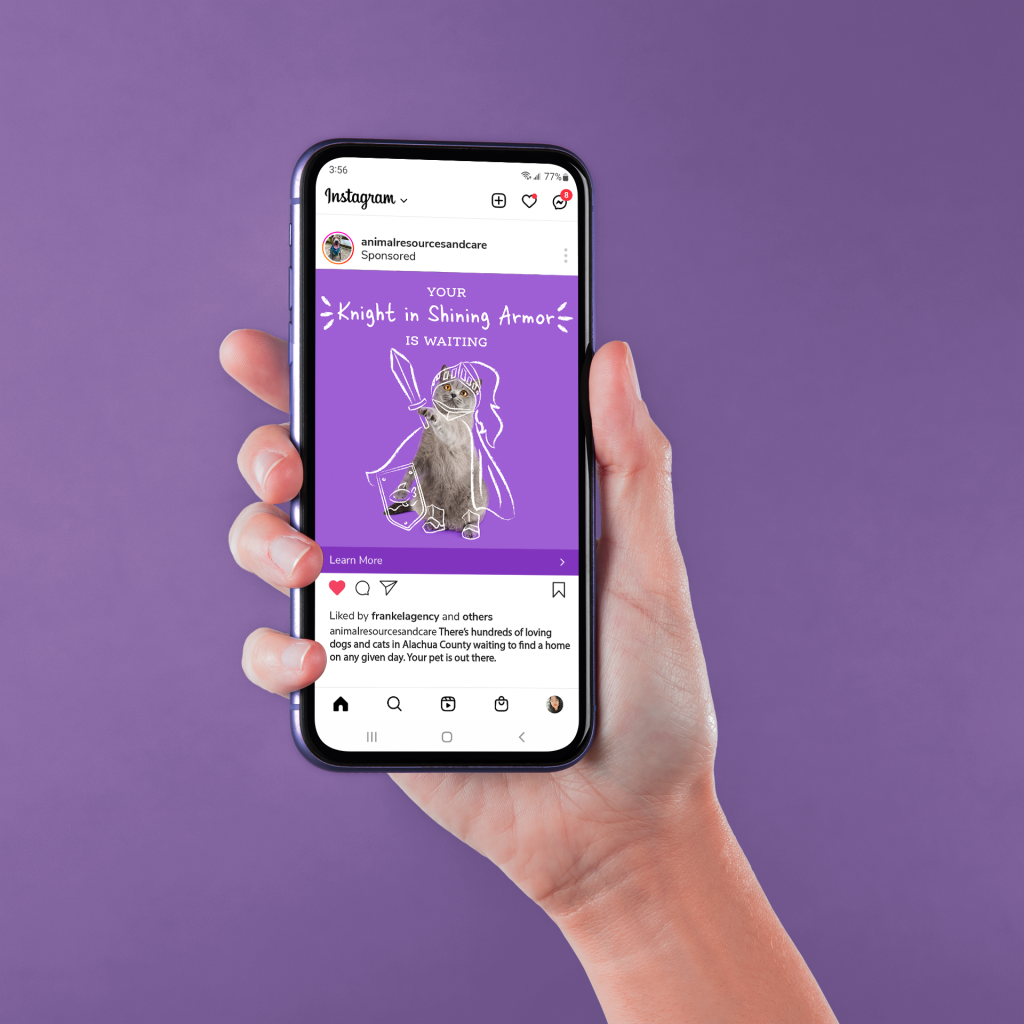
Alachua County Animal Resources
There’s always a need for people within the community to adopt cats and dogs. But how do we move them to action? With this heavily digital campaign, we approached the need from a few directions. Pets bring a lot of fun into our lives, they also provide much needed emotional support, but it’s also important to find a pet that matches your lifestyle – we covered it all.

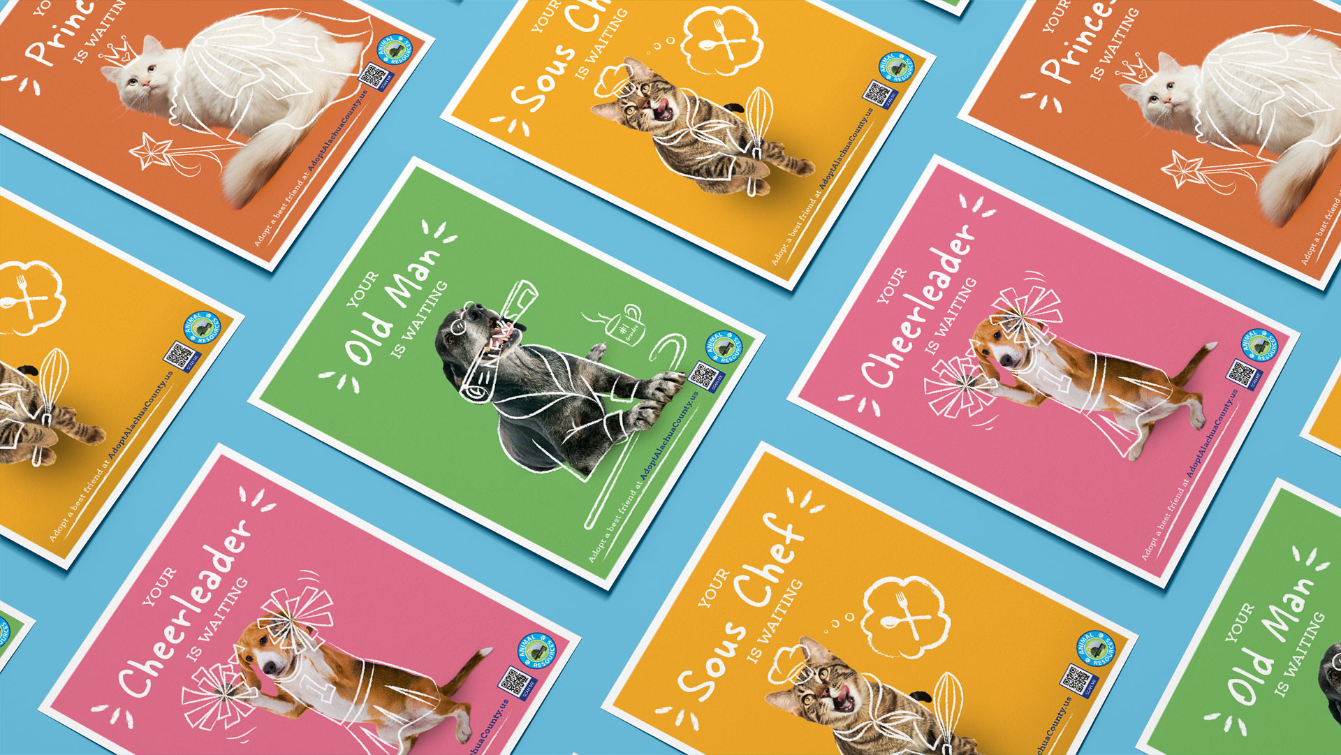
Your Best Friend Is Waiting
There’s no doubt that pets are bursting with personality, and soon become our best friends. This colorful part of the campaign paints a fun and hopeful picture of the various personality types waiting to befriend you.


More Than a Pet
It would be an understatement to say that pets provide us with much needed love and support. Their presence can make all the difference. Adoption isn’t just about caring for a pet, sometimes they take care of you, too.
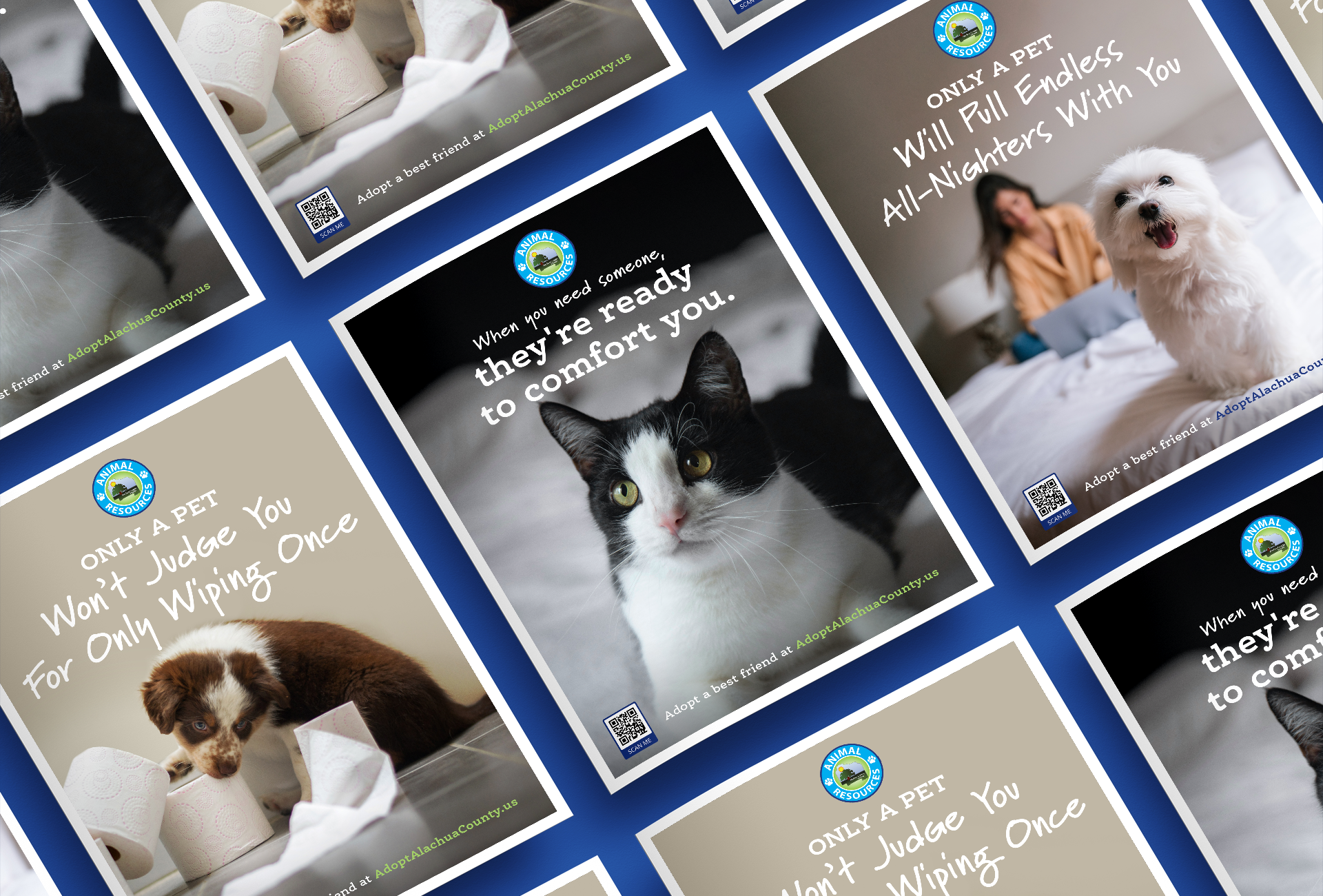
It's a Match
A playful way to personalize the adoption process – we created ads to match up potential adopters with pets.
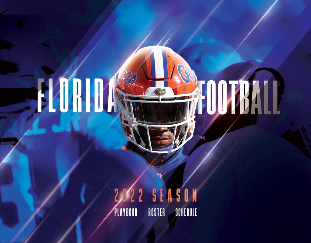
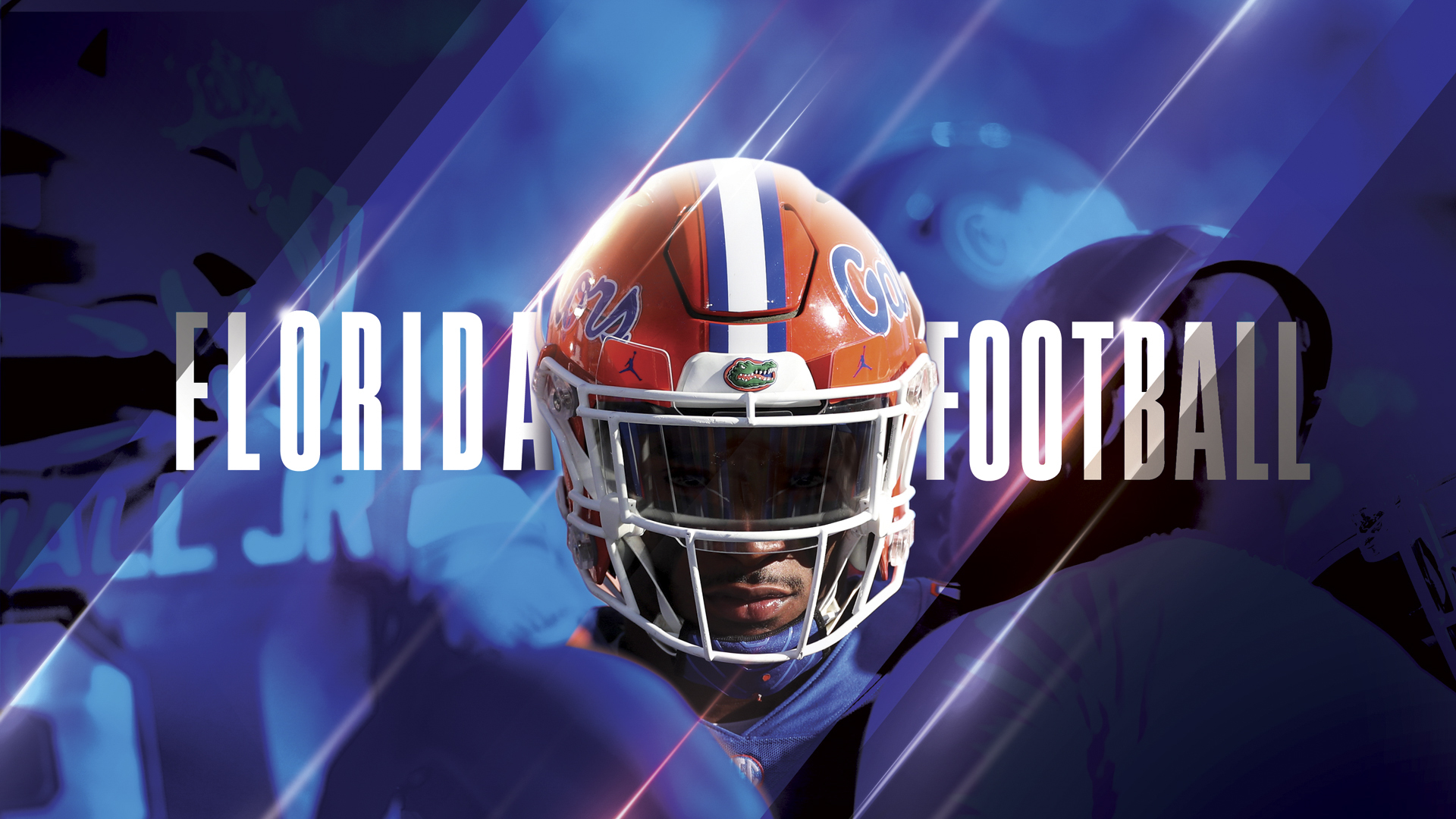
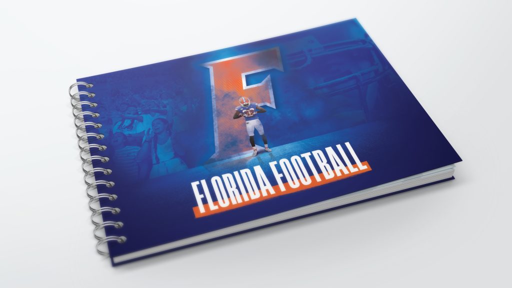
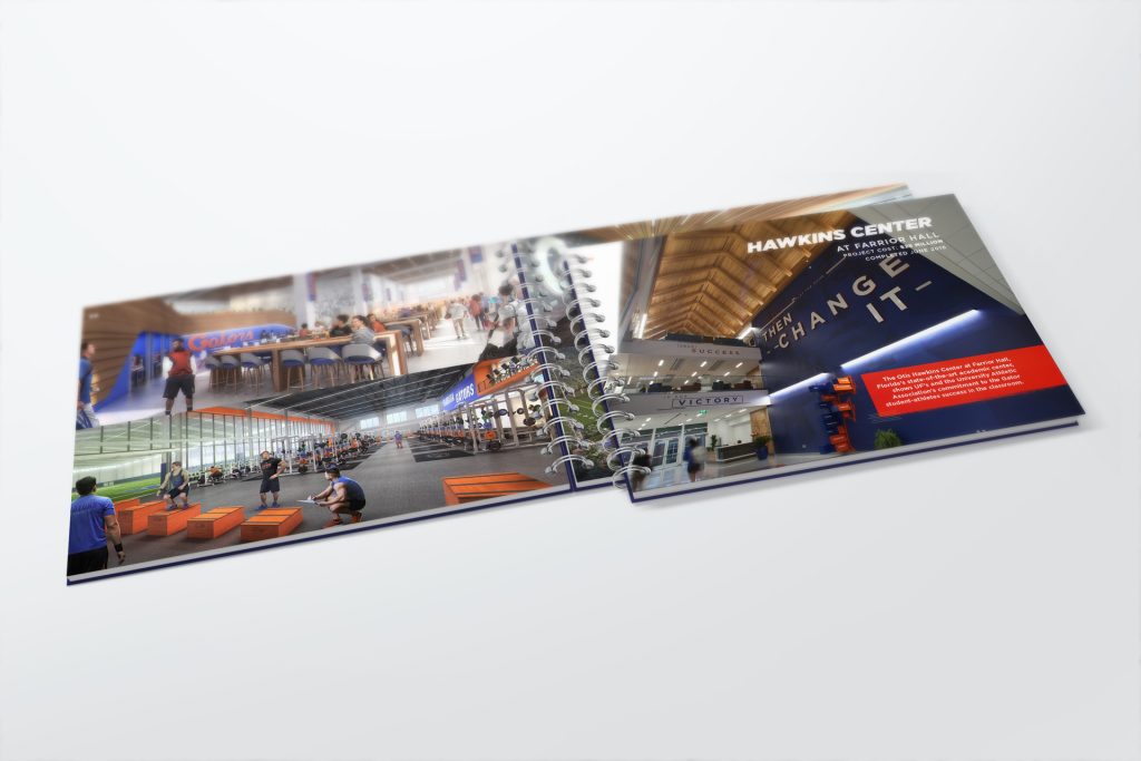
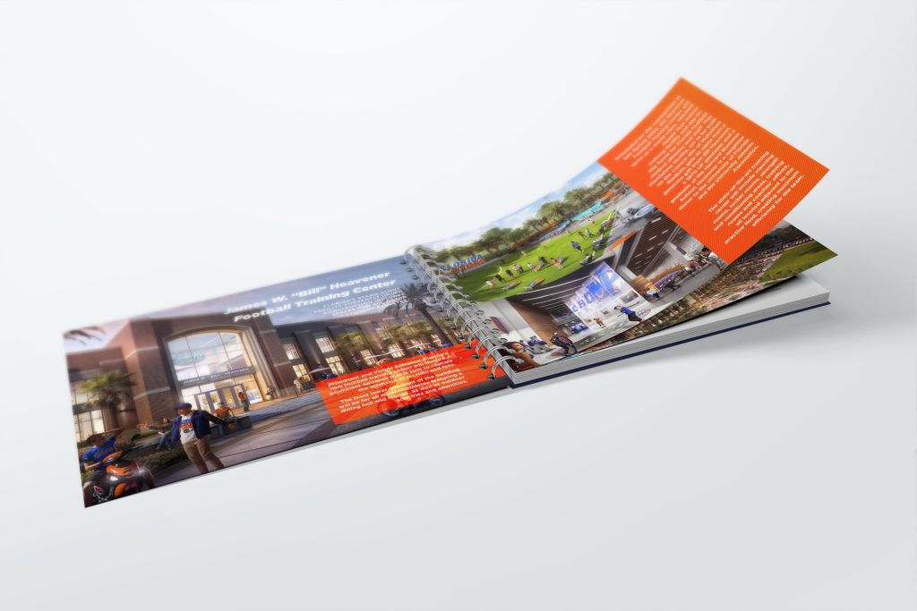
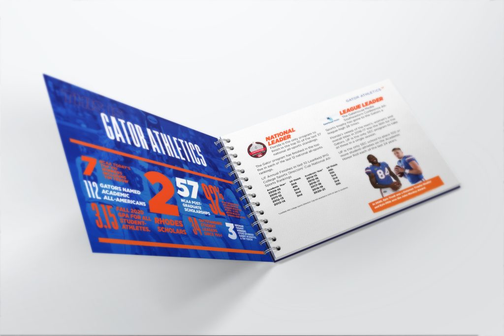
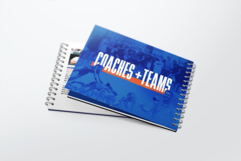
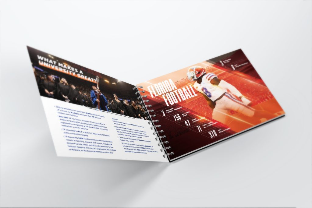
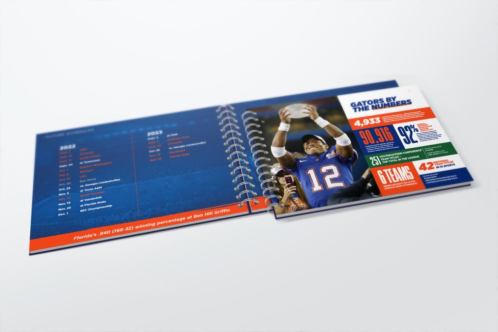
UF Coaches Booklet
With the end of the 2021 Football Season the University of Florida decided to go on the hunt for a new Head Coach. UF came to us with a tight deadline, so we rolled up our sleeves and built a kickass recruiting booklet to show off just what Gator Football is all about.
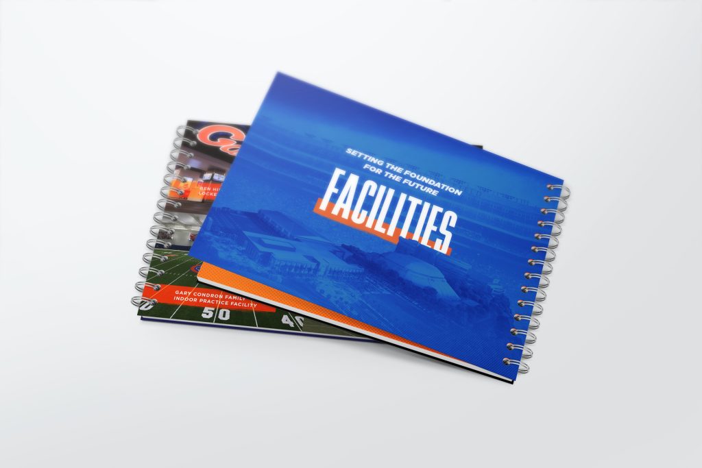
Facilities Plan
The University of Florida has some long terms plans, like 10-20 years out, We showed off what those plans entail for the newest facilities coming available to UF Coaching Staff.
By The Stats
When you talk sports, you inevitably talk about stats. So we put the numbers up front as they are nothing too scoff at with Florida’s long standing athletic history.
Two of the biggest collegiate athletic associations team up to take their rivalry off the field and into the streets. We put together a hype video to drive registration for the first the annual 5k fun run that took place ahead of the highly anticipated Florida/Georgia game weekend, one of the greatest college football rivalries of all time. Then pushed the video out on both teams social accounts and in stadiums in the lead up to the big game.
UF Online Dariel's Story
To help the University of Florida Online with student recruitment efforts, we created a video featuring one of their top graduates. His incredible story led to an engaging and inspiring video.

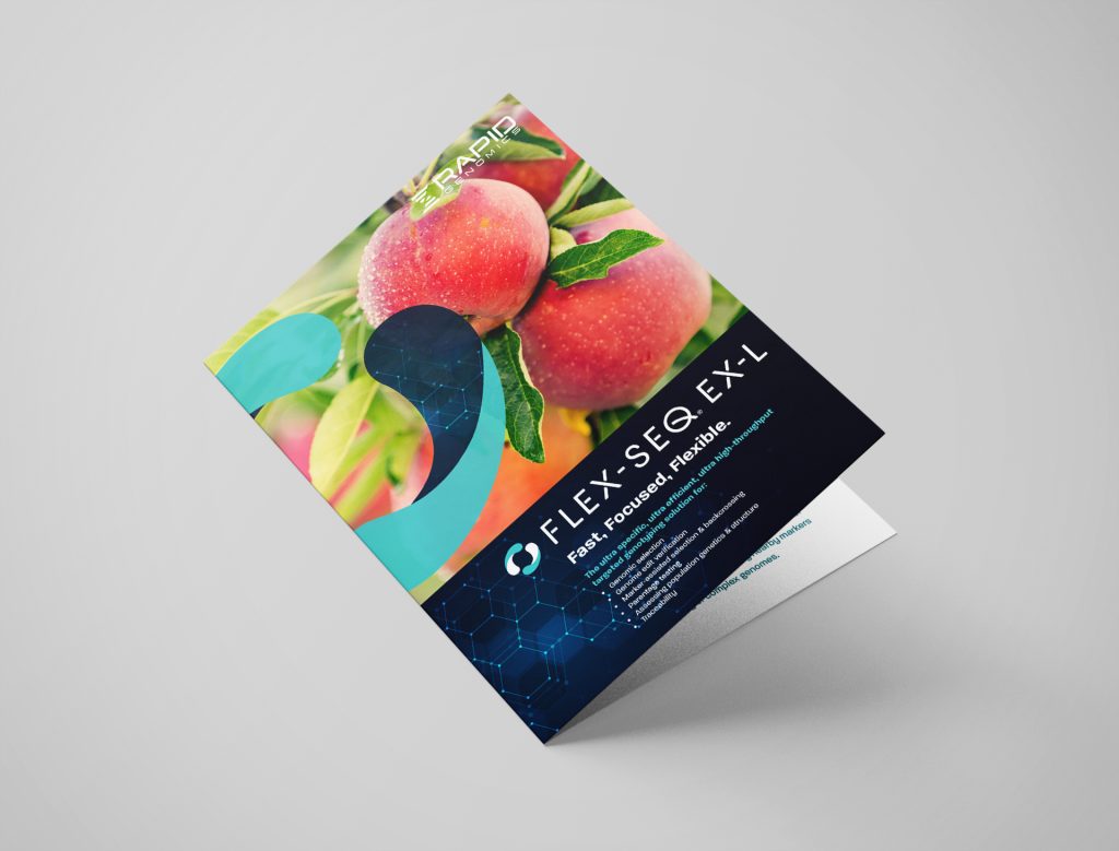
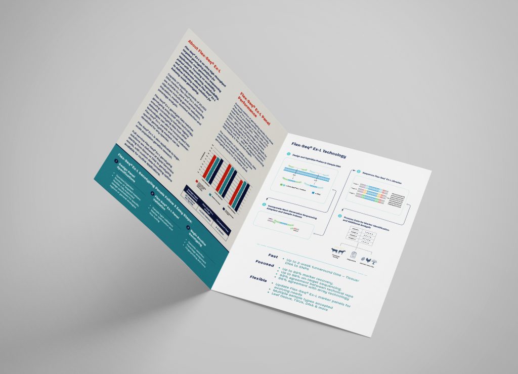
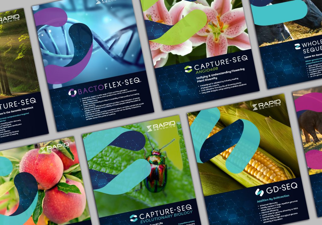
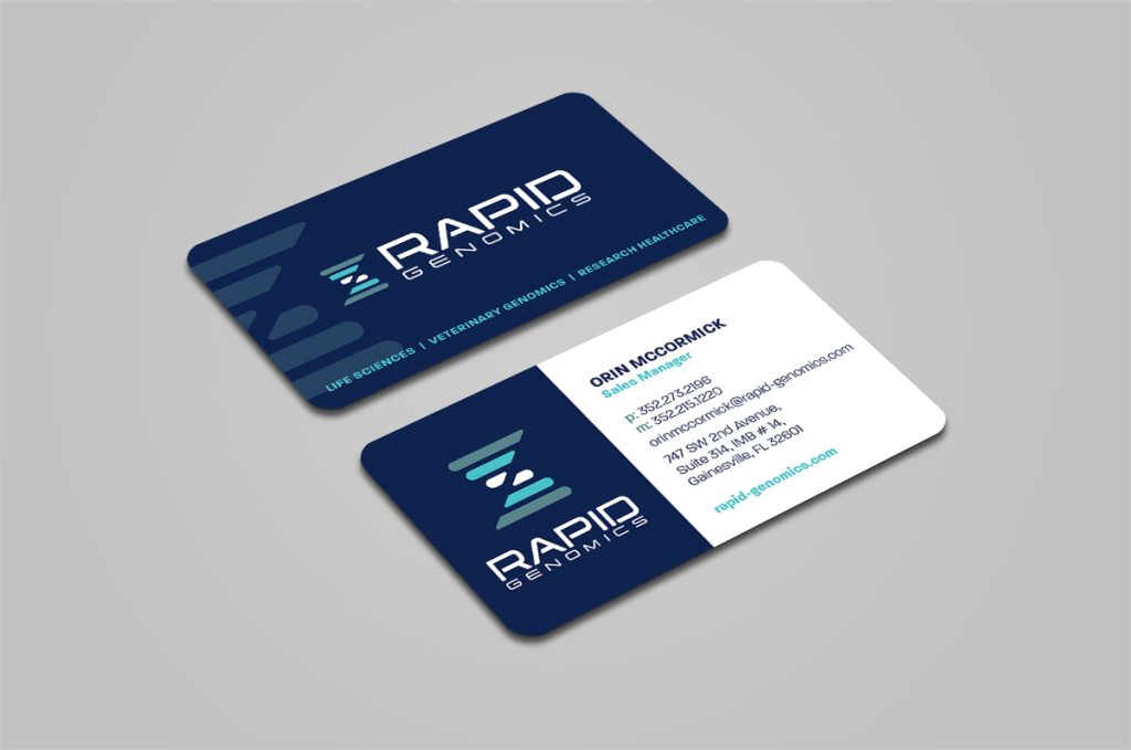
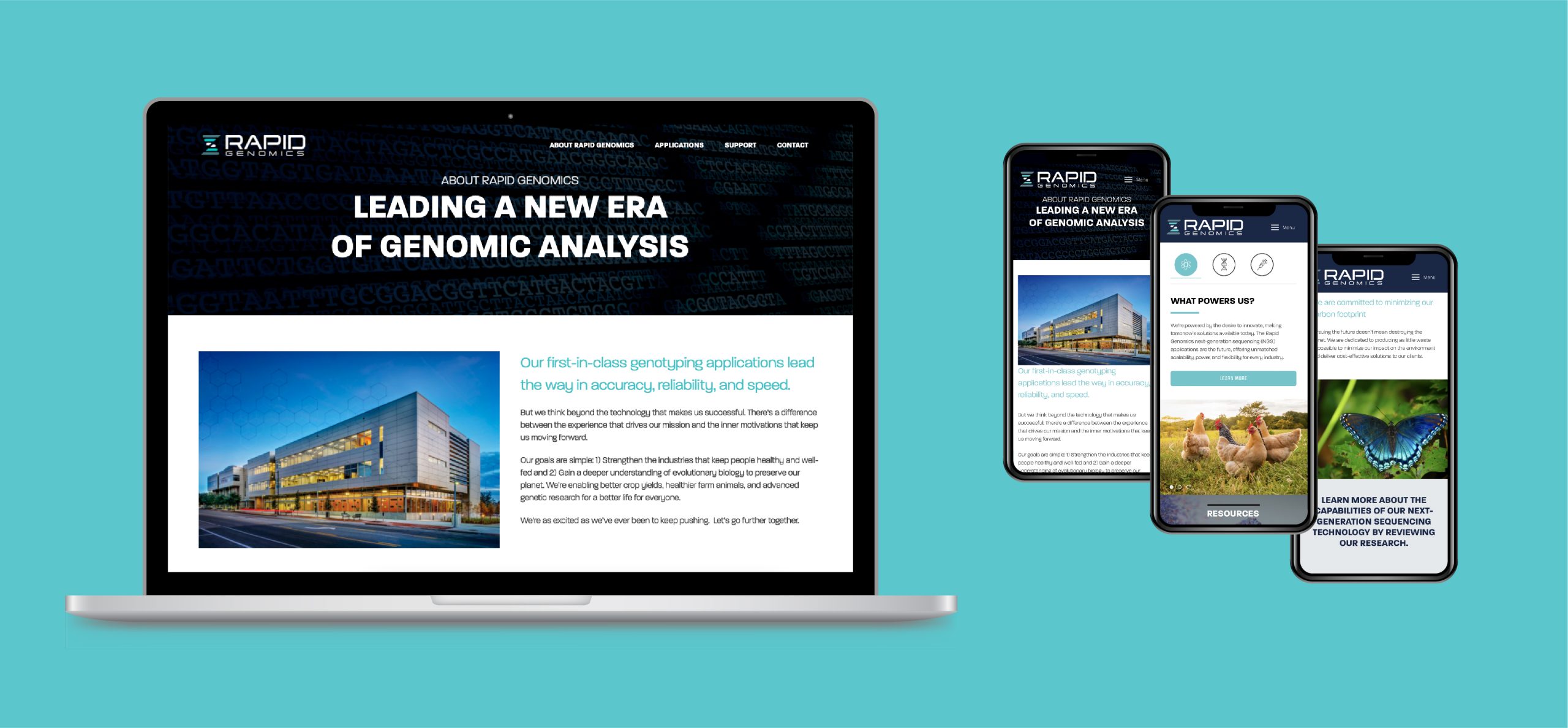
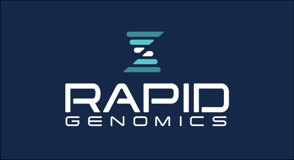
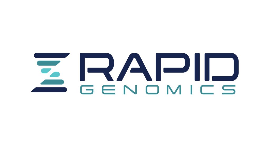
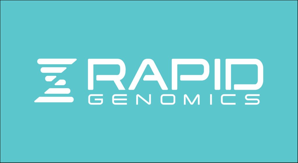
Rapid Genomics is at the forefront of genomic analysis helping companies across a broad range of industries create better outcomes for mankind. We created a unified brand identity to wrap the parent brand as well as their line of products and applications into a cohesive visual system across all communications.
![]()
![]()
![]()
![]()
![]()
![]()
Print Collateral
Website Design
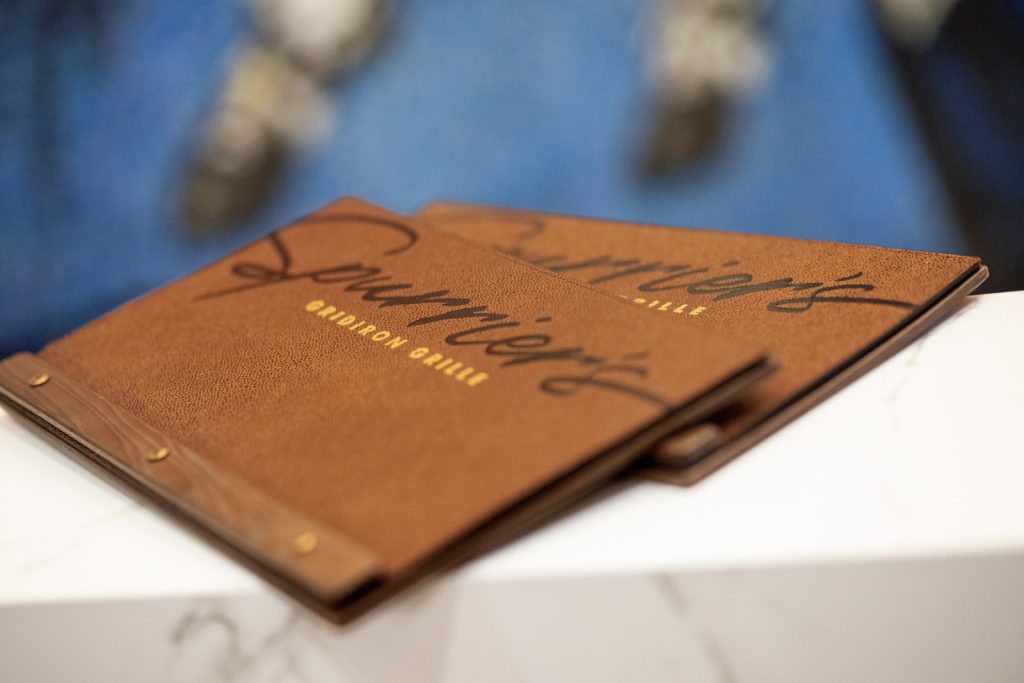
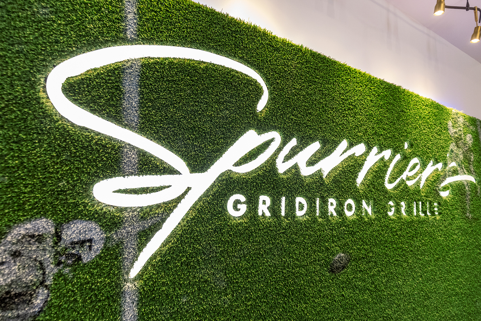
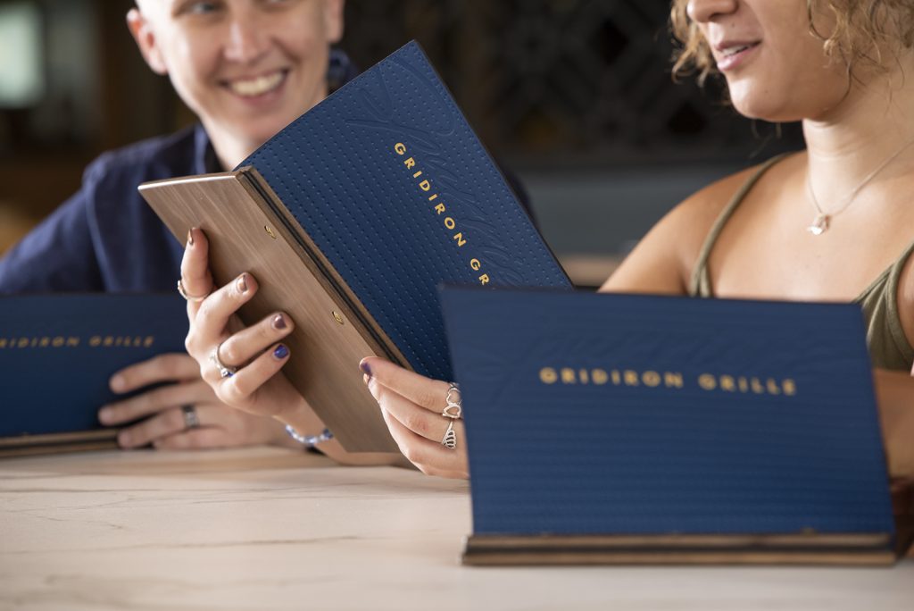
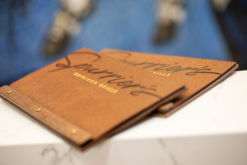
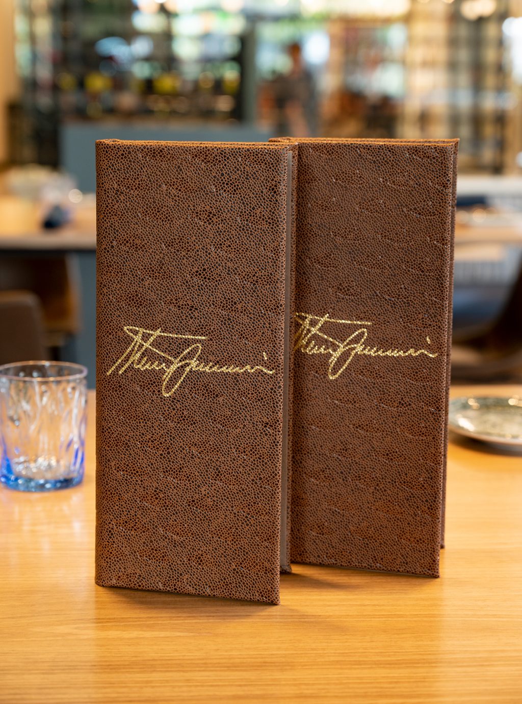
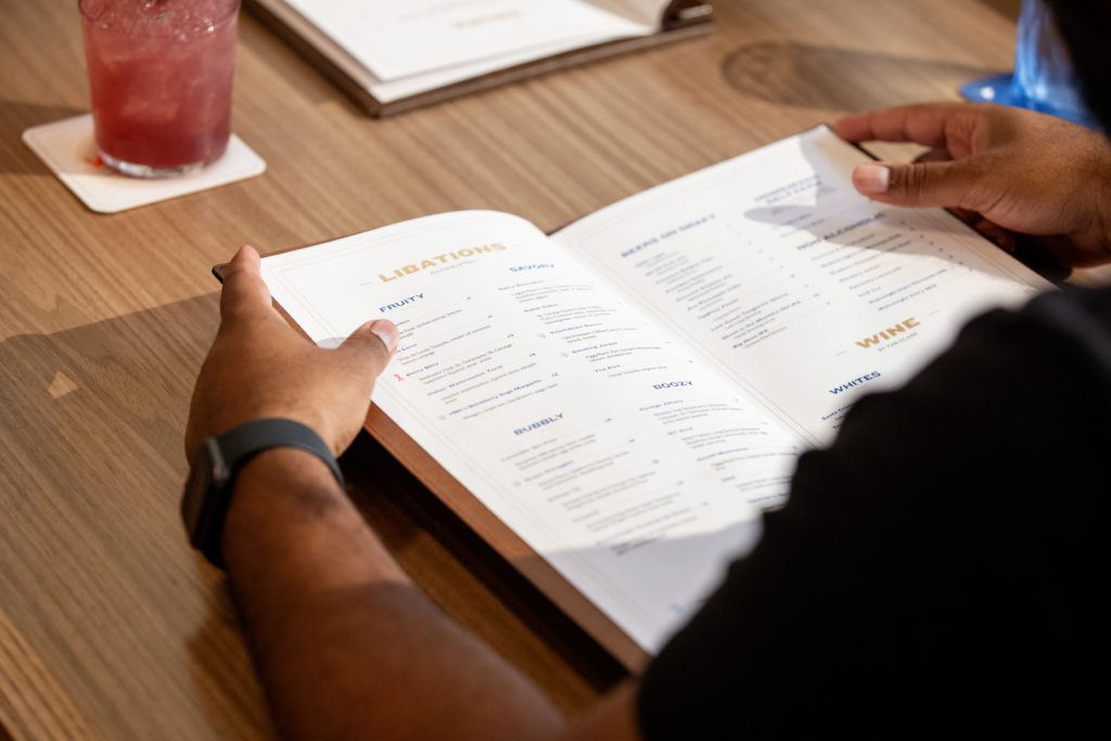
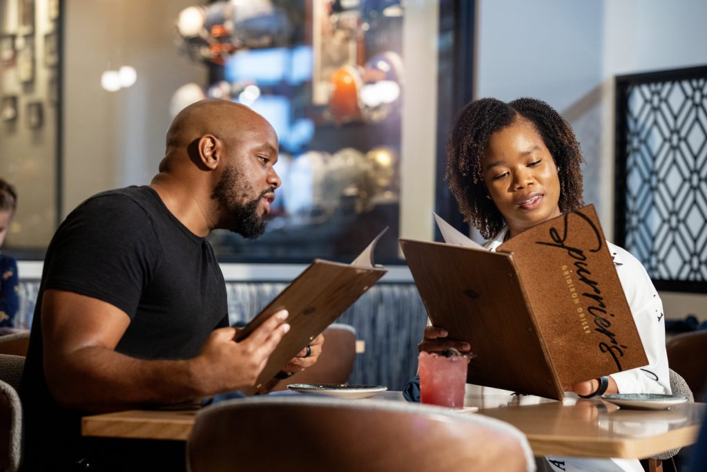
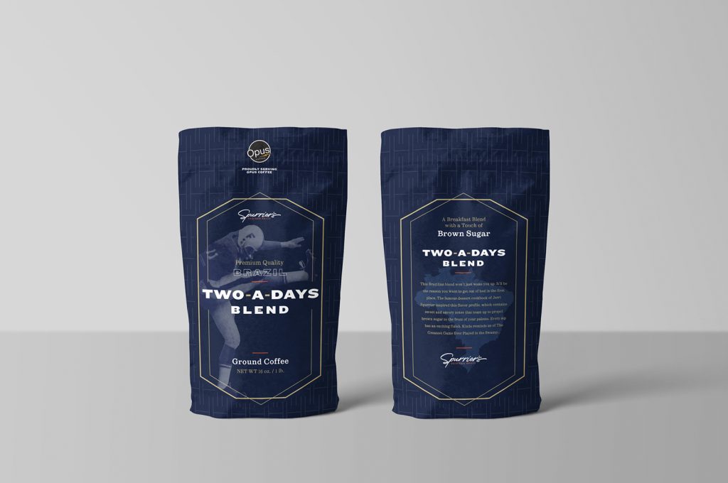
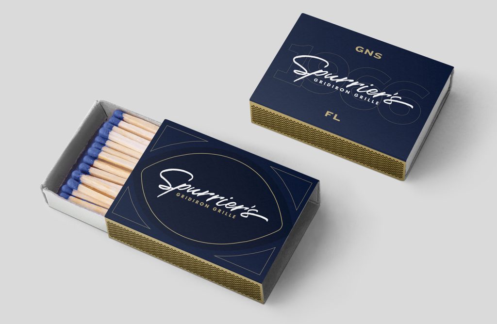
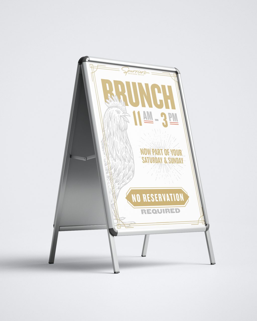
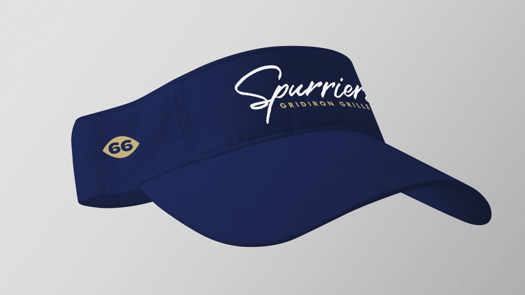
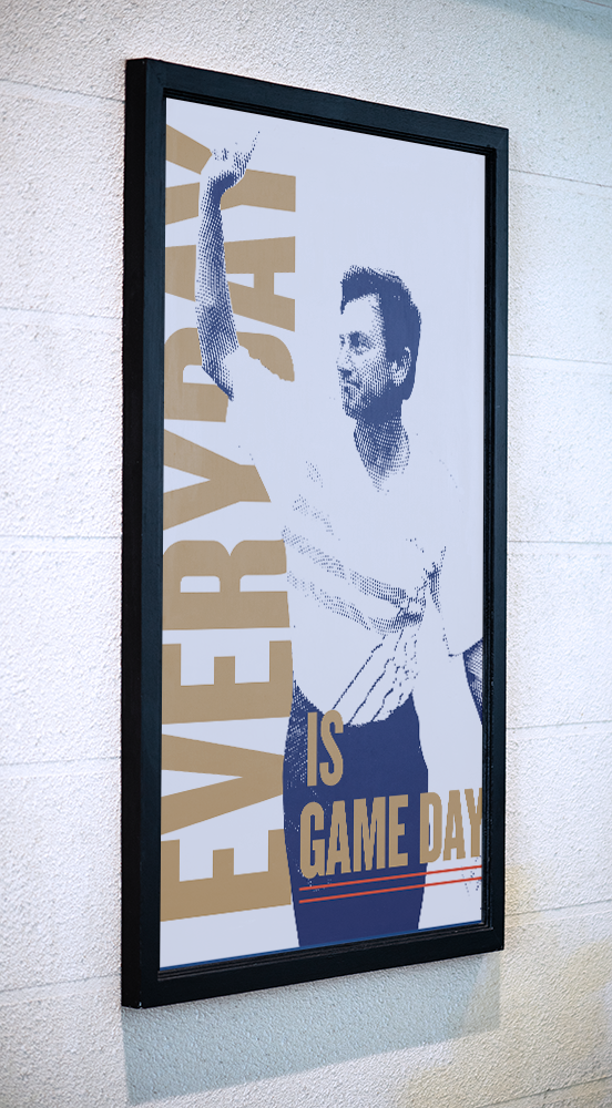
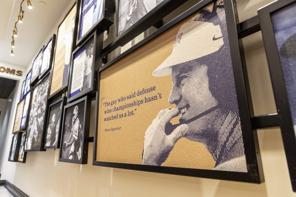
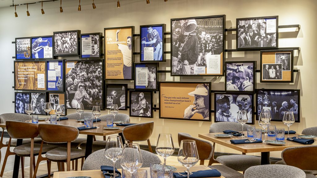
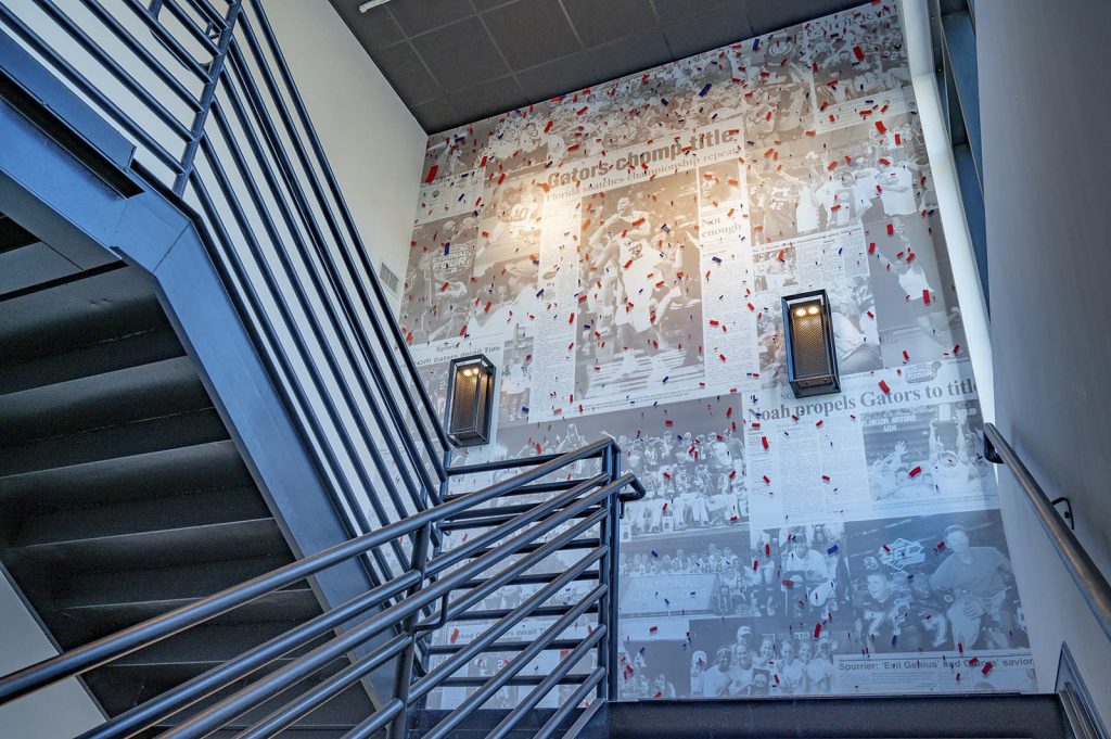
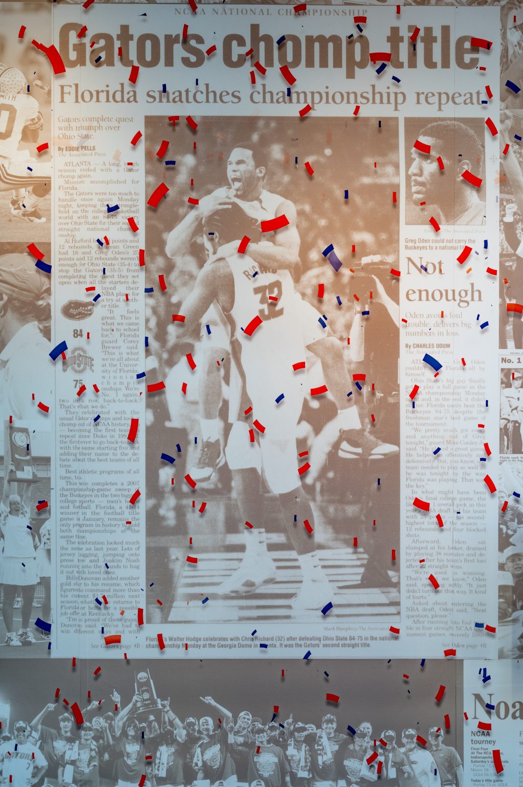
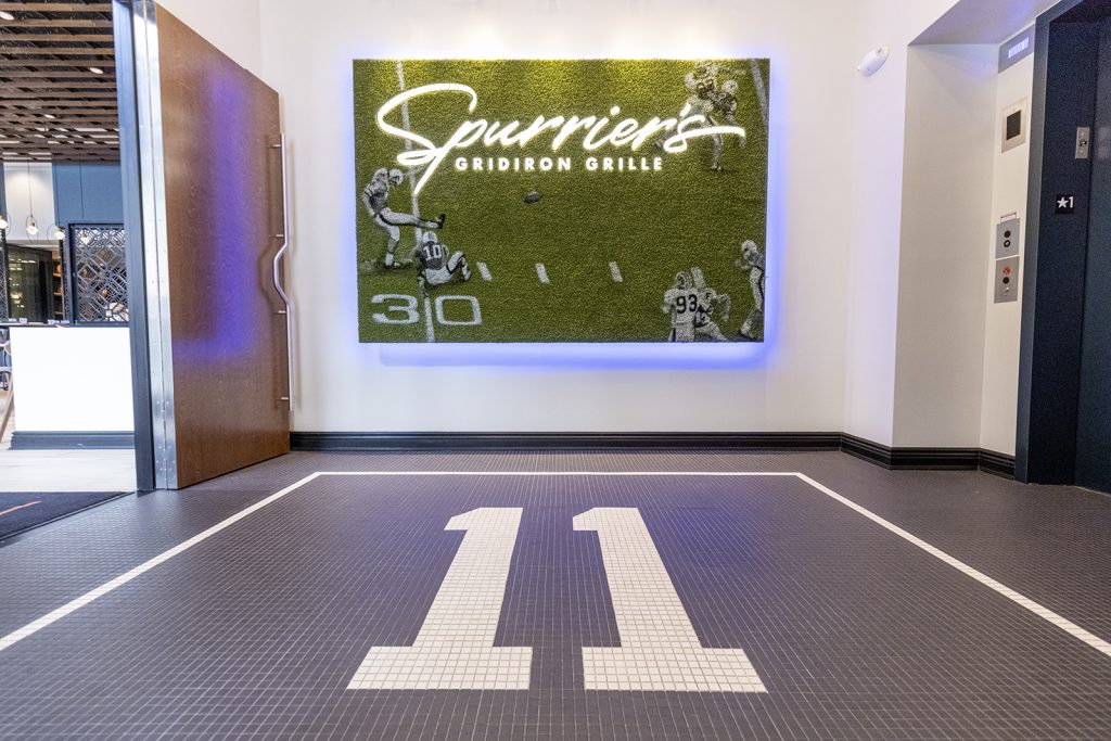
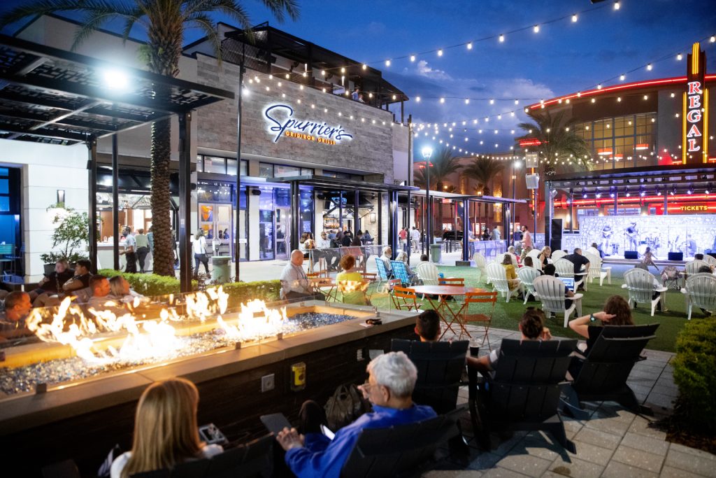
We played a major role in bringing legendary UF Gator football coach Steve Spurrier’s restaurant to life,
from finding the operating partner to designing the wallpaper, we carried it all across the line to launch.
There’s private dining, outdoor patio space, a killer menu, and a huge rooftop bar called Visors.
It’s truly a space fit for a Heisman.
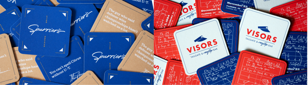
Gridiron Football Menus
Collateral

Career Displays
Lifestyle photography
Food Photography


By The Numbers - General
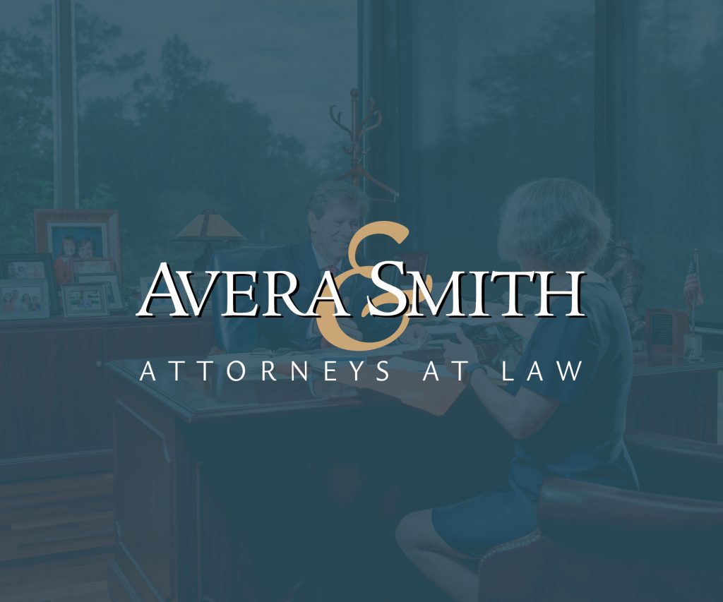
When it comes to results, Avera & Smith’s numbers speak for themselves. This video put in hard facts the success the law firm has had for their clients against the backdrop of their longstanding service to the Gainesville community.
Don't Hire Avera
A satirical view of Avera’s reputation from the point of view of insurance adjusters, who would really rather you not hire the prowess of Avera & Smith to represent your worker’s comp case. Frankel concepted, produced, shot and edited this :30 spot.
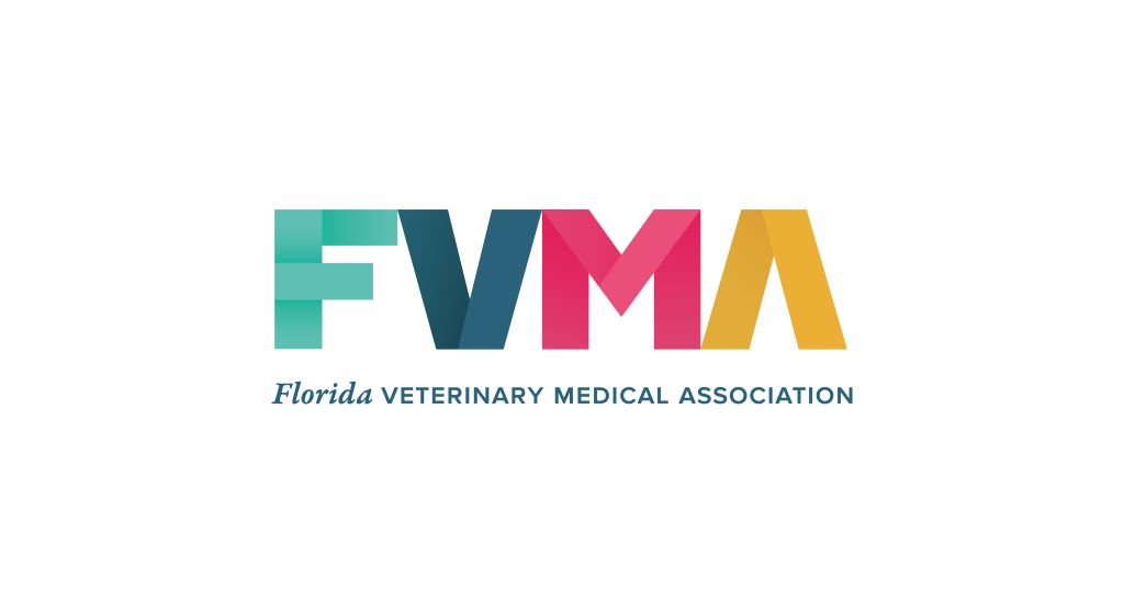
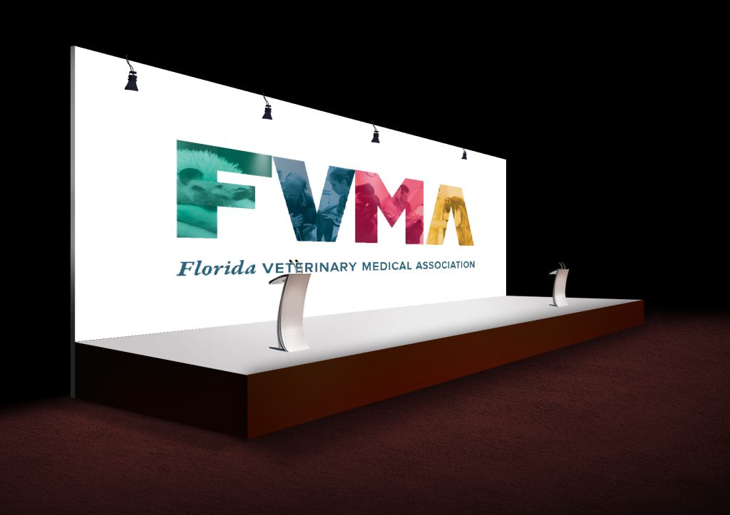
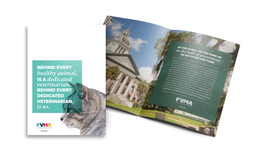
Dedicated to the Dedicated
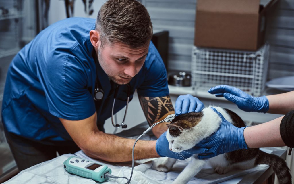
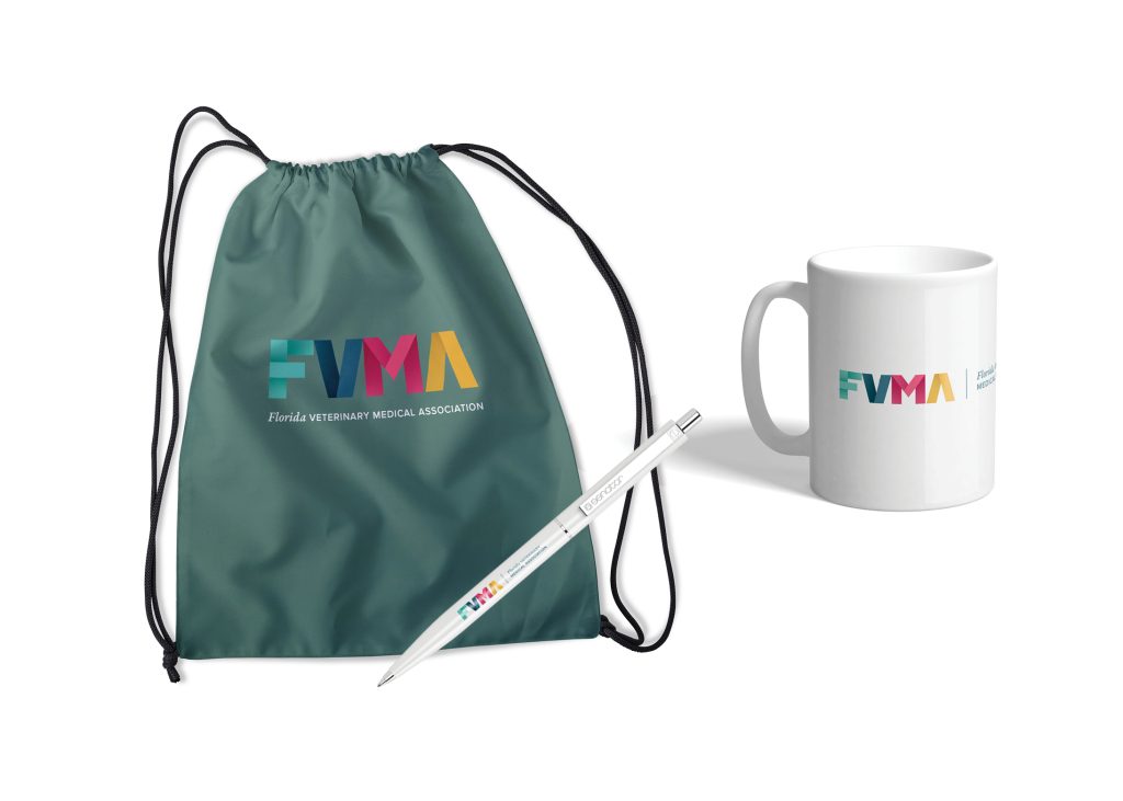
As Florida’s premier association for veterinary medical professionals, the FVMA is dedicated to the support and advocacy for those who are dedicated to the care of our animals. We revitalized their brand to strengthen the connection between their affiliate brands and constituents with a rebrand, anthem video and new website.

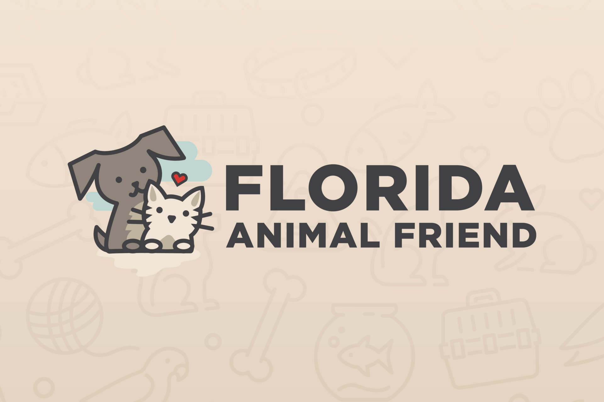
The Ask
Amplifying the Long-term Mission to End Pet Overpopulation
Since 2013, Frankel has partnered with Florida Animal Friend, a nonprofit that funds free and low-cost spay/neuter services across Florida. Their primary source of funding comes from the sale of specialty license plates, with $25 from each plate going directly toward their mission.
Our challenge was twofold: increase license plate sales and raise awareness for Florida Animal Friend’s annual grants, which award up to $25,000 to shelters and clinics serving under-resourced communities. Year after year, we’ve helped drive plate sales and keep the brand top of mind, making a measurable impact on pet homelessness across the state.
What We Did:
- License Plate Redesign
- Website Development & SEO
- Ongoing Blog Content
- Social Media Management
- Paid Digital Campaigns
- Email Marketing
- PR Strategy
- Out-of-home Advertising
- Grant Marketing Kit
Strategic Approach
Bringing Visibility to a Cause That Saves the Lives of Cats & Dogs
Our full-funnel marketing approach focused on education, storytelling, and sustained digital engagement, connecting Florida Animal Friend’s purpose to pet lovers and advocates across the state.

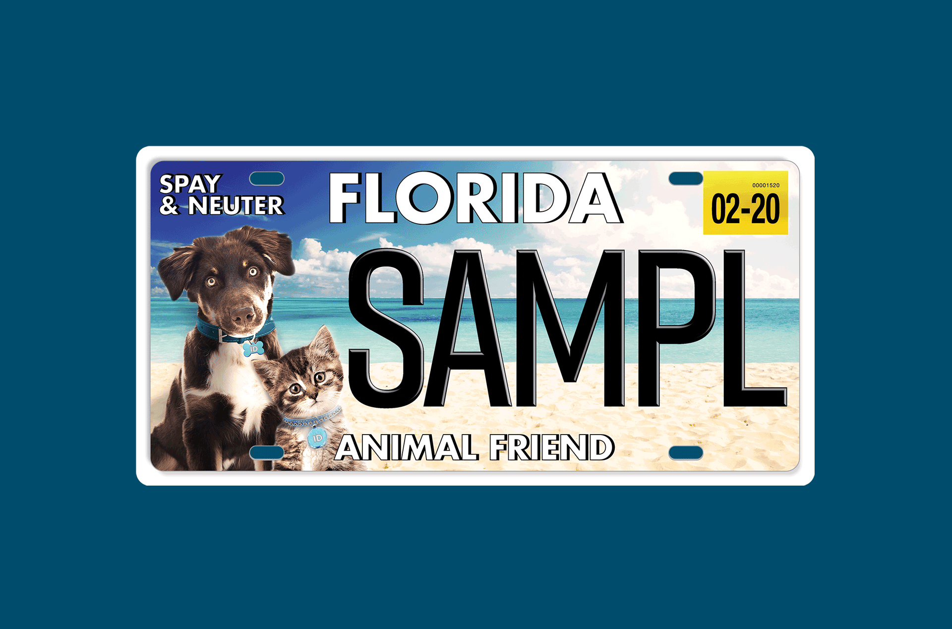
License Plate Redesign
A Design That Drives Impact
At the beginning of our partnership, we redesigned the original Florida Animal Friend specialty plate to better reflect the organization’s warmth and mission. The current plate features a puppy and kitten on a sunny Florida beach, making it an instant hit with animal lovers and helping to boost sales.
Website & SEO Strategy
Building a Digital Home With Purpose
We developed a user-friendly, mobile-optimized website built to educate, convert, and inform. From donation flows to grant applications, everything was positioned for impact. Our SEO strategy includes continuous blog development that ranks well on relevant pet care, adoption, and grant-related searches, keeping Florida Animal Friend top of search results and top of mind.
Social Media Management
Consistent Connection With Pet Advocates
Across platforms like Facebook and Instagram, we’ve maintained an engaging social media presence that speaks directly to pet lovers, grant recipients, and shelters. Through visuals, personal stories, and strategic messaging, we’ve grown their reach and deepened their community ties.

Paid Digital Campaigns
Targeted, Data-driven Advertising
Our paid media efforts span Meta and Google Search, focusing on two key objectives:
- Boosting specialty plate sales
- Increasing visibility of the grant application window among shelters and clinics
With each campaign, we not only refine targeting to maximize ROI and reach the right people at the right time, but we develop it with heart. The messaging and visuals emotionally resonate with people who deeply care about animals and who want to make a difference.
Email Marketing
Personalized Messaging for Multiple Audiences
From quarterly newsletters to segmented email lists, our email strategy reaches both prospective plate buyers and nonprofit partners. We announce grant cycles, share impact stories, and keep subscribers informed and inspired to take action
PR Strategy
Sharing the Great News ($8.8M+ Toward Saving Animals)
Public relations plays a major role in extending Florida Animal Friend’s reach. Our press releases speak to grant recipient announcements and newswire campaigns about application deadlines, keeping the organizations that are making an impact in the spotlight and in the know.
During COVID-19, we helped extend critical application deadlines with messaging that emphasized the ongoing importance of spay/neuter services during times of crisis.
To date, we’ve helped amplify the message of over $8.8 million in grants awarded across Florida.
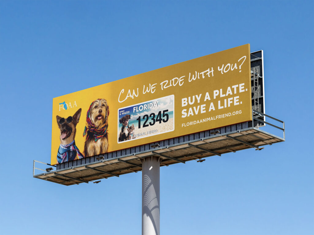
Out-of-home Advertising
Messages That Move People
We created eye-catching billboards across Florida with one simple question: “Can We Ride With You?”
Paired with the call-to-action “Buy a Plate. Save a Life,” the campaign reinforced how one license plate purchase could equate to an animal receiving a second chance at life.
Grant Marketing Kit
On-the-ground Materials With Real Reach
To help animal organizations spread the word about Florida Animal Friend, we created a marketing kit. The kit includes a high-res license plate image, digital marketing materials, and printable rack cards.
The “Can We Ride With You?” rack cards exist for animal shelters, clinics, and agencies to display in public spaces. These easy-to-grab handouts help inform visitors about the importance of spay/neuter and how they can support the mission by simply choosing the right plate.

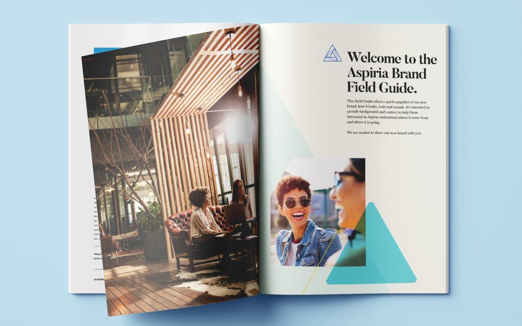
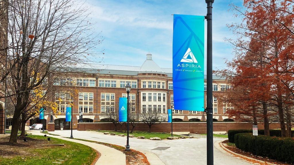
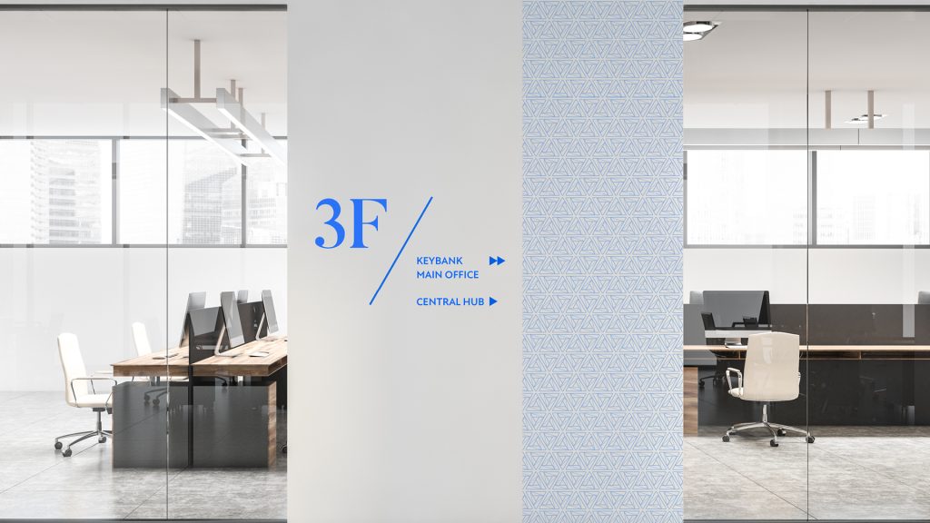
When Occidental Management asked us to partner on the gargantuan task of reimagining the former Sprint Campus headquarters in Overland Park, Kansas, we knew an aspirational rebrand was crucial to its success. Beginning with a renaming effort all they way through a new brand we worked to establish the property as a premier destination for companies and residents whose ambition knows no bounds. This work took home Silver, Graphis Design Annual 2022, and got us fired, but that’s another story.
Logo
The brand identity system offered flexibility and a dynamic usage for the logomark, all built around the strength of a multifaceted skyward-pointing triangle.
Leasing Support
A leasing brochure was developed to introduce prospective tenants to the project.
Field Guide
Brochure introducing the new brand to internal and external audiences.
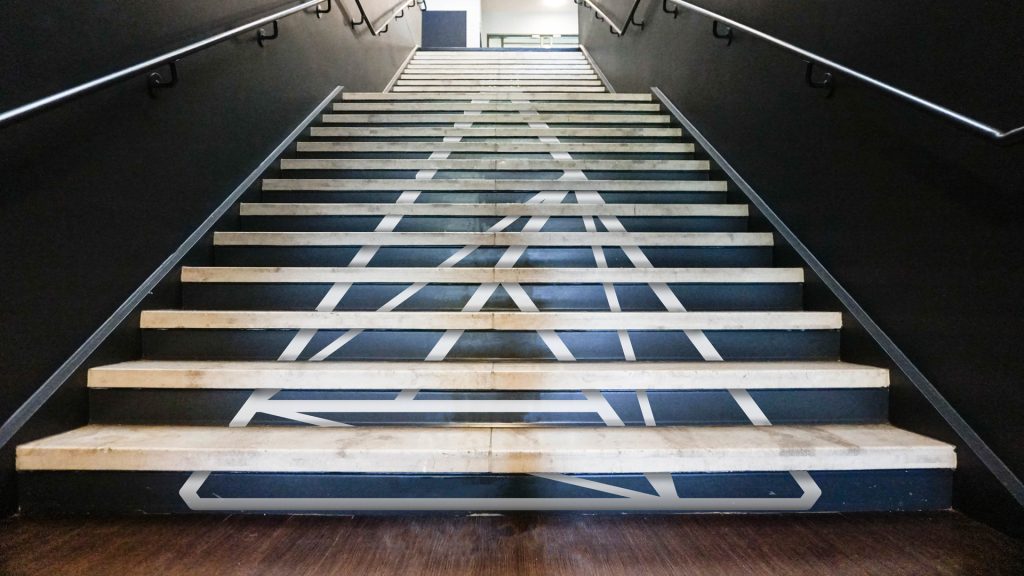
Unique opportunities were found to apply the brand identity around campus to solidify the new name and logo.


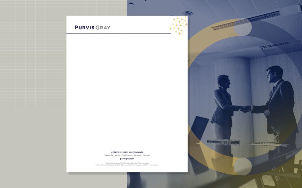
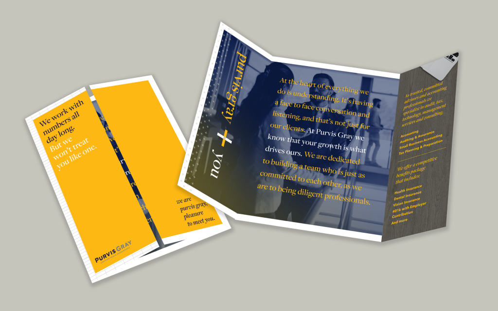
The Ask
Rebrand a Traditional Accounting Firm
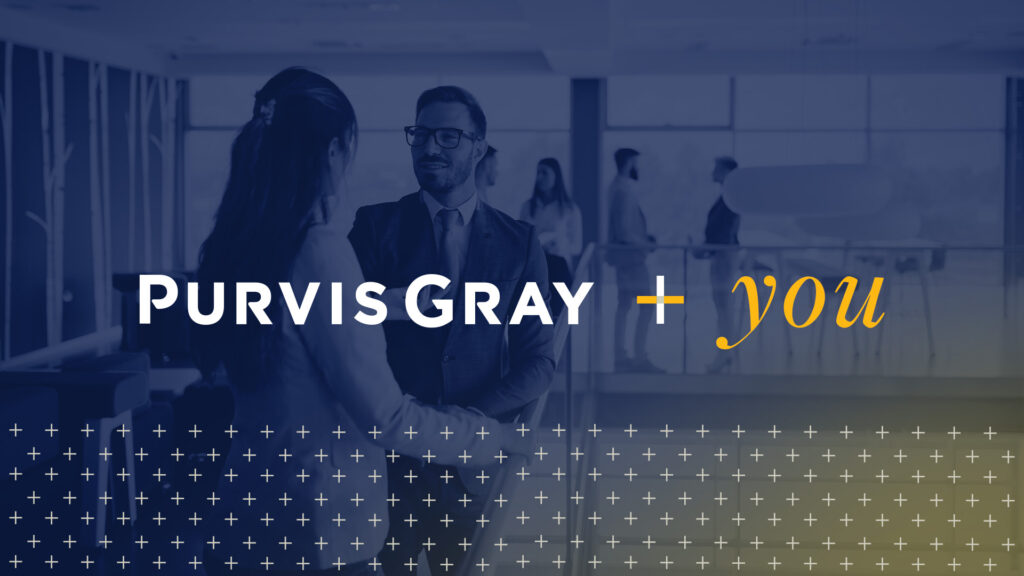
Purvis Gray, a Gainesville-based accounting firm founded in 1946, had long been known for its tax and audit services. But with a reputation rooted in tradition, the firm struggled with the perception of being outdated. Our challenge was to reposition Purvis Gray—not by changing who they were, but by refining and amplifying their strengths. The goal? Build brand recognition in key markets, enhance recruitment efforts and bring internal alignment to their identity.
What We Did:
- Brand Development
- Logo Redesign
- Brand Guide
- Recruitment Brochure
- Event Collateral
- Strategic Communications Plan
Strategic Approach
Determining Motivations & Identifying USPs
Why choose Purvis Gray—whether as an employer or an accounting partner? To answer this, Frankel led a comprehensive discovery process. We began with stakeholder interviews to get under the hood of the brand, followed by a company-wide employee survey across Purvis Gray’s Florida offices. We also conducted in-depth competitor analysis and benchmarking.
This research revealed what truly set Purvis Gray apart: a people-first culture, long-standing client relationships, and a regional presence with deep roots. These insights became the foundation of a strategic communications plan that repositioned the firm as the go-to, reliable and community-focused leader in accounting.
Brand Refresh
Bringing the Purvis Gray Personality to Life
Though Purvis Gray had history, they lacked a unified brand voice and visual identity. Our creative approach was informed directly by employee and client insights—ensuring authenticity and long-term resonance.
Logo
We gave their logo treatment a clean, modern appeal. With two types of typography, varying font applications, and a strong color palette, we ensured that the logo reflected their professional yet earnest style.
Brand Guide
The brand guide pulls together the firm’s new identity—from the position, messaging pillars, and tone to logo usage and color palette, ensuring consistency across all locations and touchpoints.

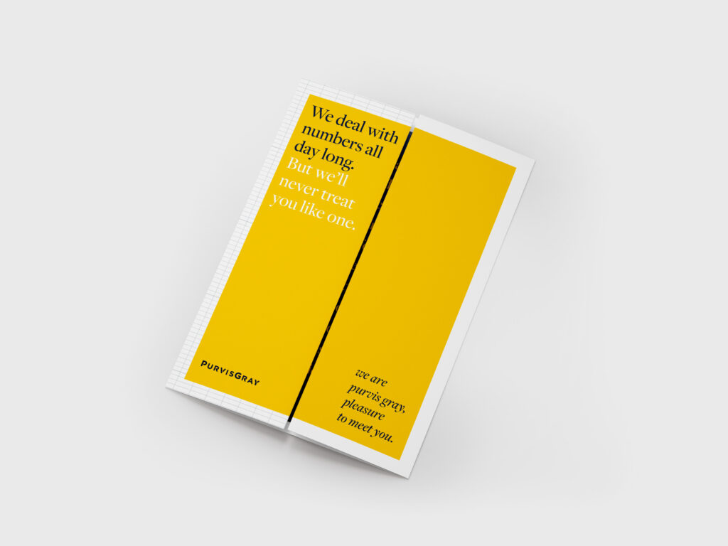
Recruitment Brochure
Recruitment was a top priority. Using real employee feedback, we developed a brochure that reflects Purvis Gray’s new messaging and look, showcasing the culture, benefits, and opportunities in an authentic tone.
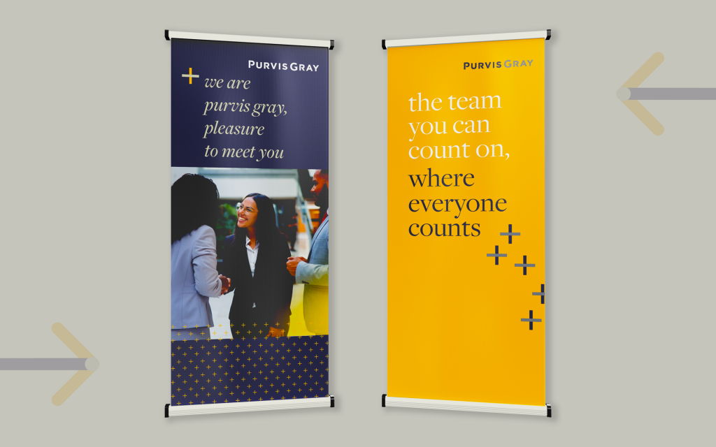
Event Collateral
We created a suite of event materials including business cards, banners, and branded tablecloths. Each was designed for consistency and memorability, whether at networking events, job fairs or community events.
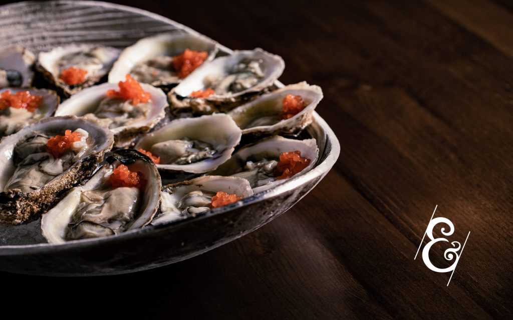
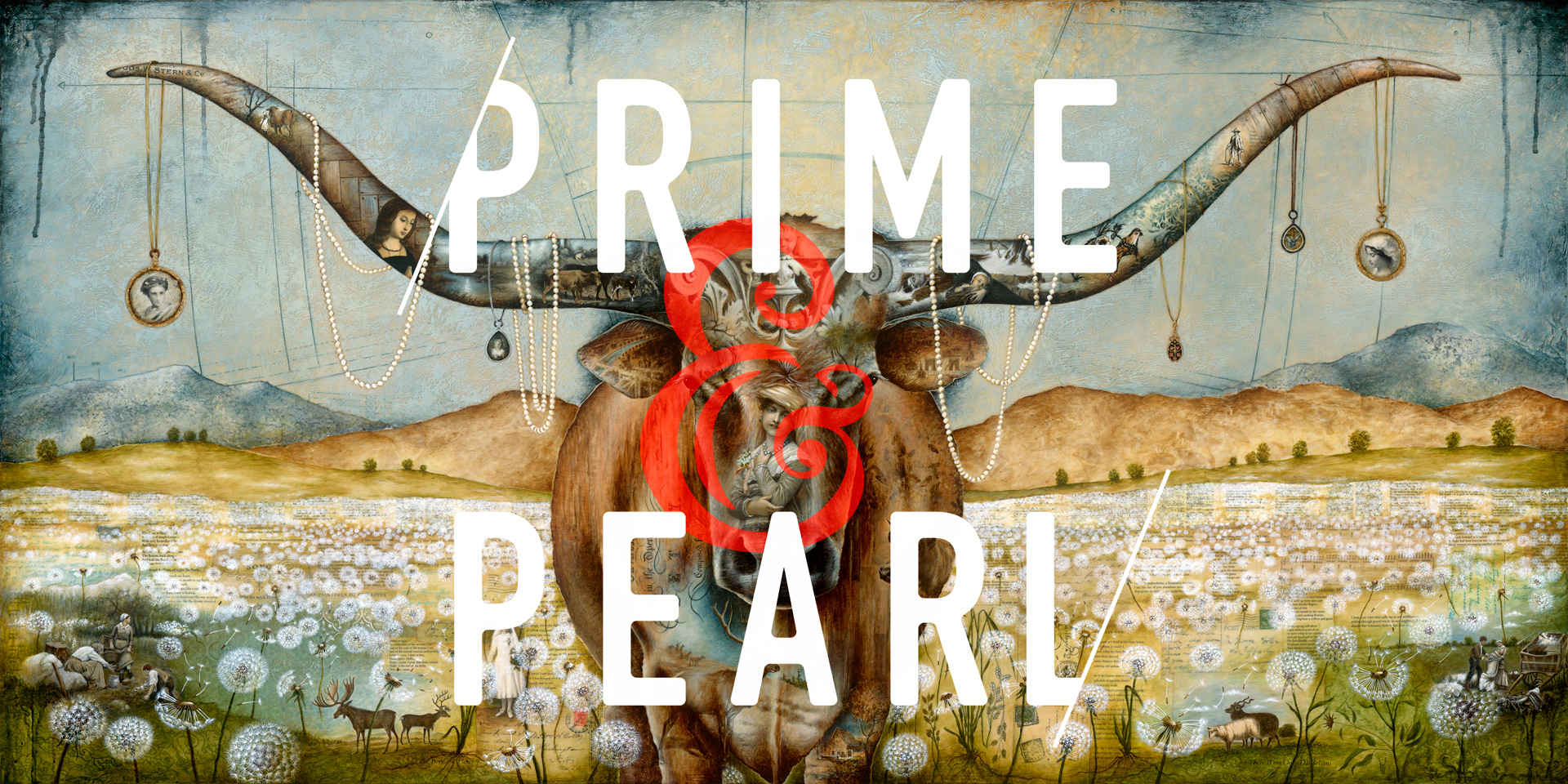
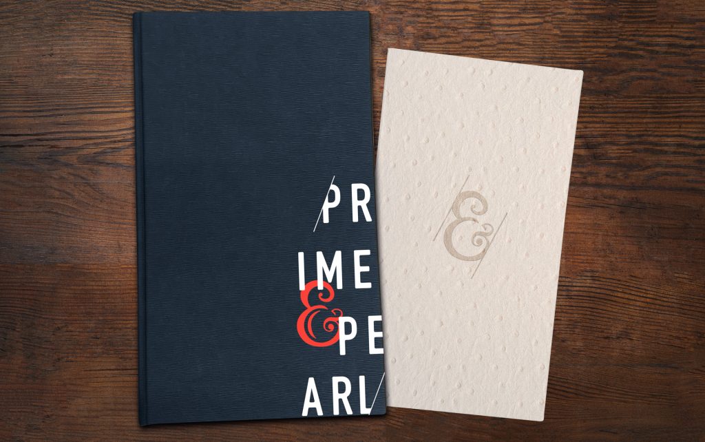
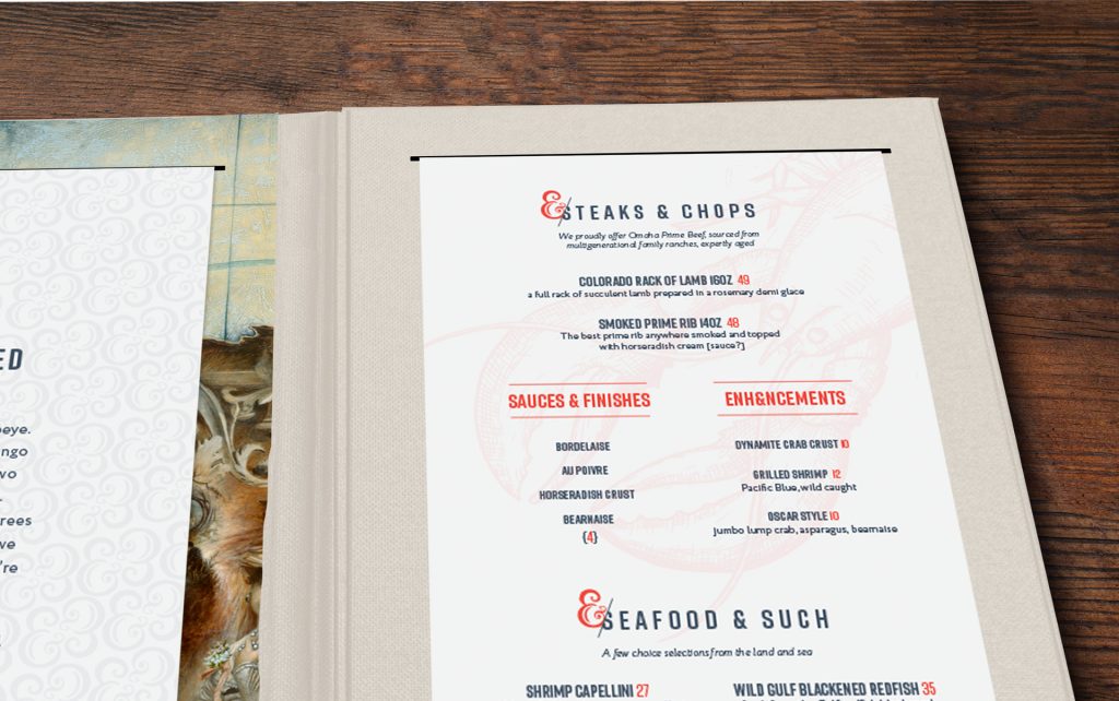
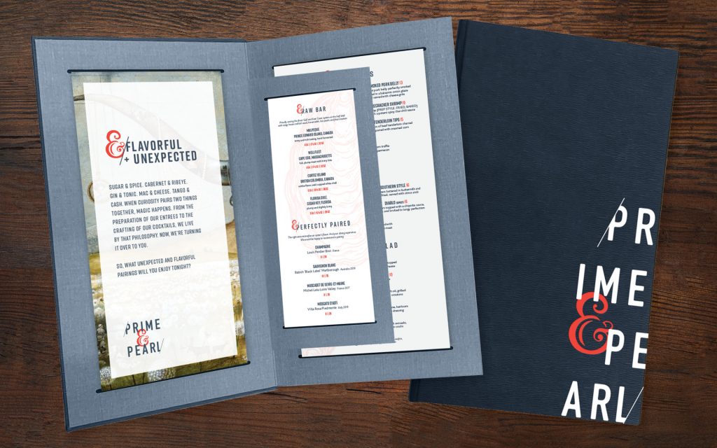
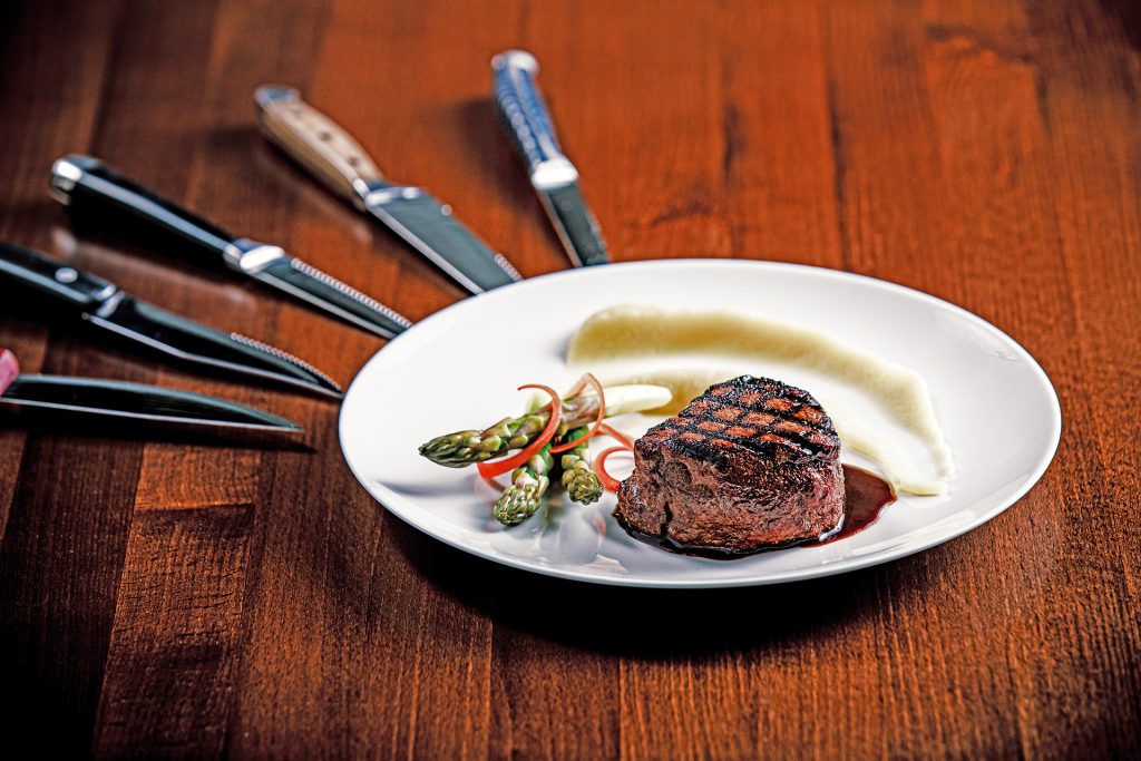
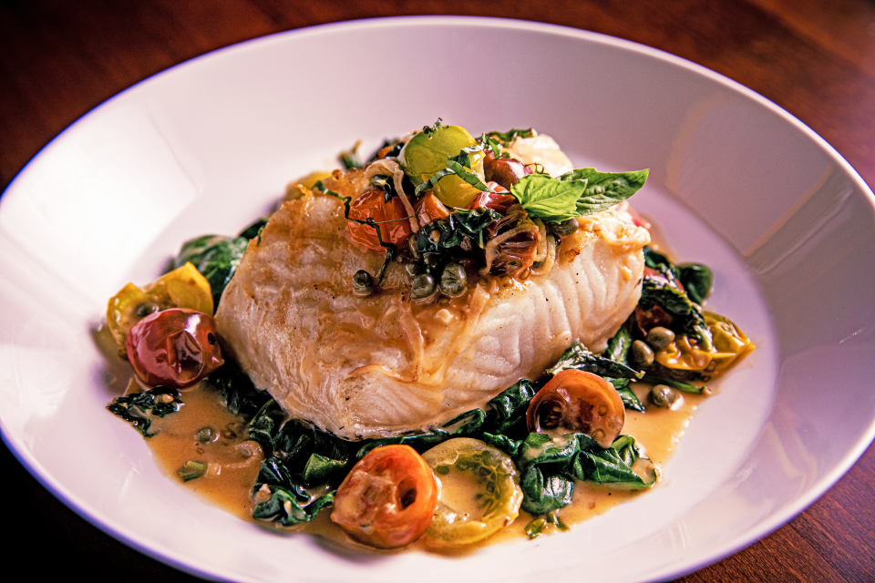
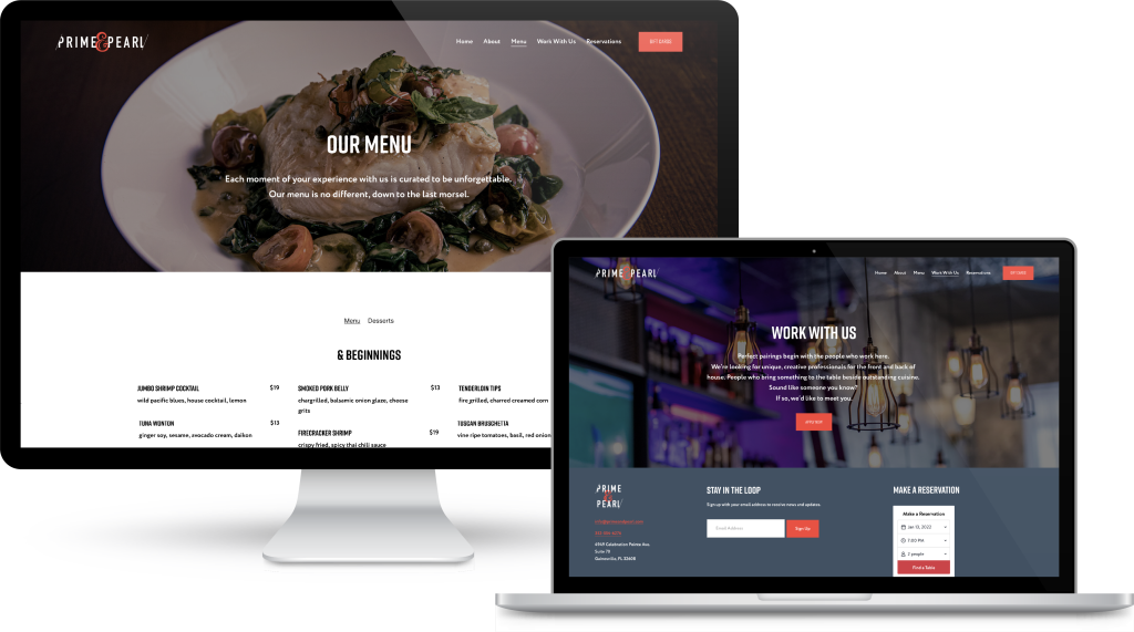
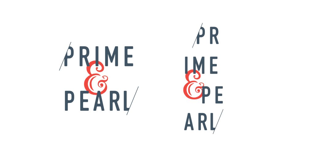
An upscale, yet eccentric steakhouse with the best cuts, the freshest shellfish and creative cocktails, Prime and Pearl is built around unexpected pairings. We crafted an equally unique and memorable brand with enough quirk and sophistication to keep diners’ curiosity piqued.
Food Photography
Website Design
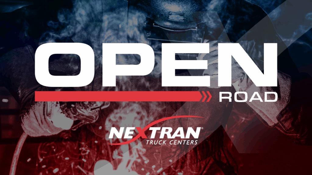
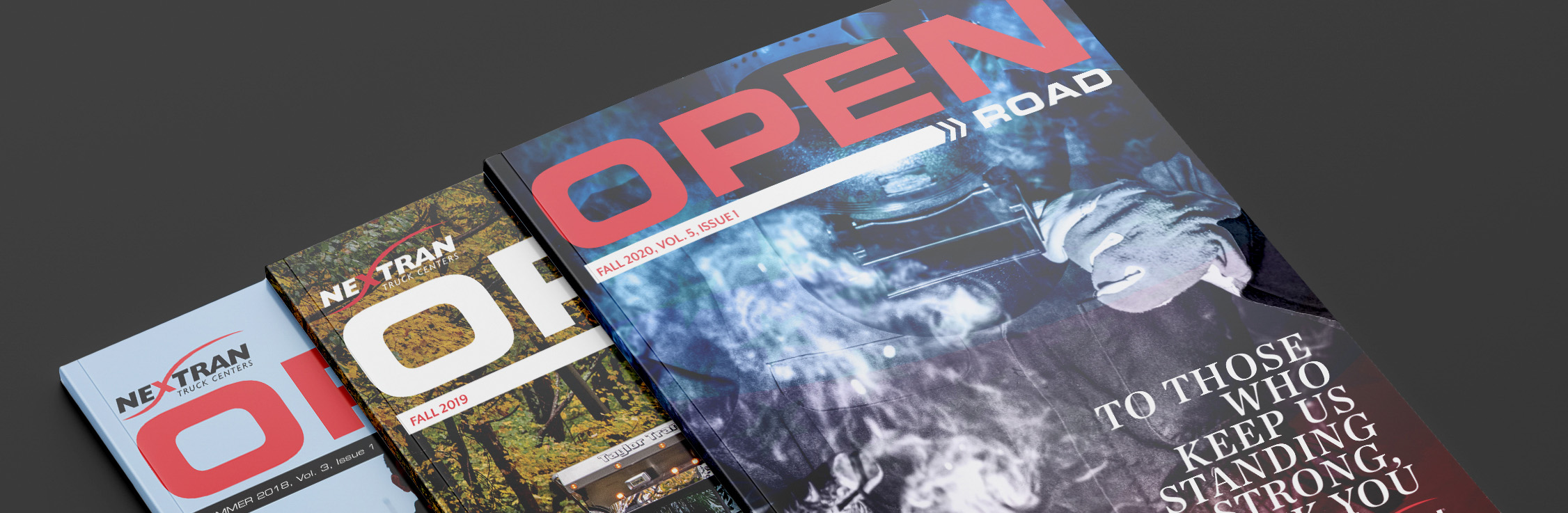
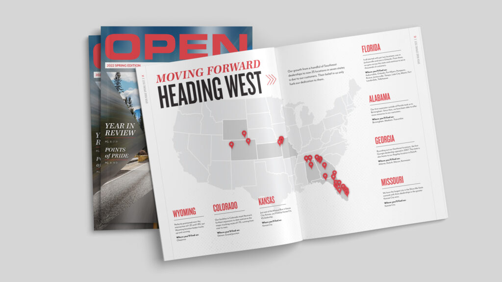
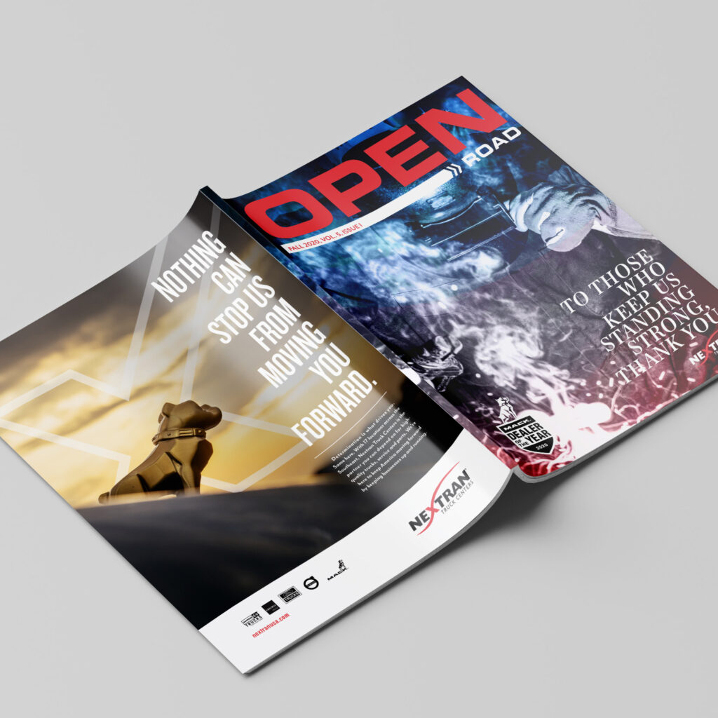
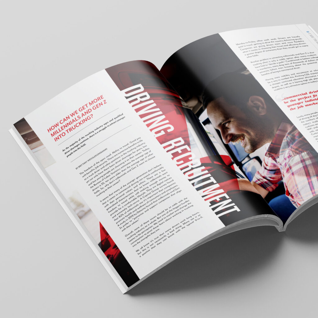
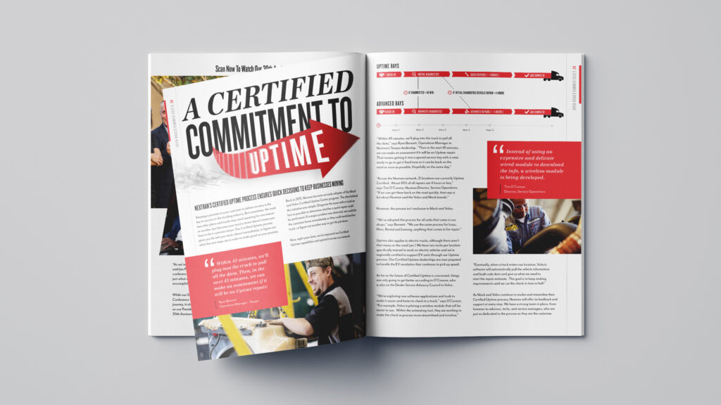
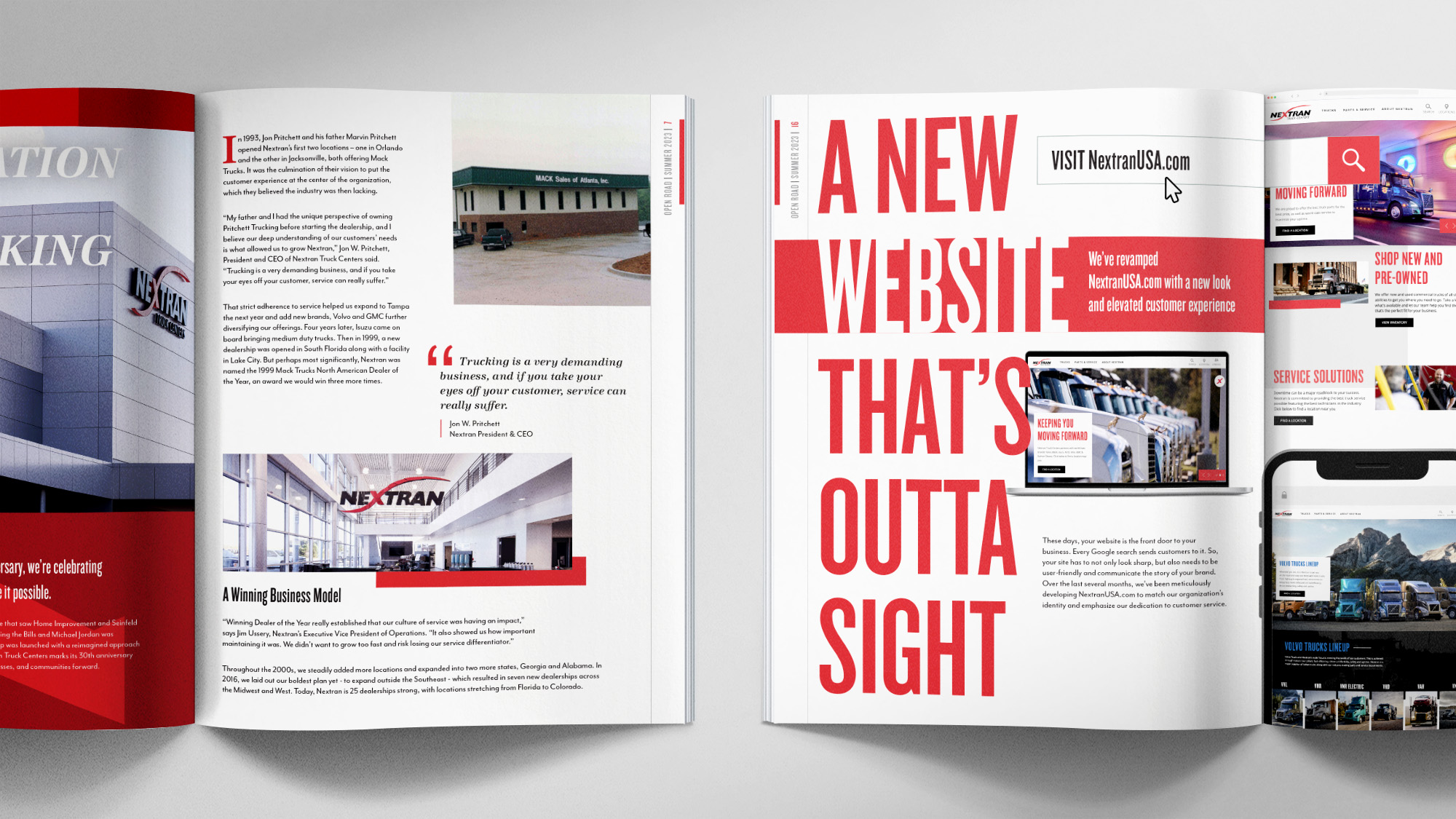
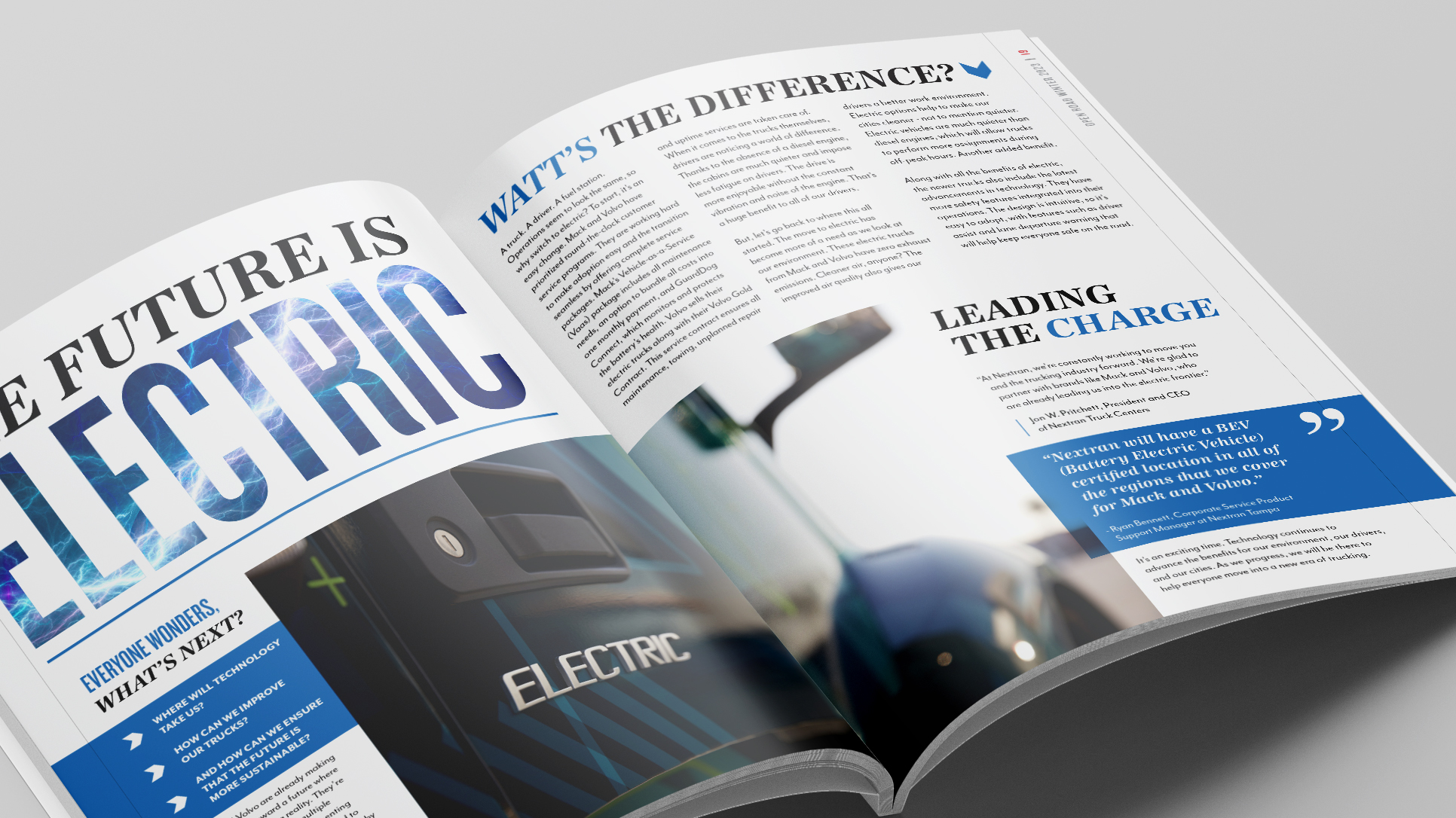
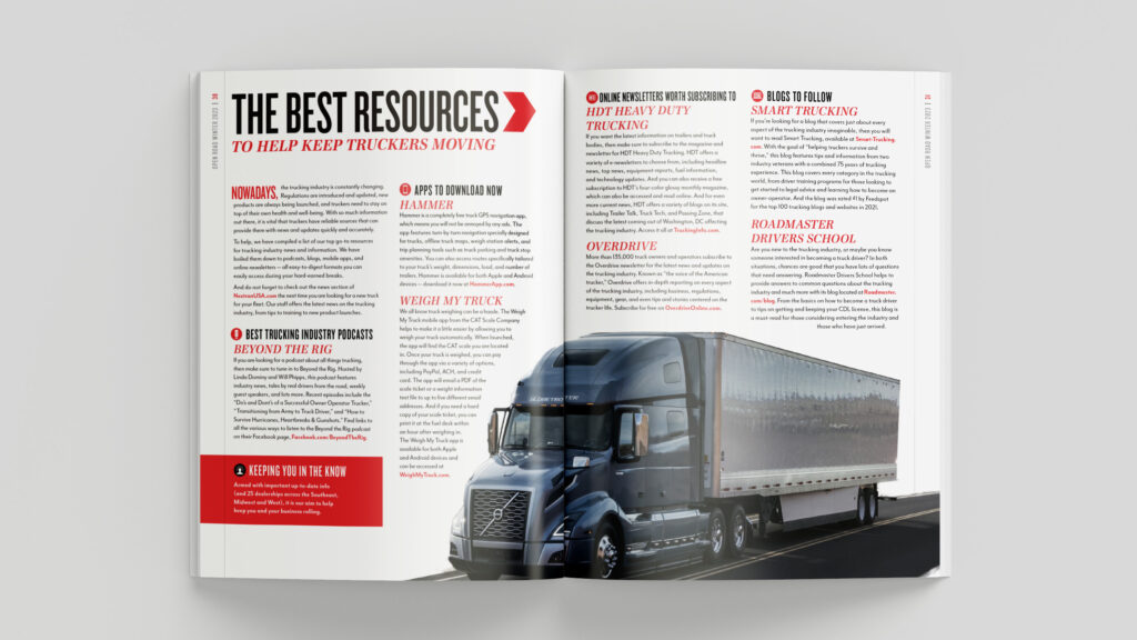
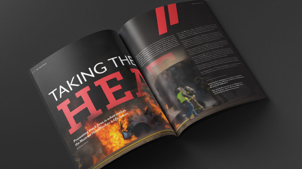
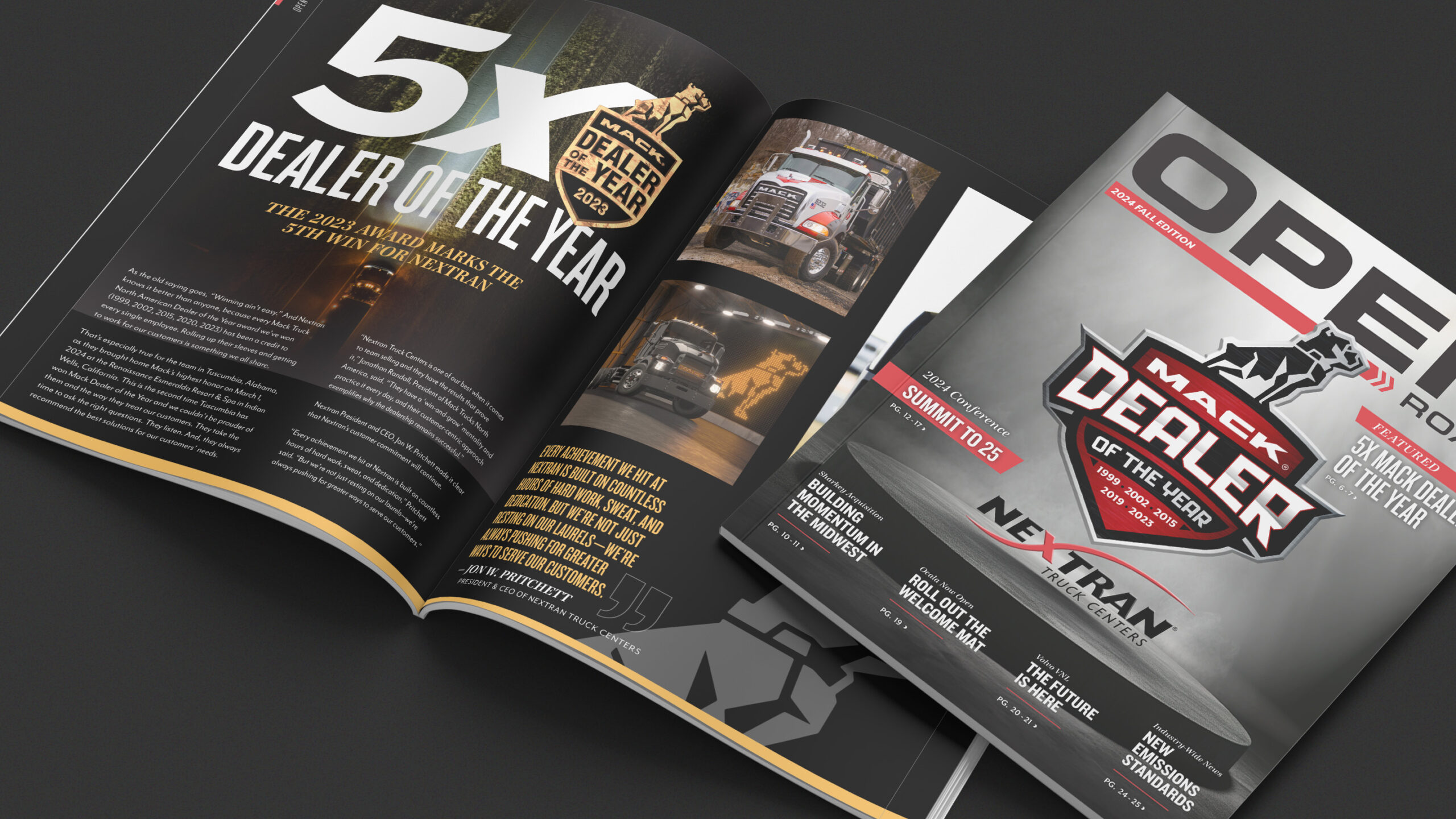
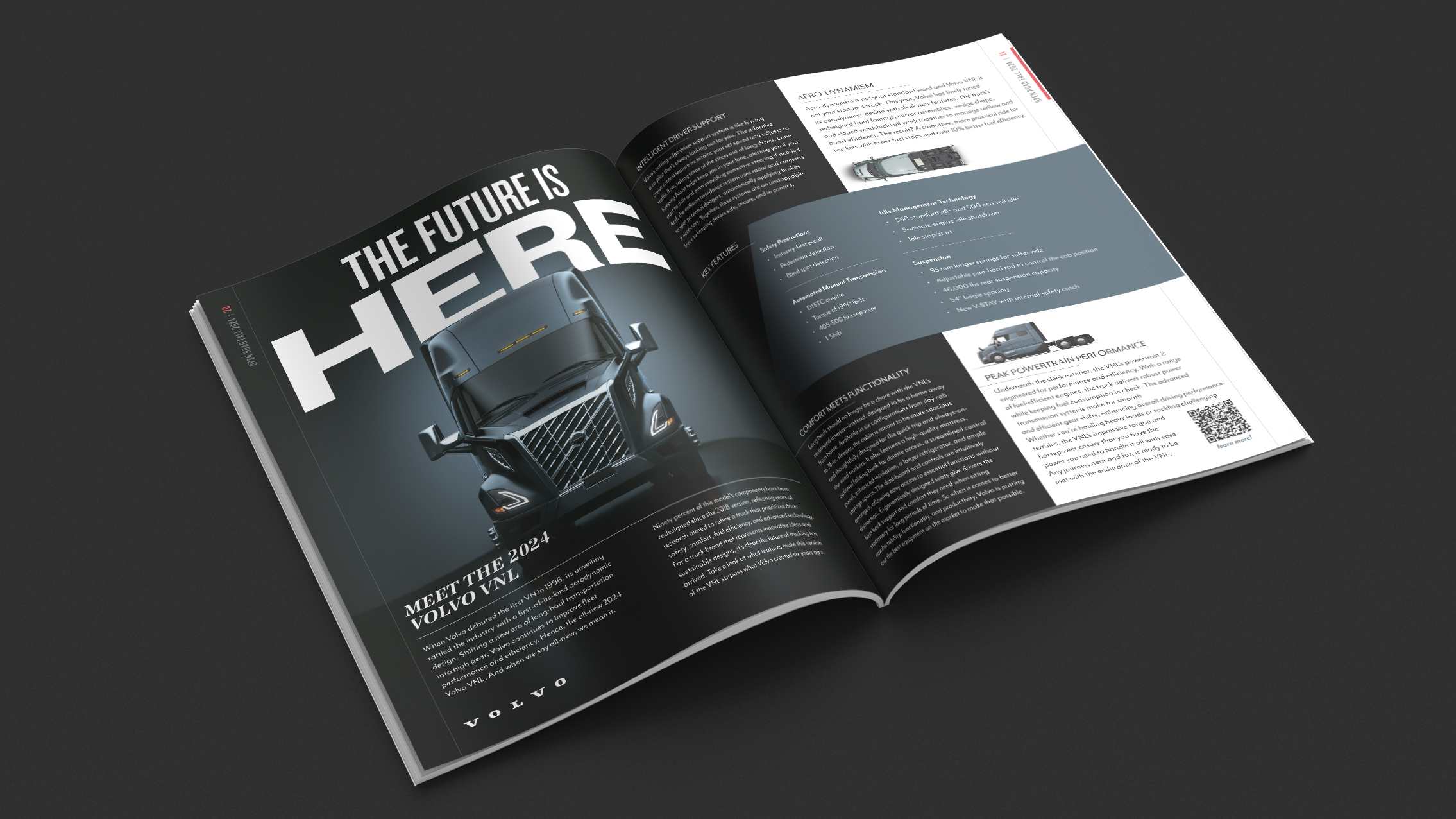
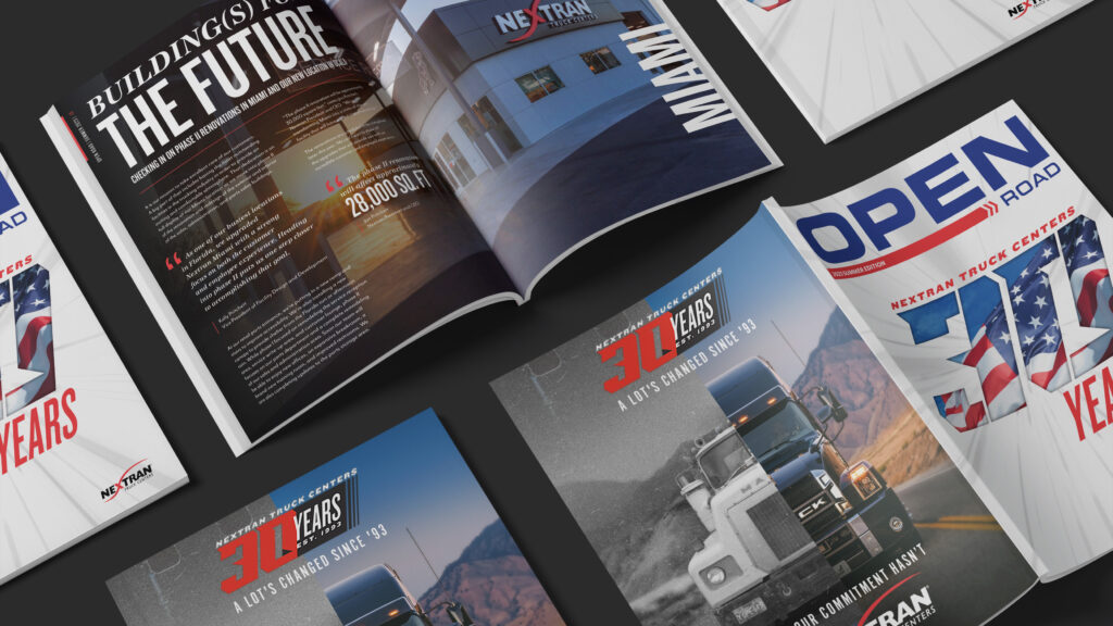
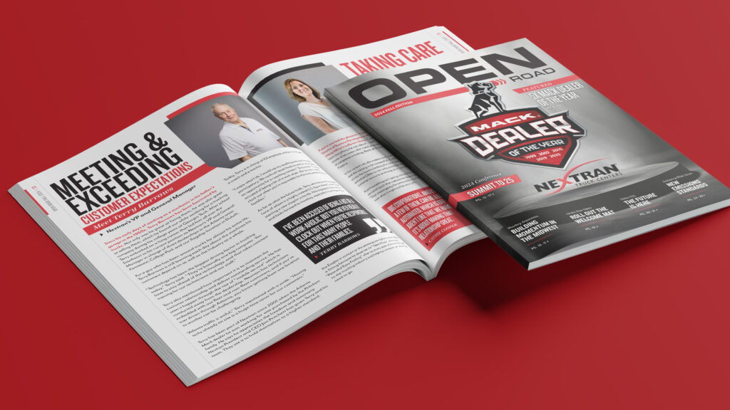
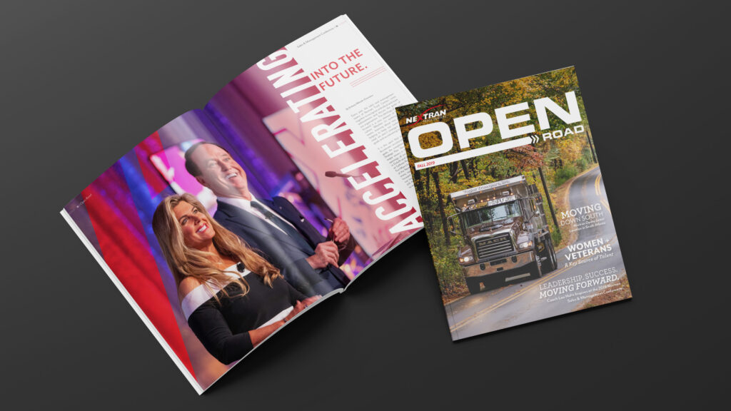
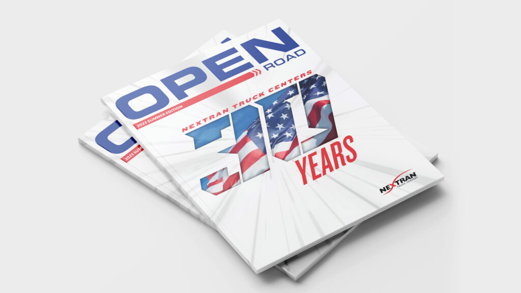
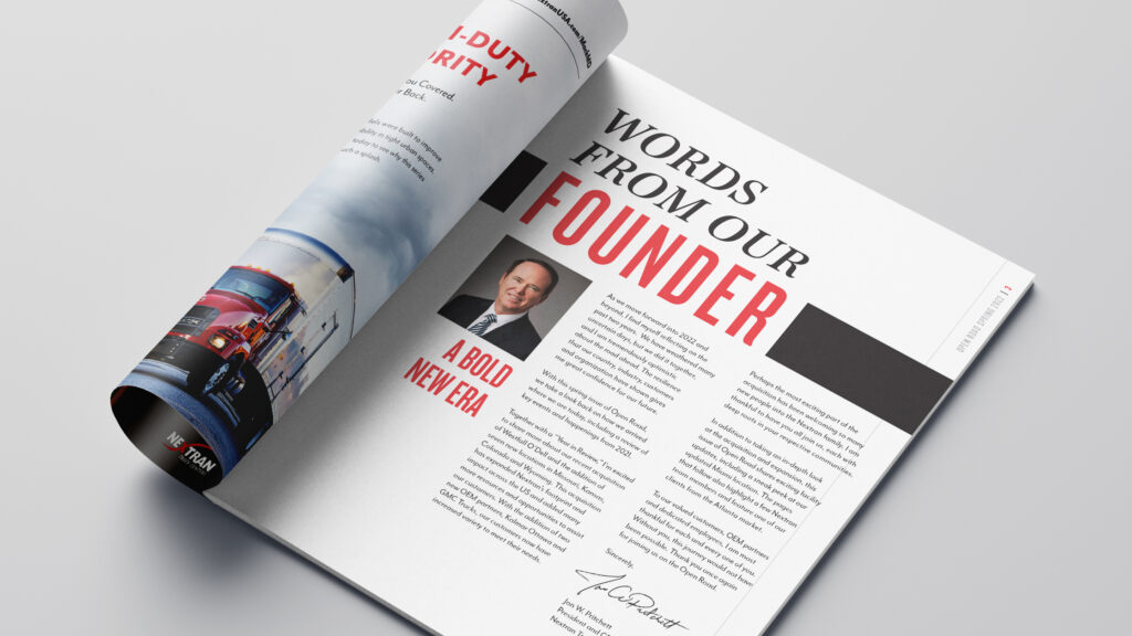
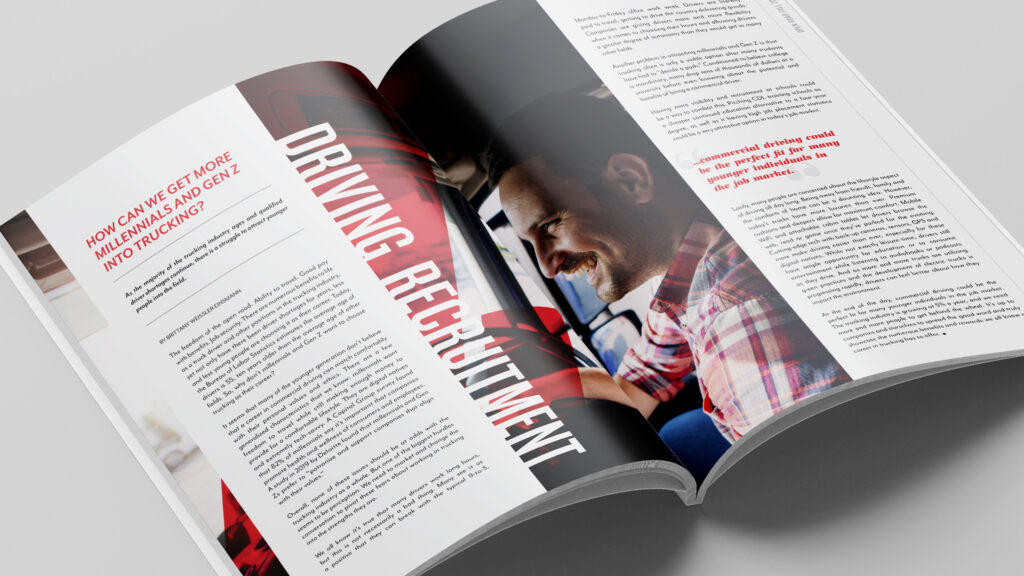
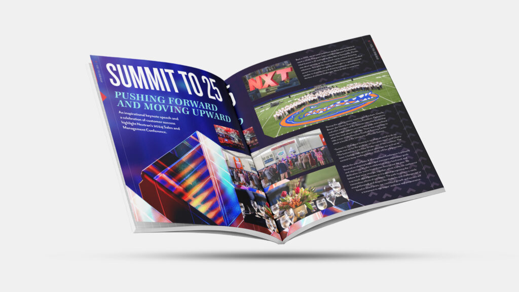
Nextran’s Open Road
To help cement Nextran Truck Centers’ reputation as a leader in the heavy-duty trucking industry, we created a bi-annual magazine published by Nextran called Open Road. Each 32-page edition covers everything from company milestones to industry news to employee and customer spotlights.
Since 2015, we have been responsible for designing every issue, conducting all the interviews and writing every piece of content.
: What We Did
- Publication Design
- Story Concepting
- Content Writing
- Publishing

Working on Open Road gives us the ability to flex our creative muscles to produce the most eye-catching magazine possible.
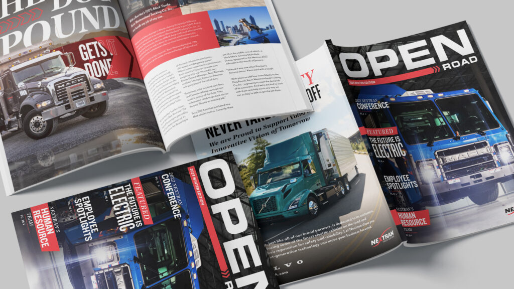
Once printed, the magazines are sent to all 32 dealerships across the country where thousands of customers interact with them.
Every issue has at least one article focused on Nextran employees. We have the privilege of interviewing them and sharing their stories with Open Road readers.


