The Situation
A Brand for a University on the Rise
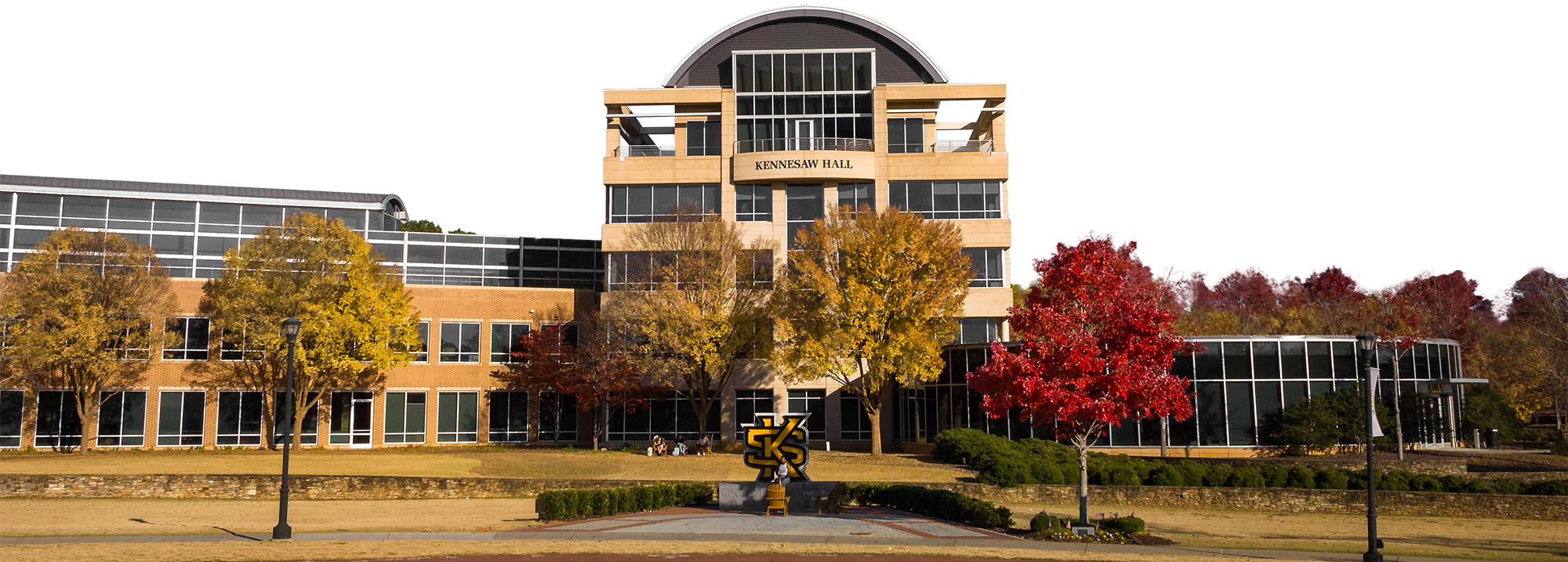
In 1962, Kennesaw State University was formed to provide residents with workforce ready skills. Over the decades, it has grown into one of Georgia’s most influential public universities through its strong work ethic and an unwavering commitment to improving the lives of students and strengthening the communities it serves.
That relentless spirit has propelled KSU’s rise into a top-tier research university with two thriving campuses and a student population of over 51,000 (the 3rd largest in Georgia). Its devotion to academic excellence and measurable achievement demanded a brand that could match its momentum.
The story of KSU is a compelling one. We set out to tell it the right way.
What We Did:
- Research & Discovery
- Brand Strategy
- Brand Development
-
- Verbal Identity
-
- Visual Identity
-
- Brand Standards Guide
- Peer Reputation Campaign
- Donor Booklet Viewbook
- Brand Video
Approach
Grounded in Research
We sat down with students, faculty, staff, alumni, donors, industry partners, cabinet and board members, and athletics. Then we broadened the lens with a university-wide survey that generated more than 3,300 responses. It’s helped us build a brand on valuable insights.
Building the Brand Platform
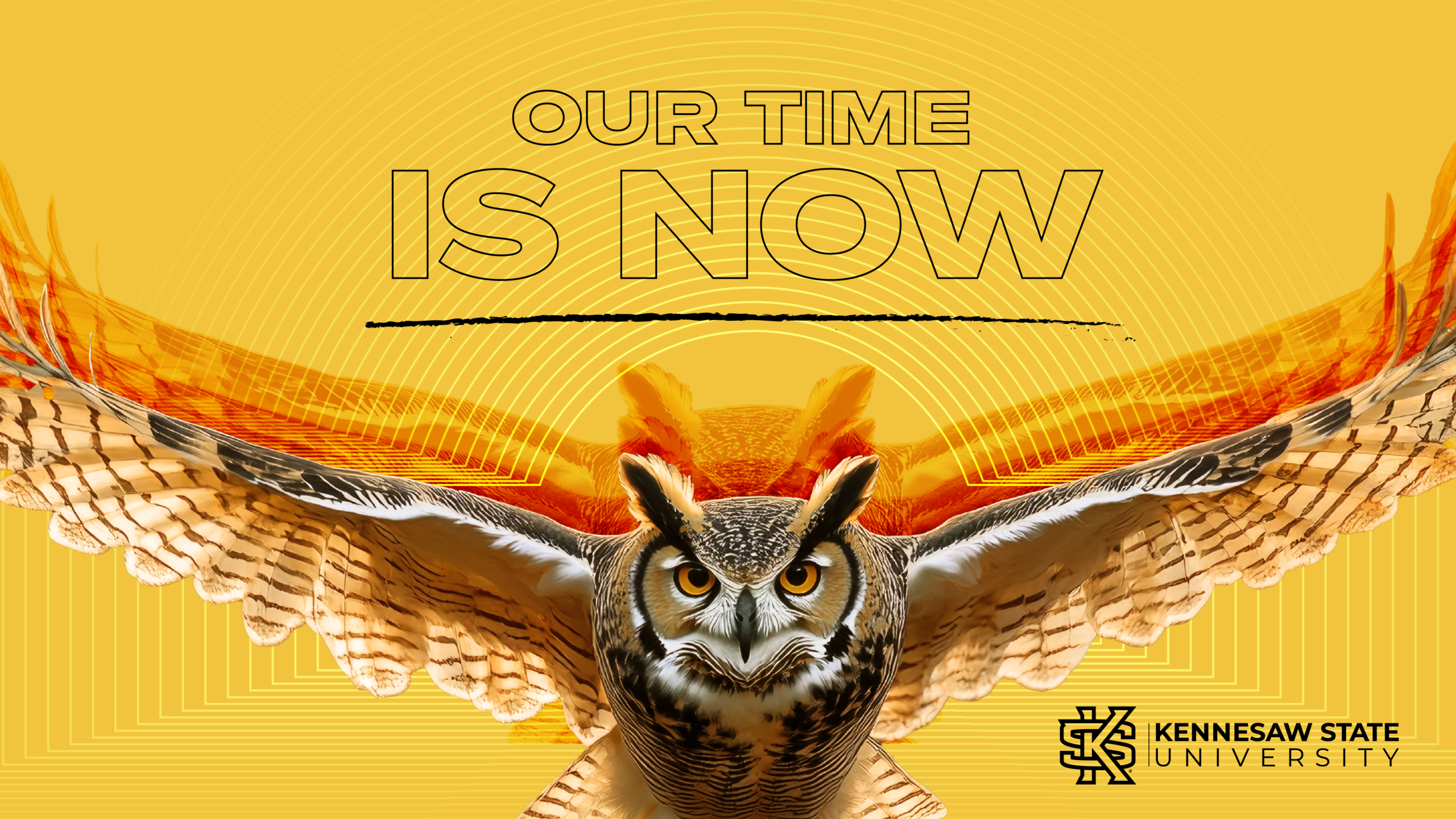
Relentlessly Rise captures Kennesaw State University’s drive to keep moving forward. From its workforce beginnings to its emergence as a leading research institution, KSU has consistently met growth with grit. The brand comes to life through four pillars—Made to Meet the Moment. Powering Our Communities. Guided By Excellence. Together, For Better. Together, they reflect a university built on responsiveness, impact, academic rigor, and shared progress—always rising, never settling.

Visually Appealing
Kennesaw State University’s visual identity ensures the brand is clear, confident, and unmistakably KSU. Through color, typography, imagery, and design, it creates instant recognition while reflecting the university’s personality and spirit. Everyone who communicates on behalf of KSU helps bring this identity to life, adapting it thoughtfully for each audience while staying true to the same standards.
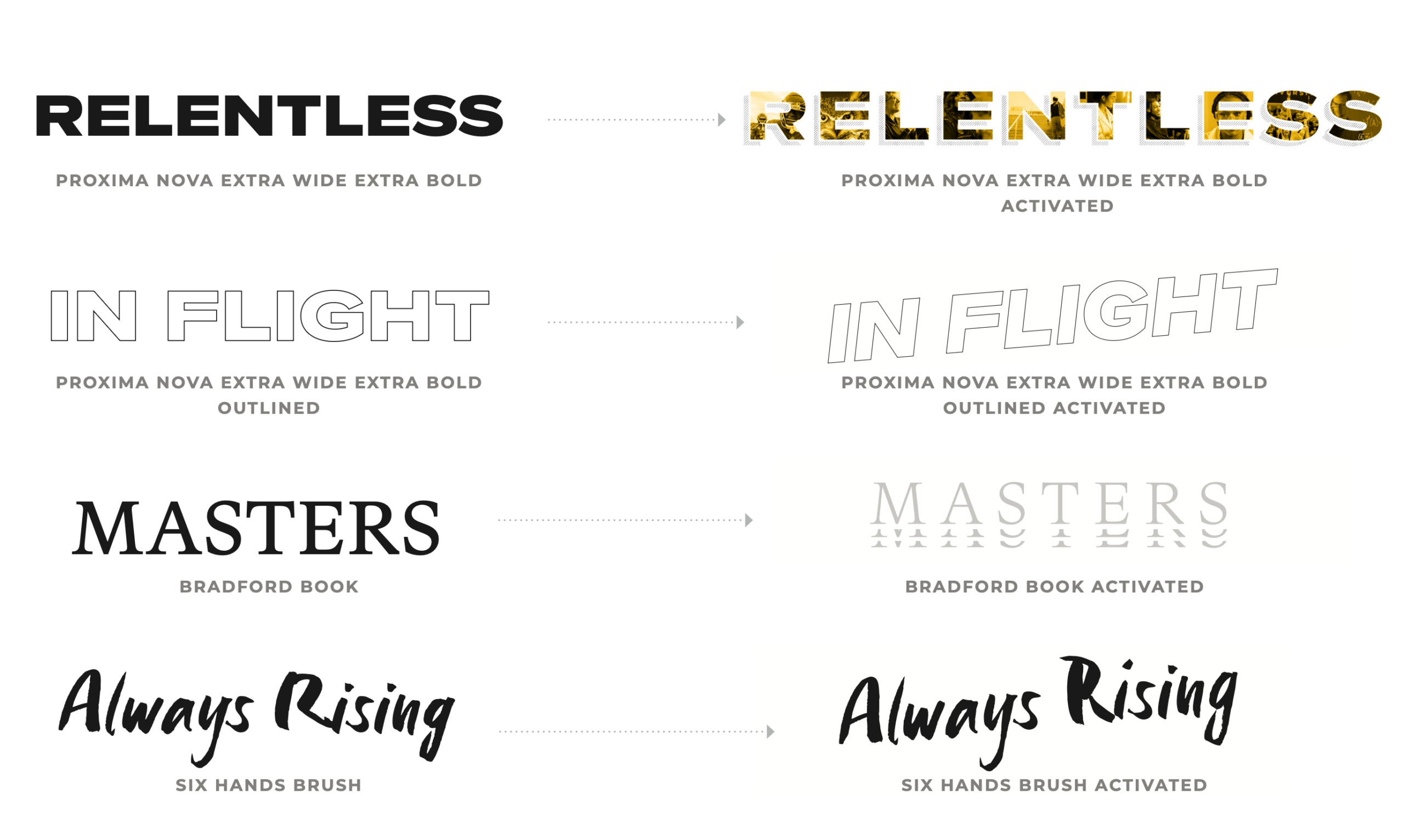
Typography
Proxima Nova Extra Wide and Proxima Nova Condensed offer the brand a bold and sharp type option. Especially when we want to make a clear impact with our words.
Bradford provides a unique serif typeface that can be paired with Proxima Nova or used on its own when a more elevated approach is warranted.
Six Hands Brush provides the brand with a highly expressive, human typeface that speaks to the grit and the person-to-person quality of our brand.
Activated Typography
In addition to our regular typography, the activated typography brings in more visual interest while communicating elements of the brand.
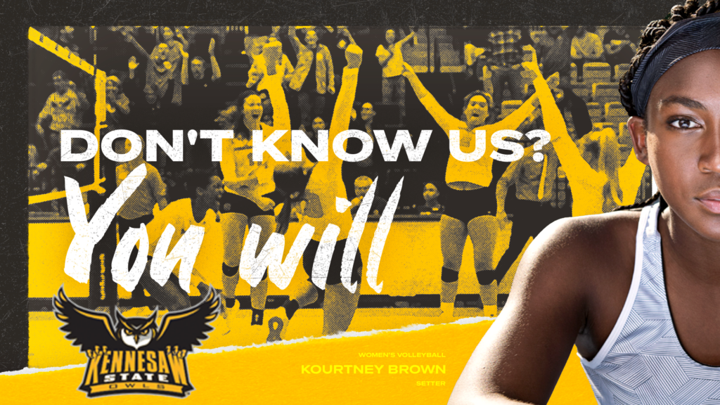
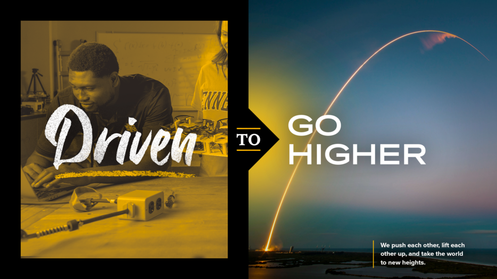
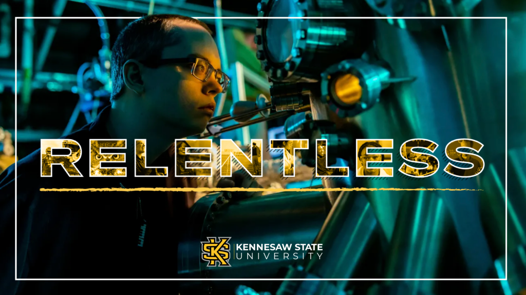
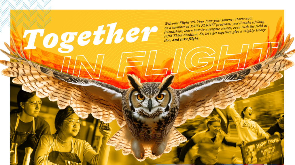
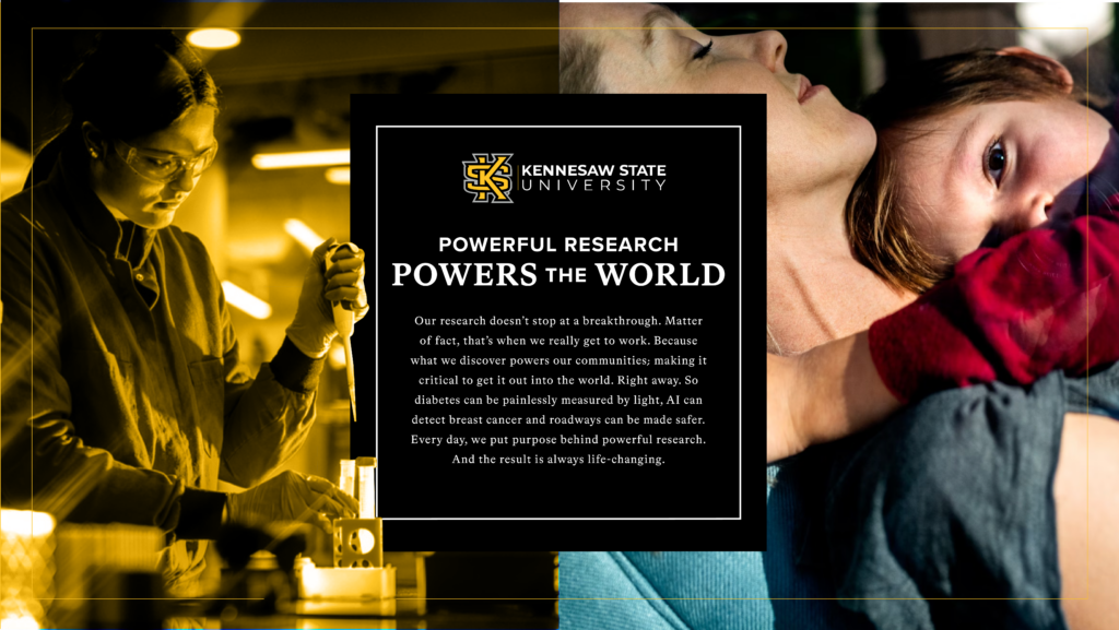
Brand Art
We developed a series of media agnostic pieces that brought the verbal and visual elements together, showing how the brand can flex across audiences.

Implementation
Brand Launch Video
To introduce the new brand to the university community, and the public at large, we developed an anthem video that brought it all together in a two minute video filled with pride and purpose.